# Why Builders Are Leaving MUI and the Honest Alternatives
> Explore why teams are switching from MUI and discover the best alternatives for your project, from headless libraries to cross-platform SDKs.
> By Dave · 2026-08-28
> Source: https://otf-kit.dev/blog/material-ui-alternatives
MUI is one of the most productive React component libraries in the world, and for many teams it's the right call. It's accessible, comprehensive, and ships with enough components that you can build a real product without bolting on third-party pieces. The question isn't whether MUI is good — it is. The question is whether MUI's opinions match your product's opinions, and what to switch to when they don't.
## MUI is the right answer for some teams
Stay with MUI if you're shipping a B2B SaaS where the Material look reads as "professional," you want a comprehensive single-vendor suite and don't mind the bundle, your designers and PMs like Material's vocabulary, or your mobile story is "responsive web," not native apps. For a CRUD-heavy internal tool, a Material-adjacent aesthetic is a feature, not a bug, and MUI's accessibility story is genuinely strong. The pain isn't MUI. The pain is MUI being the default when something else actually fits.
## Other themed libraries: same shape, different opinions
If the complaint is "Material's specific look" but you still want a comprehensive suite, you can swap MUI for another library of the same shape and pick a different design vocabulary.
| Library | Best for | Tradeoff vs MUI |
|---|---|---|
| **Chakra UI** | Lighter bundles, simpler theming, accessibility by default | Smaller ecosystem — advanced components like DataGrid and complex date pickers need third-party add-ons |
| **Mantine** | Dense component set with bundled hooks (forms, notifications, modals manager) | More npm dependency weight than MUI; CSS-modules-style API is a learning curve if you're coming from emotion |
| **Ant Design** | Enterprise density, complex tables, multi-locale admin tools | Heaviest bundle of the four; Chinese design vocabulary shows through theming work |
**Pick this if** you want a comprehensive single-vendor suite but Material's elevation, ripples, and typography don't match your brand. **Skip it if** the underlying complaint is "I want my own design system" — these are still vendor opinions, just different ones.
## The three things that drive builders away
**Bundle weight.** The full MUI suite ships with a meaningful per-import footprint. Tree-shaking helps, but the emotion-based runtime is always present, and the moment you pull in an icons package you'll notice. Mobile-first sites feel this first.
**Material look bleeding through.** Even after theming, the vocabulary keeps showing. The elevation system, the ripple on every Button, the FAB, the dense Tabs, the Typography scale — Material's design language is what you bought, and "make this look less Google" is harder than it should be.
**Theme fights.** Overriding MUI feels like a constant negotiation. Want a flat button with no ripple? You fight the default props. Want a Paper without the elevation overlay? You fight the theme. The library was built to express Material's design system, and any other design system is a translation:
```tsx
const theme = createTheme({
components: {
MuiButton: {
styleOverrides: {
root: { borderRadius: 2, textTransform: 'none', boxShadow: 'none' },
},
},
MuiPaper: {
styleOverrides: {
root: { backgroundImage: 'none' },
},
},
// ... and this list never ends
},
})
```
Each override is small. The accumulated cost is real.
## Headless primitives: you bring the styles
The most aesthetic-opinion-free escape from MUI: a library that gives you behavior, accessibility, and keyboard handling, but no CSS. You bring a stylesheet or a utility-class system. Total control, small bundles, and every pixel is yours to write.
The two exemplars searchers compare are **Radix Primitives** (unstyled, composable, the de-facto choice for utility-class-first projects) and **Headless UI** (smaller surface, tightly scoped to what utility classes usually need).
```tsx
import { Dialog } from 'your-headless-lib'
...
```
**Pick this if** you have a strong design system already, you want pixel-perfect control, and you don't mind writing CSS. **Skip it if** you want to ship a screen tonight and your design system is "whatever looks reasonable."
## Utility-class-first sets: the current default
The CLI-copied-into-your-repo pattern. You install a tool, run a command, and a `Button.tsx` lands in your repo. From then on the component is yours — edit it freely, no upstream fight.
**shadcn/ui** is the exemplar searchers compare against: it composes headless primitives with utility classes, owns nothing, and ships CLI commands that drop components into your repo. Other implementations in this bucket follow the same pattern.
The upside is speed-to-pixel and ownership. The downside is exactly ownership — when the upstream ships a bugfix or a new component, you don't get it automatically; you diff and merge.
**Pick this if** you want speed, you want the components in your repo so you can edit them freely, and you accept that "upgrades" become a chore. **Skip it if** you want a maintained vendor you can outsource component bugs to.
## Cross-platform SDKs: when mobile is on the roadmap
Different problem entirely. You also ship iOS and Android, ideally from one codebase, and "responsive web" stopped being the answer last year. Web-only sets don't help here — the native side is a separate decision.
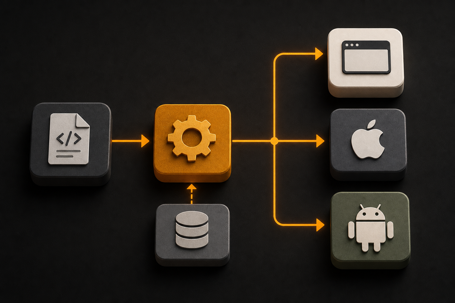
A cross-platform SDK gives you a single component API that compiles to a web bundle, a native iOS bundle, and a native Android bundle from the same source. The renderers differ per platform (DOM, UIKit, Android views), but the API doesn't:
```tsx
import { Button } from '@otfdashkit/ui'
```
Same JSX, same prop names, same intent values. Design tokens flip one theme across all three targets so a Card looks identical in Safari, in a native iOS app, and in a native Android app.
**Pick this if** iOS and Android are on the roadmap and "responsive web" isn't good enough. **Skip it if** mobile is "maybe someday" — the cross-platform overhead earns itself when you actually ship both targets.
## Picking by constraint
| Constraint | Pick |
|---|---|
| Material look is the look | Stay with MUI |
| Comprehensive suite, but not Material | Chakra, Mantine, or Ant Design |
| Pixel-perfect, design system already exists | Headless primitives (Radix, Headless UI) |
| Speed-to-pixel, own the code | Utility-class-first (shadcn/ui) |
| Web + iOS + Android from one codebase | Cross-platform SDK |
The mistake is picking by trend. The right choice follows from your hardest constraint.
## Where OTF fits
OTF is the cross-platform option. The free SDK ships roughly 200 components on npm under MIT, with the same component name and props on web, iOS, and Android. Design tokens flip a theme across all three targets so a single source of truth covers everything.
What makes the SDK different from a normal cross-platform component library is what ships with it for AI coding agents. Every kit includes `CLAUDE.md` and `.cursorrules` configs plus 20+ tested prompts in `ai/prompts/` — so when Cursor or Claude Code opens the repo, the agent extends the kit instead of regenerating it. You ask for a `DataTable` in chat and you get the OTF `DataTable`, not a utility-class hallucination.
For shipping, one script wires a custom domain, DNS, TLS, and a mobile build in a single command. Quality is enforced by a 24-item design checklist that runs before any kit ships — no hand-waving about "looks right on my machine."
For the "just ship it" version of the same problem, OTF also publishes paid full-stack kits ($99 each, Everything Bundle $149) — SaaS Dashboard, Fitness, Booking — with auth, billing, DB, and Stripe wired, plus 15 landing templates at $9. The free SDK is enough to evaluate; the kits are what you reach for when the deadline is real. Live demos at saas.otf-kit.dev and fitness-preview.otf-kit.dev.
OTF doesn't compete with MUI, Chakra, Mantine, Ant Design, Radix, Headless UI, or shadcn/ui on the web-only question. Those are great answers when the deliverable is a web app. When iOS and Android are also on the deliverable, and you want one component source of truth instead of three, that's where a cross-platform SDK earns its place.