# Radix primitives give accessibility; you still own the designed system
> Radix Primitives ship accessible unstyled React parts. Decide when your tokens are enough versus a designed kit spine agents can extend.
> By Dave · 2026-09-15
> Source: https://otf-kit.dev/blog/radix-primitives-vs-designed-kit
Radix Primitives are unstyled, accessible React building blocks for web apps and design systems. They handle focus traps, keyboard patterns, and WAI-ARIA semantics for Dialog, Dropdown Menu, Tabs, and similar patterns. What they deliberately do not ship is a finished visual system, native parity, or a product spine agents can extend.
This guide is primitives-vs-designed-kit for teams already evaluating Radix itself. It is not a shadcn CLI post — shadcn builds on Radix, and that copy-paste registry path is covered separately in [Uniwind and Gluestack put shadcn on React Native, but you still copy-paste per platform](/blog/shadcn-react-native-universal-components). It is also not a web-first stay-or-leave framing. The decision here is narrower: when accessibility primitives plus your own tokens and styles are enough, versus when you need a designed kit spine on disk.
For the live product matrix, see [otf-kit vs Radix UI](/compare/otf-kit-vs-radix-ui). Pair with [Tamagui is the cross-platform engine — you still choose who owns the design system](/blog/tamagui-engine-vs-designed-system) and [NativeWind is Tailwind classes on React Native — components are still yours](/blog/nativewind-utility-vs-designed-kit) for different catalog rows.
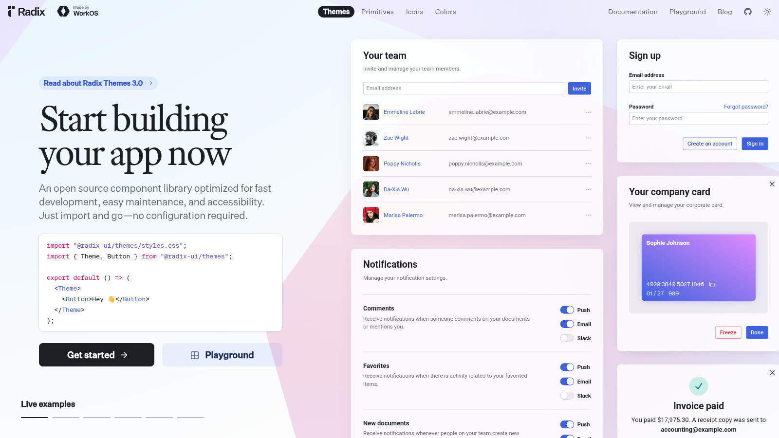
*Source: https://www.radix-ui.com/ — public marketing page captured 2026-09-16.*
## What Radix Primitives actually ship
The [Radix Primitives](https://www.radix-ui.com/primitives) site positions the library as unstyled, accessible, open-source React primitives for high-quality web apps and design systems. The [introduction](https://www.radix-ui.com/primitives/docs/overview/introduction) is explicit: common UI patterns are documented by WAI-ARIA, but browser defaults are inadequate. Radix's goal is a low-level layer you can adopt as a design-system base, or add incrementally.
Key properties from the docs:
- **Accessible** — WAI-ARIA design patterns where possible; aria/role attributes, focus management, and keyboard navigation handled for you.
- **Unstyled** — no presentation styles shipped; you own look and feel with any styling solution.
- **Composable** — open parts architecture (`Trigger`, `Portal`, `Content`, `Close`) so you wrap and recompose.
- **Incremental** — install the unified `radix-ui` package, or individual `@radix-ui/react-*` packages per primitive.
```bash
npm install radix-ui
```
```tsx
import { Dialog, DropdownMenu, Tooltip } from "radix-ui";
```
Or per-package:
```bash
npm install @radix-ui/react-dialog
```
```tsx
import * as Dialog from "@radix-ui/react-dialog";
```
That is the product boundary. Behavior and accessibility wiring ship. Designed Button skins, theme pickers, React Native parity, auth, and payments do not.

*Radix ships focus, keyboard, and ARIA behaviors — the visual system stays yours to design.*
## Accessibility is the product — not a checkbox
The [accessibility overview](https://www.radix-ui.com/primitives/docs/overview/accessibility) states that Primitives follow WAI-ARIA authoring practices and are tested across modern browsers and common assistive technologies. Focus management is part of the contract: opening an `AlertDialog` moves focus to a Cancel control so the next interaction is predictable.
Take [Dialog](https://www.radix-ui.com/primitives/docs/components/dialog). Documented features include modal and non-modal modes, automatic focus trapping in modal mode, controlled or uncontrolled open state, screen-reader announcements via `Title` and `Description`, and Escape-to-close. Keyboard interactions are spelled out: Space/Enter open or close, Tab cycles focus, Escape returns focus to the trigger.
```jsx
import { Dialog } from "radix-ui";
export default () => (
);
```
None of that paints a card or names a brand color. The [styling guide](https://www.radix-ui.com/primitives/docs/guides/styling) is blunt: you control functional and presentation styles — even overlay full-viewport coverage is your CSS. Stateful parts expose `data-state` (`open` / `closed`) so you style open vs closed without fighting a theme you did not choose.
```css
.DialogContent[data-state="open"] {
opacity: 1;
}
```
If your team wants that split — correct behavior under the hood, full visual ownership on top — Radix Primitives are doing exactly what they advertise.
## Primitives success is not the same as a designed kit
Teams confuse two questions:
1. Can we stop reimplementing focus traps and ARIA for web overlays?
2. Who owns the designed Button/Input/Modal vocabulary, the themes agents read, and the product kit around it?
Radix answers (1) for React web. Question (2) remains a staffing and repo choice. If the plan is "install Dialog, invent eighty composites, invent themes, invent native parity, invent auth," you chose a design-system and product-build project — not a two-week ship plan. Agents amplify that: they wrap `Dialog.Content` with a new class name every sprint without knowing which wrapper is canonical.
## When primitives plus your tokens are enough
Stay on Radix Primitives (with your CSS, tokens, and composites) when most of these are true:
1. **You are building a bespoke web design system on purpose** — library authors, platform teams, or a funded design-system squad.
2. **Web is the only client that needs these interaction patterns** — Expo/React Native is out of scope for the planning horizon, or native uses a separate accessibility stack you already staff.
3. **Visual ownership is a feature** — brand rejects pre-skinned libraries; designers want every pixel.
4. **You already have (or will staff) composite owners** — someone names the public `ConfirmDialog` API so agents do not invent three variants.
5. **Backend and product seams exist elsewhere** — UI behavior is the gap, not auth, schema, or payments.
Under those conditions, Radix is scope control: buy accessibility primitives, own the designed layer.
## When the bet flips toward a designed kit spine
Move past "primitives only" when any of these show up:
- Product managers expect a finished component catalog, not a backlog of unstyled parts.
- Agents keep shipping one-off Dialog wrappers because there is no canonical import path.
- You need many designed screens quickly instead of composing every pattern from primitives.
- Theme switching must be picker-driven for non-experts, not a tokens file only seniors edit.
- Cross-platform parity enters the roadmap — Radix Primitives are a React web layer; native needs another plan.
- You want agent configs, demo data, and payment/auth seams in the same purchase as UI.
That is the fork at [otf-kit vs Radix UI](/compare/otf-kit-vs-radix-ui): headless primitives versus a designed system plus kits. The compare page is explicit that the question is whether you assemble the design layer yourself. On many stacks you can keep raw Radix beside designed components when they share tokens. The decision is what is canonical on day one.

*The fork is primitives plus your tokens versus a designed kit spine agents can extend on disk.*
## A concrete decision test you can run this week
Spike the install and answer out loud:
```bash
npm install radix-ui
```
```tsx
import { Dialog } from "radix-ui";
export function ConfirmDialog() {
return (
Open
Confirm
This closes after you review the copy.
Done
);
}
```
Then ask:
- Are we staffing a design-system build, or shipping product screens this quarter?
- Which composites must exist in week two (auth forms, paywalls, settings dialogs)?
- Who owns tokens and class contracts if three engineers wrap Dialog differently?
- Do we need a backend kit in-repo, or is accessible web behavior the only missing piece?
- Will agents read a single `components/ui` barrel, or invent styles in every feature folder?
If the answers are "design-system team," "we will own composites," "tokens live in one place," and "backend exists," stay on primitives. If answers point at product velocity, a large designed catalog, missing seams, or agent drift, a primitives-only start is debt.
## Owned repo outcome
Choosing a designed kit should not mean "delete Radix." Many web stacks keep Radix under the hood for overlays and menus. The outcome you want is:
- Canonical designed components with stable names agents can import
- Themes humans can pick without editing ARIA attributes
- Explicit rules for when to drop to raw `@radix-ui/react-*` for a custom interaction
- Kit-level seams when you need a product, not only a Storybook of primitives
Browse the [templates catalog](https://otf-kit.dev/templates) when the gap is a full product spine rather than another Accordion wrapper.
## Migration notes if you already invested in Radix
If you stay: prefer one install strategy (`radix-ui` or coordinated `@radix-ui/react-*` versions); document allowed composite wrappers in agent rules; keep `Title`, `Description`, and focus callbacks in the public API so styling wrappers do not strip accessibility parts.
If you add a designed system on top:
1. Keep shared tokens — do not run two theme owners.
2. Replace high-traffic composites first (Dialog, Dropdown Menu, Tabs), then specialty patterns.
3. Write the "raw Radix allowed here" rule for one-off interactions.
4. Land kit seams (auth, payments) in the same sprint you freeze the design API.
## Practical checklist
- Goal: design-system build vs product ship this quarter
- Install surface: `radix-ui` vs per-package `@radix-ui/react-*` documented
- Canonical composites listed for agents
- Styling ownership named (one CSS contract)
- Compare page reviewed: [/compare/otf-kit-vs-radix-ui](/compare/otf-kit-vs-radix-ui)
## Bottom line
Radix Primitives give you accessible, unstyled React composition for web UI patterns: WAI-ARIA behavior, focus management, and keyboard support without dictating visuals. The day you need a large designed catalog, picker themes, cross-platform parity, and a full-stack kit agents can extend, the decision is no longer about importing `Dialog.Root` — it is about which designed system your humans and agents treat as canonical.
## Sources
- [Radix Primitives homepage](https://www.radix-ui.com/primitives) — unstyled, accessible React primitives positioning
- [Introduction](https://www.radix-ui.com/primitives/docs/overview/introduction) — install (`radix-ui` / `@radix-ui/react-*`), vision, key features
- [Accessibility overview](https://www.radix-ui.com/primitives/docs/overview/accessibility) — WAI-ARIA practices, focus management, keyboard navigation
- [Dialog](https://www.radix-ui.com/primitives/docs/components/dialog) — anatomy, modal focus trap, Title/Description, keyboard table
- [Styling guide](https://www.radix-ui.com/primitives/docs/guides/styling) — unstyled contract, `className`, `data-state`
- [otf-kit vs Radix UI](https://otf-kit.dev/compare/otf-kit-vs-radix-ui) — primitives vs designed system matrix
- [Templates](https://otf-kit.dev/templates) — product kit catalog