# The Secret to Elite UI Kits: It's Not Features, It's Obsession with Details

> Why the best UI kits feel magical isn't more features, but relentless execution on the little things users barely notice.
> By Dave · 2026-07-18
> Source: https://otf-kit.dev/blog/the-24-item-design-checklist

## What Linear, Stripe, and Vercel actually have that you don't

Most templates you can copy-paste in five minutes have the same surface area as Linear or Stripe. Sidebar, tables, settings pages, modals. The buttons work. The icons render. It ships.

Then you click a row in their table, hover, and nothing happens. Tab through it and the focus ring is the browser default — a chunky blue outline someone clearly deleted and then put back because an audit caught it. Open a dropdown in dark mode and the labels go light gray on white because the dark token wasn't wired to the menu. Press Escape with a modal open and the page scrolls underneath anyway.

You won't list these in a Notion doc titled "what's wrong with our template." You'll just feel that something is off. That the template feels like a starter, not a product. That you paid $99 for something that costs $0.10 to make.

Linear, Stripe, and Vercel-tier UIs feel expensive for one reason: disciplined execution on the things buyers barely notice consciously. Hover states that confirm the cursor is over a tappable thing. Focus rings that say "yes, keyboard nav is a real path through this app." Dark mode parity that doesn't require a hero engineer to maintain. Keyboard nav that works without a tutorial.

These aren't features. They're the residue of a checklist someone enforced before the kit shipped.

Here's ours.


![A 24-item checklist enforced by a script before a kit can ship — the bar between a starter](https://cdn.otf-kit.dev/blog/the-24-item-design-checklist/inline-1.png)


## 1. Hover, focus, active, disabled — the four states of every interactive thing

Every `<Button>`, `<MenuItem>`, `<Card>`, `<Row>`, `<Input>`, and `<Switch>` ships with four explicit visual states. Not three. Not "hover is a CSS pseudo-class we'll add later." Four.

```css
/* what "four states" looks like in tokens, not magic numbers */
.button {
  background: var(--surface-1);
  color: var(--text-primary);
  border: 1px solid var(--border-subtle);
  transition: background 150ms ease-out, transform 80ms ease-out;
}

.button:hover { background: var(--surface-2); }
.button:active { background: var(--surface-3); transform: translateY(0.5px); }
.button:focus-visible { outline: 2px solid var(--focus-ring); outline-offset: 2px; }
.button[disabled],
.button[aria-disabled="true"] {
  background: var(--surface-1);
  color: var(--text-disabled);
  cursor: not-allowed;
  opacity: 0.6;
}
```

The trap most templates fall into: hover is added on day one because it shows up in the screenshot. Disabled is `opacity: 0.5` tacked on at the end. Active state is whatever the browser does for free (often: nothing). Focus-visible is the default browser outline that nobody rebranded.

Disabled deserves a real treatment because users notice. `opacity: 0.5` on a primary button makes the label unreadable on light backgrounds. A real disabled state uses a `text-disabled` token, keeps the contrast ratio above 4.5:1 against its background, and sets `cursor: not-allowed`. Active is a 0.5px translate plus a slightly darker surface — the same thing your OS does when you click a real button.

The checklist gates every component on shipping all four. No "we'll add the active state in the next sprint."

## 2. Focus rings you actually want to keep

The default browser focus ring is one of two things: removed entirely (because it clashed with the brand) or restored in shame because an audit caught it. Both are wrong.

A Linear-tier focus ring is two pixels, brand-colored, with a two-pixel offset, and it only appears on keyboard navigation — not on mouse click. The CSS keyword that makes this work is `:focus-visible`, and it's the single highest-use accessibility primitive in modern CSS.

```css
/* show the ring on keyboard nav, hide it on mouse click */
.button:focus { outline: none; }
.button:focus-visible {
  outline: 2px solid var(--focus-ring);
  outline-offset: 2px;
}
```

Two things to know. `focus-visible` doesn't fire on mouse click — it fires when the browser detects keyboard-or-equivalent input (Tab, programmatic focus, screen-reader navigation). A mouse user clicking a button sees no ring. A keyboard user tabbing through sees it exactly where they need it. The ring itself uses a token, not a hex value. The same focus ring color drives every focusable component — buttons, inputs, links, menu items, table rows. The moment a designer hand-picks `#3B82F6` for one focusable thing and `#60A5FA` for another, you've shipped two focus systems. The user perceives it as inconsistent, even if they can't name it.

The checklist item: every focusable component must use `:focus-visible` with a tokenized ring. Mouse-only focus styles are not allowed. Browser-default outlines are not allowed. `outline: none` without a replacement is not allowed.

## 3. Dark mode parity, not dark mode "v2"

Dark mode is the cleanest litmus test for whether a template was built with tokens or with hardcoded hex codes. If the engineer wrote `background: #FFFFFF` and `color: #1F2937` directly into 200 components, dark mode requires touching 200 files. If they wrote `background: var(--surface-1)` and `color: var(--text-primary)`, dark mode requires flipping one theme object.

```ts
// what a real theming boundary looks like — one object, two themes
const lightTheme = {
  surface: { 1: '#FFFFFF', 2: '#F9FAFB', 3: '#F3F4F6' },
  text:    { primary: '#111827', secondary: '#4B5563', disabled: '#9CA3AF' },
  border:  { subtle: '#E5E7EB', strong: '#D1D5DB' },
  focus:   { ring: '#2563EB' },
}

const darkTheme = {
  surface: { 1: '#0B0B0C', 2: '#141416', 3: '#1C1C1F' },
  text:    { primary: '#F5F5F7', secondary: '#A1A1AA', disabled: '#52525B' },
  border:  { subtle: '#27272A', strong: '#3F3F46' },
  focus:   { ring: '#60A5FA' },
}
```

The components don't know which theme is active. They reference tokens. The kit ships both objects. You swap which one the `<ThemeProvider>` mounts, and the entire app — including the marketing site, dashboard, modals, toasts, dropdowns — flips. No per-component dark mode work. No "we'll do dark mode in v2."

The trap: a team wires up dark mode on the marketing page because that's where the screenshot lives, then ships a dashboard with hardcoded white backgrounds and figures they'll "do the dashboard dark mode later." Later never comes. The checklist item is: every component must render correctly under both themes before the kit ships. The dashboard, not the landing page, is the test.

## 4. Keyboard nav that doesn't require a tutorial

Tab through a Linear-tier app. Every focusable thing is reachable, in DOM order, with a visible ring. Escape closes any open overlay — modal, popover, command menu, dropdown. Arrow keys navigate within composite widgets: menus, radio groups, tabs, listboxes. Enter and Space activate the focused control. The contract is invisible until you break it.

```tsx
// what "Escape closes" looks like — the most-omitted keyboard contract
function CommandMenu({ open, onClose }: { open: boolean; onClose: () => void }) {
  useEffect(() => {
    if (!open) return
    const onKey = (e: KeyboardEvent) => {
      if (e.key === 'Escape') onClose()
    }
    document.addEventListener('keydown', onKey)
    return () => document.removeEventListener('keydown', onKey)
  }, [open, onClose])

  if (!open) return null
  return <div role="dialog" aria-modal="true">…</div>
}
```

The trap most templates hit: Escape closes the modal, but focus is still trapped inside the (now invisible) modal because nobody removed the focus-trap listener. The user tabs into the void and the focus ring goes to `<body>`. Or: the modal closes but focus doesn't return to the button that opened it — the user is stranded, and their next Tab sends them to the address bar.

Composite widgets (menus, listboxes, tabs) need arrow-key handling, not just Tab. Tab moves you between *groups* of focusable things. Arrows move you *within* a composite widget. A menu with five items should be navigable with five Down-arrow presses, not five Tab presses that wander through every focusable thing on the page.

The checklist item: every overlay handles Escape and returns focus to its trigger. Every menu, listbox, tab group, and radio group handles arrow keys. The contract is tested with the keyboard, not the mouse, before the kit ships.

## 5. Loading, empty, and error — the three faces of every data surface

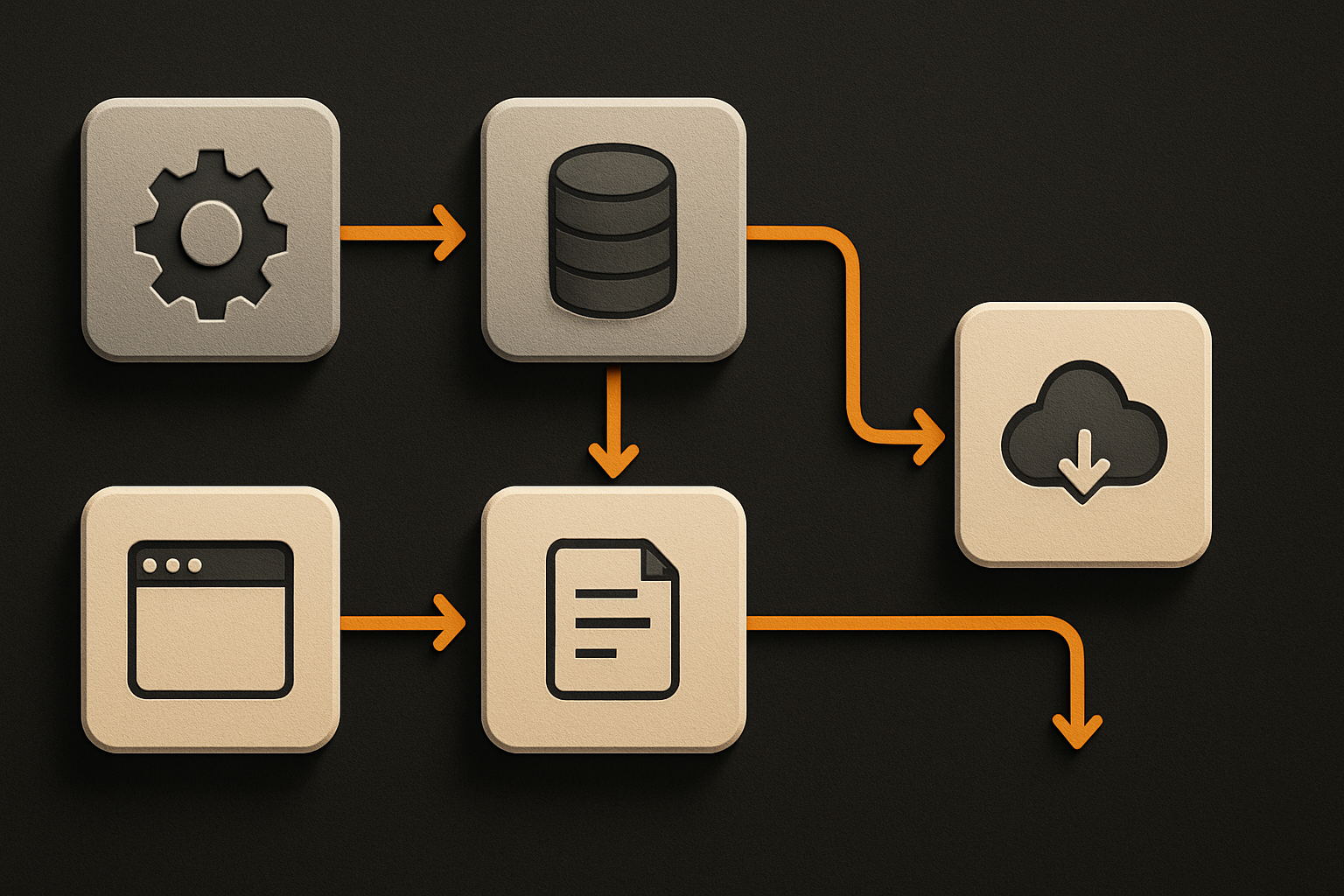
A table without loading state shows a flash of empty rows. A table without empty state shows "No data" centered with 80% of the screen blank. A table without error state shows the last successful render until the user refreshes. None of these are template-quality.

```tsx
// what a real table state machine looks like
function Table({ query }: { query: Query }) {
  const { data, status, error, refetch } = useQuery(query)

  if (status === 'pending') return <TableSkeleton rows={8} />
  if (status === 'error')   return <ErrorState
                                    title="Couldn't load rows"
                                    body={error.message}
                                    action={<Button onClick={refetch}>Retry</Button>} />
  if (data.length === 0)    return <EmptyState
                                    title="No rows yet"
                                    body="Create your first row to get started."
                                    action={<Button>New row</Button>} />
  return <TableBody rows={data} />
}
```

Three principles. Loading state is a skeleton matching the real layout's shape, not a centered spinner. A spinner in the middle of a table tells the user *something is happening* but not *what is happening*. A skeleton — eight grey rectangles where the rows will land — preserves layout and signals that the data exists, it just isn't here yet. Empty state has a verb. "No data" is a dead end. "No rows yet — create your first row" is a CTA. Empty states are onboarding surfaces wearing a disguise. Error state has a retry button and a copyable error message. The error goes to Sentry, but the user sees it too. Hiding errors is a worse failure mode than showing them.

The checklist item: every data surface ships all three states with real content, not `null`. Every component consuming data has the same three-state contract.


![a single data-fetching component resolving to one of four render branches — loading skelet](https://cdn.otf-kit.dev/blog/the-24-item-design-checklist/inline-2.png)


## 6. Reduced motion, screen reader labels, and the rest of the a11y floor

The last block of checklist items lives in the "you'll never see a screenshot of this, but the audit will catch it" bucket:

- **Reduced motion.** Wrap every animation in a `prefers-reduced-motion: reduce` query that collapses durations to `0.01ms`. Users with vestibular disorders will literally get sick from a 300ms slide-in they didn't ask for.
- **Touch targets.** Every tappable thing is at least 44×44 CSS pixels on mobile. The visual element can be smaller; the hit area cannot.
- **Color contrast.** WCAG AA at minimum — 4.5:1 for body text, 3:1 for large text and UI components. Tested against both themes.
- **Screen reader labels.** Icon-only buttons have an `aria-label`. Decorative icons have `aria-hidden="true"`. Form inputs have associated `<label>` elements, not placeholder-as-label.
- **Live regions.** Toasts and async errors announce themselves via `aria-live="polite"`, so a screen reader user hears the success message instead of staring at a silent banner.
- **`<html lang>`.** Set on the root element. Sounds trivial; gets missed on half the templates that ship.

None of these show up in a marketing screenshot. All of them are in the checklist. All of them are tested by the lint script before the kit can ship.

## What shipping this actually costs

The checklist isn't free. Enforcing it on every component takes longer than shipping the component without it. Hover, focus, active, disabled — that's four times the styling work per component. Loading, empty, error — that's three render branches per data surface. Both themes — that's two visual regression suites, not one.

But this is the gap. The $99 template that ships in a weekend is the one without the four states, without the dark mode parity, without the keyboard contract. The $99 template that ships after a 24-item checklist is enforced is the one buyers install and don't immediately fork to fix.

The bar isn't more features. It's finish. And finish is what a checklist buys you — and what a script, run before every release, prevents anyone from quietly dropping.