otf-kit vs shadcn/ui — which UI library to pick in 2026
Pick shadcn/ui if you only ship web and want pure-code ownership. Pick otf-kit if you ship to mobile + web from one codebase, or want a kit that includes auth and a database wired.
TL;DR
shadcn/ui changed how the React community thinks about component libraries — copy the source into your repo, own it forever, no npm dependency. It's brilliant for web teams who want full control.
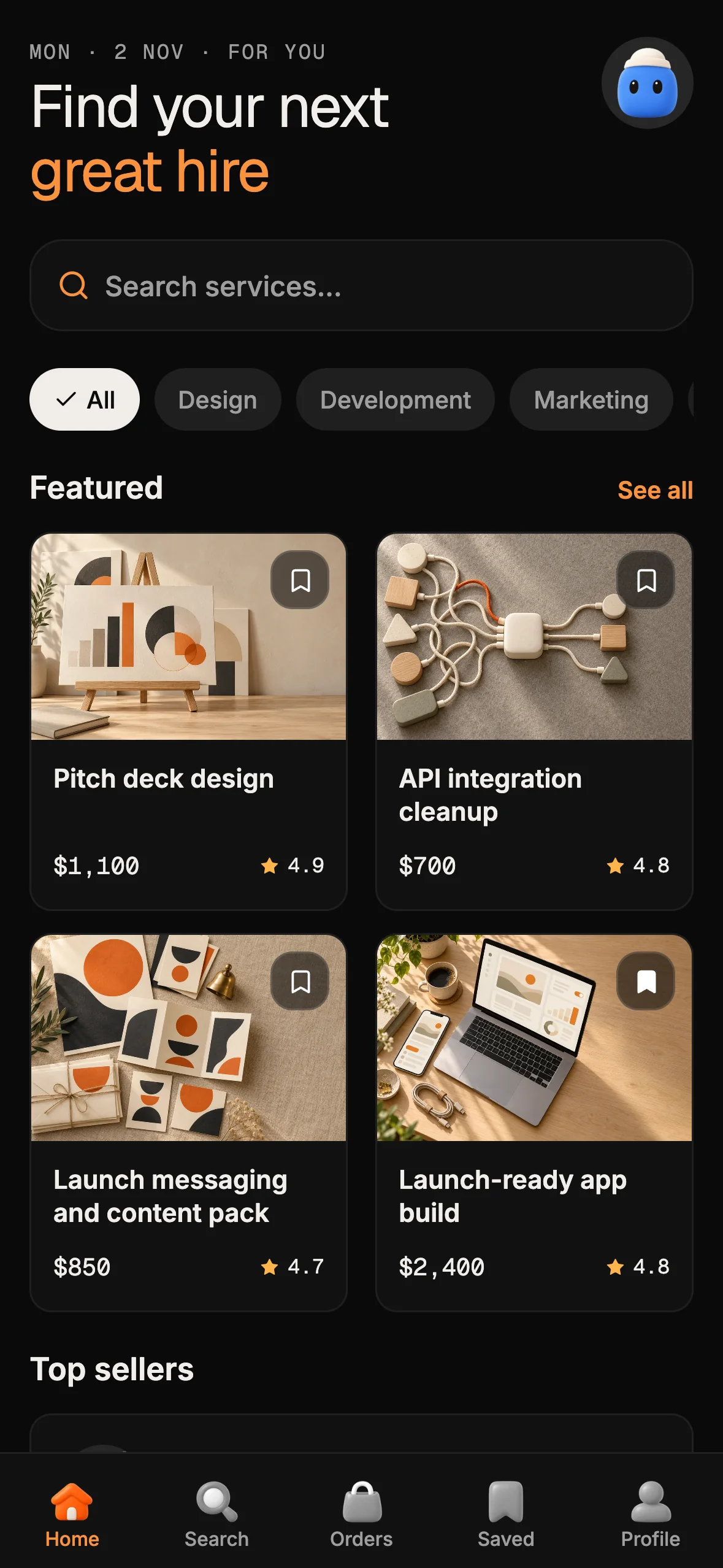
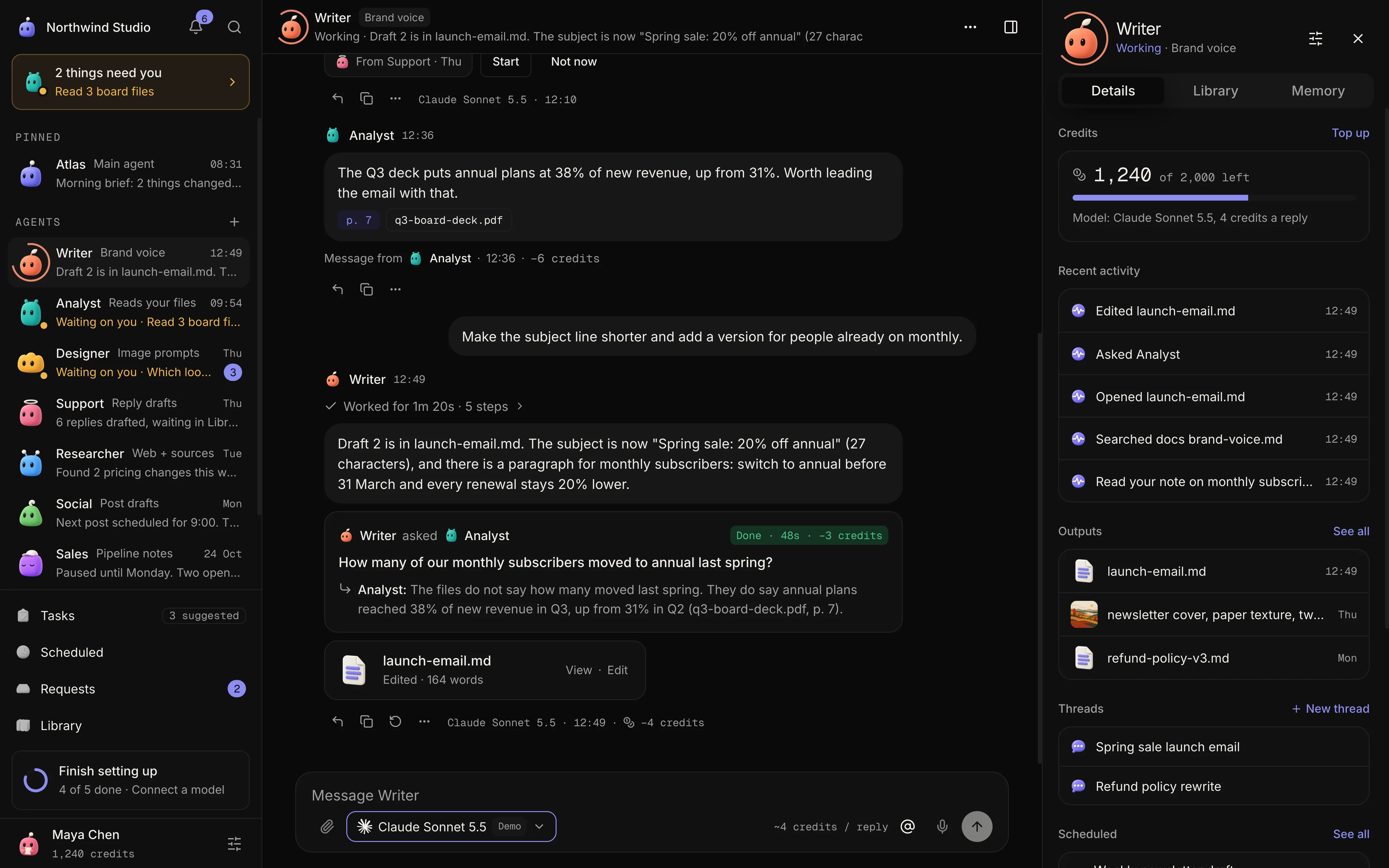
otf-kit is a different bet: one component set on web and native, with shared component names and design tokens (a web package and a React Native package), shipped as proper npm packages, with paid full-stack kits on top. If you're building cross-platform, shadcn/ui doesn't help — its components don't run on iOS/Android. otf-kit does.
OTF's catalog separates product layers: the free SDK is the installable component system, blocks and patterns have their own catalogs, and paid products include full-stack app kits and standalone landing-page templates. Choose shadcn/ui when you want to own copied web component source; choose the OTF SDK when you need a package-based web and React Native component catalog, or browse an OTF kit when you need a more complete app starter.
Feature matrix
| otf-kit | shadcn/ui | |
|---|---|---|
| Platforms | Web + iOS + Android | Web only |
| Distribution | npm (@otfdashkit/ui, @otfdashkit/ui-native) | Copy-paste source |
| Component count | 150+ web · 85+ native (shared names and tokens) | 60+ web only |
| Themes | 17 design themes shipped, dark mode included | None — bring your own |
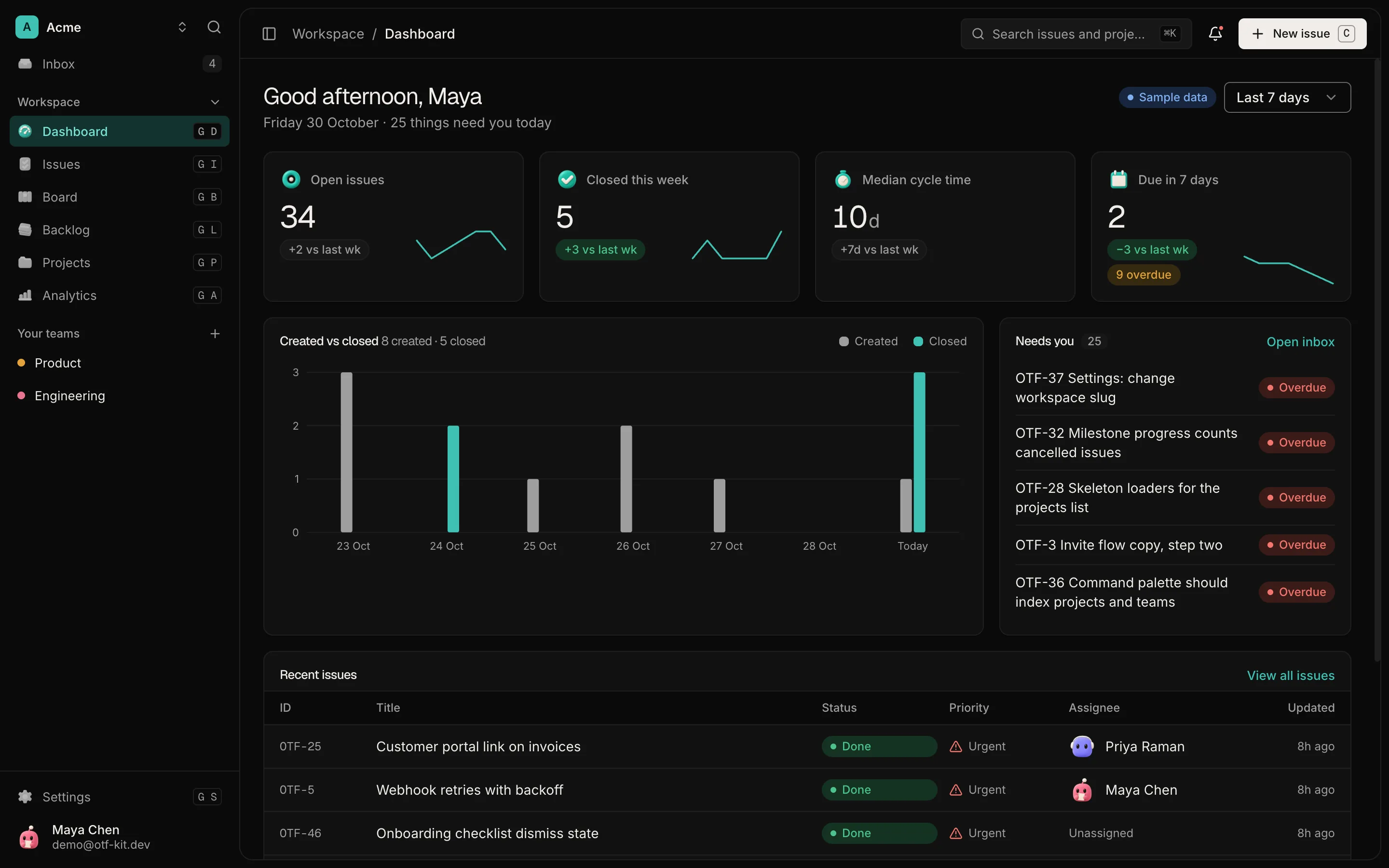
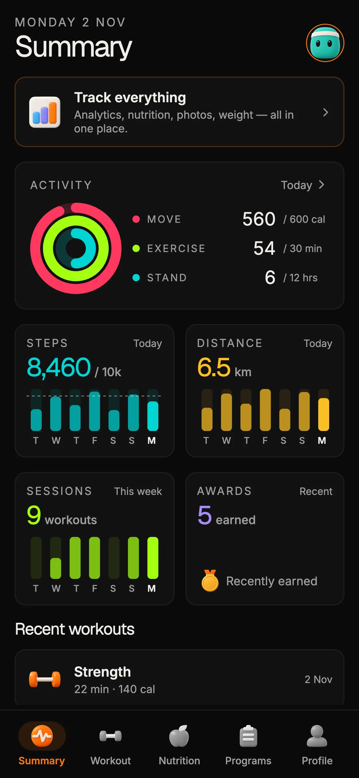
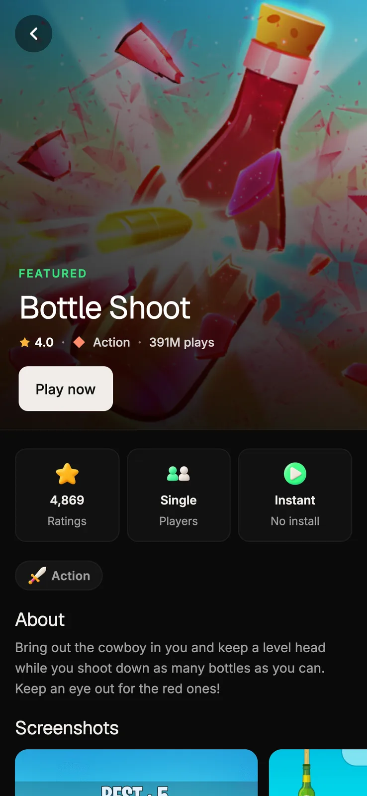
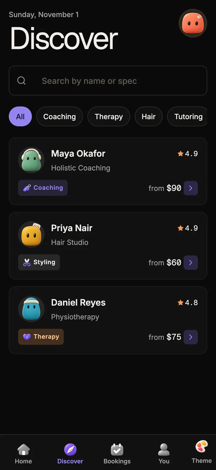
| Full-stack kits | 6 live kits at $99 each: SaaS Dashboard, Fitness, Arcade, Booking, Marketplace and AI Agent. Sign-in and a database in every kit except Arcade | Nothing — components only |
| Underlying primitives | Radix (web) + Tamagui (native) | Radix (web) |
| Source ownership | MIT SDK; full source on GitHub, heavy native components copied in with npx @otfdashkit/cli add <name> | Copy-paste from CLI |
| Update model | bun update @otfdashkit/ui | Re-run CLI per component |
| TypeScript | Strict, runtime-validated | Strict |
| AI tooling | Cursor / Claude Code configs pre-wired in every kit | None official |
| Pricing | SDK free · Kits $99 each | Free, MIT |
When shadcn/ui wins
- You're building a web-only product and the React Native question doesn't apply.
- You want zero npm dependency for your design system. Owning the source by copy-paste is the entire shadcn ethos.
- You're already in the Tailwind ecosystem and your design system needs heavy customization at every step. shadcn's "every component is yours" model is built for this.
- You don't care about kits — you have an existing backend, auth provider, etc.
When otf-kit wins
- You're shipping cross-platform (Expo + Next.js, or Expo + Remix). shadcn doesn't run on RN; otf-kit ships a web package and a native package with shared component names and design tokens.
- You want a full-stack starting point, not just primitives. SaaS Dashboard, AI Agent, Fitness, Booking and Marketplace include a backend and sign-in; Arcade runs client-side by default — then extend the kit you choose for your product.
- You'd rather upgrade via npm than re-run a CLI for every component update. otf-kit ships proper semver releases.
- You want 17 designed themes (Mono, Ocean Teal, Warm Amber, and Cosmic Night, etc.) out of the box — every component re-renders instantly through the picker.
What's identical
The web-component DX is intentionally similar. Both libraries:
- Use Radix primitives under the hood
- Lean on Tailwind for styling
- Compose primitives → blocks → layouts the same way
- Ship strict TypeScript
- Are MIT-licensed where source is available
If you've used shadcn/ui, the web side of otf-kit will feel familiar within 5 minutes.
Code comparison — Button in each
// shadcn/ui — copied into your repo
import { Button } from '@/components/ui/button'

<Button variant="default">Click me</Button>
// otf-kit — installed from npm
import { Button } from '@otfdashkit/ui'
<Button variant="default">Click me</Button>For the web Button the props are shadcn-style: variant and size, both with their own value sets (web size is sm, default, lg, xl, icon or icon-sm). The native Button shares the name, not the props: its variant is primary, default, outlined, transparent, floating, destructive or shimmer, and its size is a Tamagui token such as $4. The difference with shadcn is whether the source lives in @/components/ (yours) or node_modules/ (ours). If you want shadcn-style ownership, the MIT source is on GitHub to copy in, and npx @otfdashkit/cli add <name> copies the heavy native components (shaders, animations) into your project.
Migrating from shadcn/ui to otf-kit
If you're already on shadcn/ui and want cross-platform reach:
bun add @otfdashkit/ui @otfdashkit/tokens- Find-replace
from '@/components/ui'→from '@otfdashkit/ui' - Drop the
components/ui/directory - For mobile, install
@otfdashkit/ui-nativeand use the same component names and read each native component's page, because its props differ from the web component.
Check each component's props before you swap it: web reference → · native reference →
FAQ
Does otf-kit lock me in?
No. The SDK is MIT and its full source is on GitHub, so you can copy any component into your repo and drop the npm dependency. Kits include their full source. Heavy native components install as source with npx @otfdashkit/cli add <name>.
Can I mix otf-kit and shadcn? Yes — they share Radix primitives and Tailwind classes. We've done this in production: shadcn for one-off web pages, otf-kit for the cross-platform components.
Is the native side really at parity with the web side?
No, and we do not claim it is. The native package has 85+ components and the web package has 150+. A subset shares a component name and the same theme tokens, but the props differ: for example Button has different variant and size values on each platform. Web has components, such as data grids, with no native counterpart yet.
Ready to own more than copy-paste components?
otf-kit is an owned full-stack kit — auth and database wired, web + native. shadcn/ui is a web-only copy-paste UI primitive set — you still assemble the product yourself.
Everything Bundle — $149
SaaS Dashboard — $99 — 12 screens; billing is not included
Live demos: SaaS Dashboard · Fitness · Arcade · Booking · Marketplace · AI Agent