
Replace the generic AI landing page with evidence visitors can verify
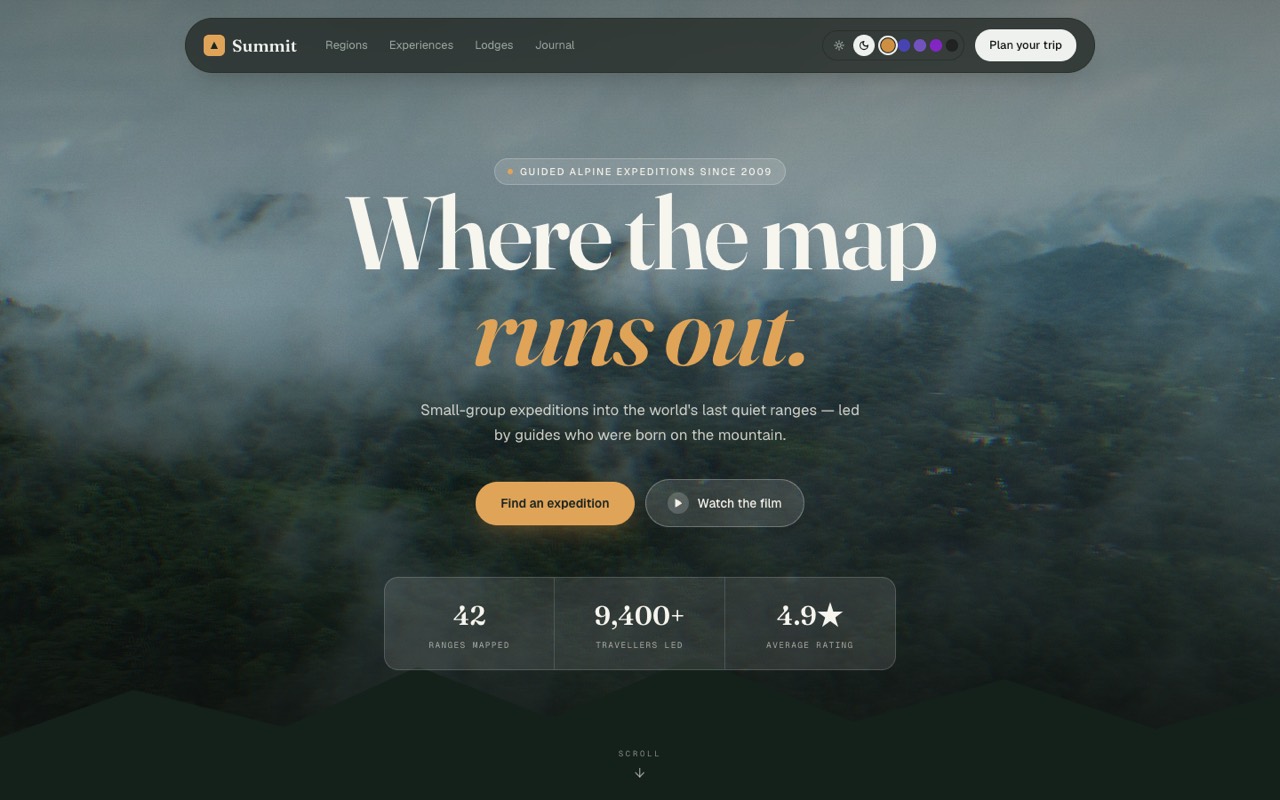
Your AI page can look finished before it has proved anything. A polished gradient is not a product claim.
A useful signal appeared in a 16 October discussion on r/SideProject: a builder described a detector for generic AI-page tells such as purple gradients, stock fonts and placeholder text; a reply observed that landing pages are starting to look alike. That is one conversation, not a survey. But it points to a practical launch question: what should you replace before sending real visitors?
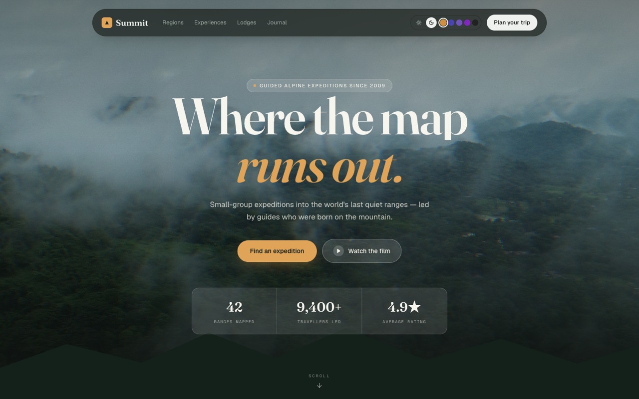
If you need a ready-made starting point, the OTF Everything Bundle is $149 and includes 15 landing-page templates plus three kits. You can preview the Summit landing page. A template supplies a layout and code; it does not supply your positioning, product evidence or customer proof.
Start with the promise, not the palette
Open the page as if you have never heard of the product. Give yourself five seconds and answer three questions:
- What is this?
- Who is it for?
- What can I do next?
If the first screen answers only “this is modern software,” the visual treatment is carrying a promise that the copy has not earned. Write one plain sentence that names a specific user, the job they are trying to finish and the result your product actually provides. For example: “A weekly meal planner for two-person households that turns saved recipes into a shared grocery list.” Use that only if it describes your product; do not borrow the example as a claim.
Then check the verbs. “Transform,” “speed up” and “reimagine” can sound confident while explaining nothing. Replace them with actions a visitor can picture: import a CSV, compare two plans, review a draft, schedule a session. Do not add benefits your product does not deliver.
Audit the first screen in five passes
Treat the hero as a short product walkthrough. It should let a visitor identify the product, recognize their problem, see a credible next step and find what happens after they click.
Pass 1: Name the audience. Avoid “for everyone” unless that is genuinely true. Say which role or situation the page serves. A narrower, accurate sentence gives a qualified visitor a better reason to continue.
Pass 2: Show the product. Replace a decorative gradient or generic stock image with a real screen, a small interaction, or a concrete before-and-after from your own product. If a screenshot is not possible, use a diagram that explains a real workflow. Do not use a fake customer portrait, made-up testimonial or an AI-generated interface as if it were live software.
Pass 3: Make the action specific. “Get started” is vague when the visitor does not know what will happen. Use “Open the demo,” “See the sample project,” or “Download the starter” only when the button really does that. Make the destination visible before the click.
Pass 4: Check every number. A count, rating, percentage, logo wall or “trusted by” line is a factual claim. Find the source and confirm it is current, representative and approved for public use. If you cannot verify it, remove it. A sample dashboard can contain illustrative data, but label the view as a demo and never imply those numbers came from customers.
Pass 5: Read the page on a phone. Check that the headline wraps cleanly, the primary action is visible, the body text is readable and the key visual still explains the product. A page that looks convincing only at desktop width is not finished.
11 production screens. Login and database wired.
The SaaS Dashboard Kit includes login, a database, and a working dashboard. Live demo at saas.otf-kit.dev.
Replace filler with evidence you can stand behind
For each section, ask: what would a skeptical visitor need to see here? The answer may be a real product view, a short explanation of the workflow, a documented integration, a transparent limitation, or a link to a working demo. It does not have to be a testimonial.
A feature list is more useful when it is tied to a task. “Role-based access” is a capability. “Invite a teammate and limit which records they can edit” shows what it means. Use that second sentence only if the product supports it. If the capability is planned, say so plainly rather than describing it in the present tense.
If you have a case study, quote, customer count or performance result, keep its source close. Confirm that you have permission to publish it and that the statement is still accurate. If you have no such proof yet, do not fill the gap with invented social proof. Show the product working and state what it does today.
The same check applies to template screenshots. The Summit preview below is a layout example, not evidence that a real travel company achieved the figures shown in the sample design. Replace every illustrative label or number with your own substantiated details before launch.
Give each section one job
A long page can still feel generic when every section repeats “simple,” “capable” or “beautiful.” Assign each section one question to answer:
- Hero: What does this product do for me?
- Product view: What will I actually use?
- How it works: What are the steps?
- Proof: What can I verify?
- Pricing: What will I pay, and what is included?
- FAQ: What might stop me from trying it?
Remove a section when it does not answer one of those questions. If two sections make the same claim with different gradients, keep the clearer one.
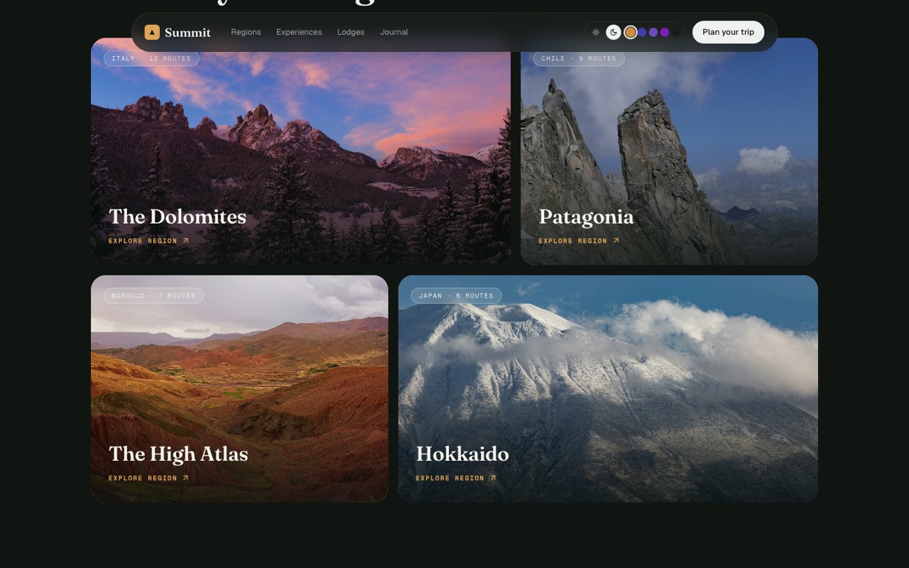
A “proof” section does not have to claim popularity. It can show a product state, a documented compatibility list, a changelog entry, a sample output labeled as such, or a clear explanation of a limitation. The key is that the visitor can check what you mean.
Make the click match the promise
A landing page is a path, not a poster. Follow the primary action from the first screen through the destination. Does the button open the demo you named? Does the next page preserve the same product language? Is a purchase action clear about what the buyer receives?
A good launch check uses a clean browser session and test data. Click every primary action. Follow a signup or checkout only as far as your test account permits. Confirm that the page does not lose the visitor’s context, show stale pricing or promise a feature that is missing. Never test with real customer records.
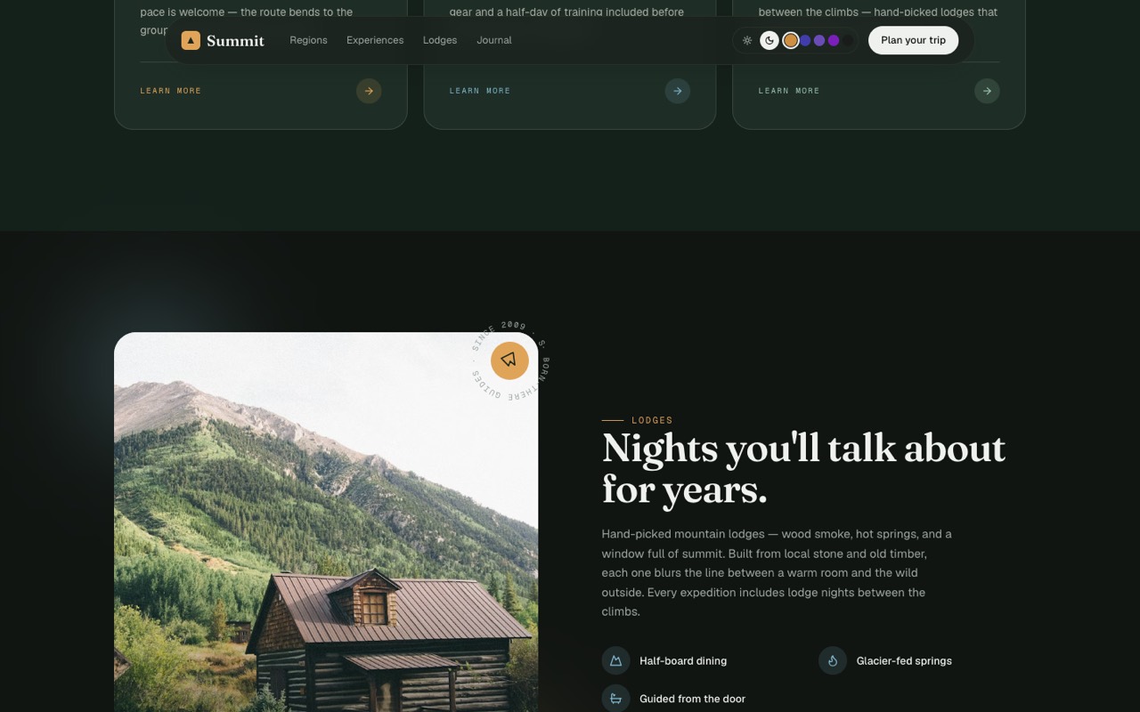
If you use a starter or template, audit its sample content before publishing. Search for placeholder names, generic quotes, stock counters, decorative partner logos and buttons that do not work. A polished template can make unsupported copy look more authoritative, so the responsibility to verify it remains yours.
A 15-minute pre-traffic checklist
Before you share the page, write down the answers:
- Can a new visitor explain the product and audience after reading the hero?
- Does the first screen show a real product view or a clearly labeled illustration?
- Can every factual statement be traced to something you can substantiate?
- Are sample metrics, fake testimonials and placeholder logos removed or unmistakably labeled?
- Does the main action lead to the destination its label promises?
- Is the price, what is included and any important limitation clear?
- Does the page remain readable on a phone?
- Is there one next step for someone who is not ready to buy?
This is a readiness check, not a conversion guarantee. A page can be clear and still fail to find its audience, price or channel. Publish only what you can prove, then measure qualified visits and the actions people actually take.
For another view of what to inspect when an AI-built project moves from a prompt into a repo, see how a founder who cannot code can still ship. For landing-page builders who want code they can edit, the Everything Bundle brings together all 15 landing templates and the three kits for $149; the Summit preview is one example, not a substitute for custom proof.
Sources
- r/SideProject discussion, “What are you building right now? Drop your project below,” 16 October 2026
- OTF pricing and bundle contents
- Summit landing-page preview
Ship the product, not the setup.
- 11 production screens — auth, team, analytics, and settings
- Login and a real database are wired in
- AI configs pre-tuned so your agent extends instead of regenerates