
Material UI stays web-first: keep it or move to an owned kit

Material UI is a web React component suite with a Material Design default. That is enough when the product stays in the browser. It is the wrong default the week the roadmap adds Expo, a shared Button API across web and native, or a full-stack kit your agents should extend on disk.
This guide is stay-or-leave for teams already on Material UI. It is not an alternatives shopping list — that roundup is Why builders are leaving MUI and the honest alternatives. The Chakra sibling decision is separate at Chakra UI still wins for web-only React; switch when mobile parity matters. For an owned SaaS spine after you leave a web-only library bet, see How to build a SaaS app with AI from a day-1 owned monorepo.
What "web-only" actually costs
MUI's public positioning is honest: a suite of React UI tools for shipping web features, with Material UI as the fully-loaded Material Design library and companion products for advanced grids and templates. The Material UI install path documented on https://mui.com/material-ui/ is @mui/material plus @emotion/react and @emotion/styled. That is not a bug. It is the product boundary.
The cost shows up later:
- Every native screen needs a second component system. You do not "enable React Native" on a Material UI app; you start a parallel design language (often React Native Paper or a custom set).
- Emotion (or styled-components) still runs in the browser for dynamic styles. Material UI's own v9 announcement keeps CSS-in-JS in the current stack and lists "Remove dependency on Emotion" as future work — not a finished migration.
- Agent prompts that only know your
ThemeProviderandsxrecipes will invent mobile UI that does not exist in the repo. The agent is not wrong; the context is incomplete.
None of that means you should abandon MUI tomorrow. It means you should name the bet you are making.

Material UI v9 kept the web suite teams already trust
Material UI v9 (stable April 2026 per GitHub release and mui.com announcement) focused on accessibility defaults, keyboard navigation, sx performance, and Base UI surfaces such as NumberField and Menubar. The upgrade path still assumes a web React tree: theme CSS variables, slots, and Emotion/styled wiring.
For a web-only team, that is usually the right call. You keep a large Material Design surface (40+ building blocks on the product page), theme tokens plus sx, optional MUI X Pro grids, and docs depth coding agents already index well.
Material UI's FAQ on the product page is explicit: it currently adopts Material Design 2, with Material Design 3 tracked as future work. If Material aesthetics fit the brand, that is a feature. If you plan to erase Material ripples and elevation, you are fighting the library's default opinion. If your ICP is a Next.js or Vite SaaS dashboard with no Expo client this year, staying on MUI is rational.
11 production screens. Login, database, payments — all wired.
The SaaS Dashboard Kit ships everything already connected. Nothing to set up. Live demo at saas.otf-kit.dev.
When MUI still wins
Stay on Material UI when most of these are true:
- The product is web-only for the planning horizon — marketing, admin, B2B SaaS UI with no Expo app for 6–12 months.
- Material Design is acceptable or required for brand or internal-tool vocabulary.
- Your team already has MUI muscle memory (theme overrides, slots, X Data Grid).
- Specialty web packages beat native parity needs — Autocomplete, Date Pickers, MUI X grids for dense web work.
- Emotion/
sxcost is acceptable next to your data layer. - Agents target the web design system you actually ship — no invented second platform.
Under those conditions, "pick MUI" is scope control, not nostalgia.
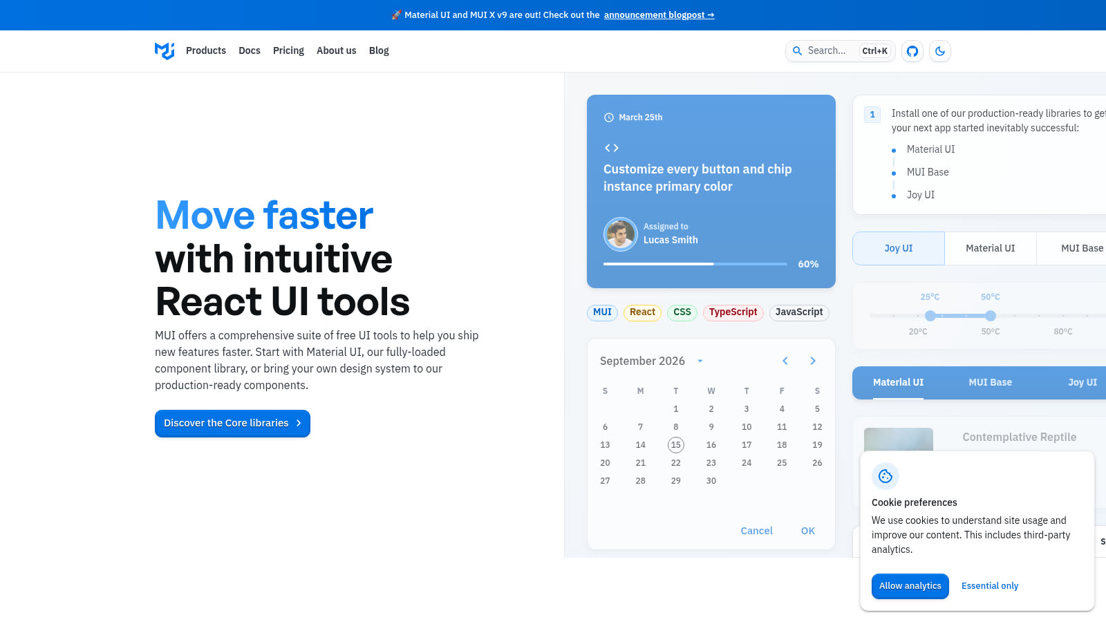
Source: https://mui.com/ — public marketing page captured 2026-09-15.
The public homepage still sells speed for web React products: Material UI, MUI X, templates, design kits, and npm install @mui/material @emotion/react @emotion/styled. Read that as a product boundary, not a missing native feature.
When the bet flips
Switch the default — or refuse to start on Material UI alone — when any of these show up:
- You need one component API across web and React Native. Duplicate Button/Input/Modal definitions drift within a quarter. Agents amplify the drift because they paste
@mui/materialimports into native files that cannot resolve them. - You want build-time styling on web and a shared token story on native. Tailwind-on-web plus a native styling engine is a different architecture than Emotion everywhere.
- You are buying time-to-production for a full product, not just a component kit. Auth, schema, payments, and agent docs belong in the repo from day one. A component library alone does not carry that.
- You already feel the second-system tax. Design review keeps asking "why does mobile look like a different product?"
- You do not want Material Design. Restyling MUI away from Material is possible, but you pay continuous override tax for a look the library was not optimized to erase.
That is the fork the compare page is written for: otf-kit vs Material UI (MUI). The honest matrix is not "which Button is prettier." It is platforms, runtime styling cost, Material opinion, and whether a full-stack kit exists on the other side.
A concrete decision test you can run this week
Do not argue in the abstract. Run a two-hour spike:
# 1) Confirm Material UI install surface (web)
npm install @mui/material @emotion/react @emotion/styled

# 2) Sketch the mobile question as a yes/no
# If the answer is "Expo app in H1", stop the MUI-only plan.
Then answer these out loud with the team:
- Which screens must ship on iOS/Android in the next two quarters?
- Who owns tokens if web and native diverge?
- Is Material Design the brand, or a default you plan to fight?
- What does the coding agent read —
theme.tsonly, or a repo that includes native components and kit prompts?
If the answers are "no native," "web design system owner," "Material is fine," and "MUI theme + docs," stay. If any answer points at dual platforms, dual owners, or a non-Material brand, you are choosing debt by staying.
Owned repo outcome (what "switch" should mean)
Switching should not mean "rewrite every page this sprint." It should mean the repo becomes the source of truth:
- One token set agents can read
- Web components and native components that share naming
- Kit-level seams (auth, database, payments) when you need a product, not a Storybook
- Docs the agent opens before it invents UI

That is why this decision post ties to the live compare target instead of inventing a new marketplace story. Material UI remains strong at what it is. The failure mode is asking it to be a cross-platform product foundation it never shipped.
Migration notes if you already invested in MUI
If you stay: pin Material UI v9 + Emotion as an explicit dependency set, document "web-only" in AGENTS.md / Cursor rules so agents stop proposing React Native imports, and treat MUI X Pro seats as a product cost — not a surprise line item after the grid demo lands.
If you leave:
- Inventory theme tokens (
palette, typography, spacing) before touching JSX. - Replace layout primitives first (
Box/Stack/Grid), then composites. - Do not run Emotion and a utility-CSS system side by side "just for a while" — you pay twice and agents mix APIs.
- Land native screens only after web parity for the components you actually use.
- If Material look was the reason you chose MUI, pick a library that matches the brand instead of fighting overrides.
For owned monorepos, pair this decision with How to build a SaaS app with AI from a day-1 owned monorepo so UI choice and product spine move together.
Practical checklist
- Product surfaces: web only / web+native / native-first
- Material Design accepted — or rejected with a measured reason
- Agent docs name the canonical design system
- If native is real, dual-system tax is budgeted or avoided via a cross-platform kit path
- Compare page reviewed: /compare/otf-kit-vs-mui
Bottom line
Material UI remains a strong pick for browser-only teams that want Material Design coverage, deep docs, and optional MUI X grids. The day you need mobile parity, a single component API, a non-Material brand, or a full-stack kit in the repo, the decision is no longer about Button variants — it is about which system your agents and humans can keep coherent.
Sources
- MUI homepage (suite positioning; Material UI / MUI X / templates)
- Material UI product page (
@mui/material+ Emotion install; Material Design 2 note; 40+ components) - Material UI v9.0 announcement (Base UI NumberField/Menubar; accessibility; Emotion removal listed as future work)
- Material UI v9.0.0 GitHub release (stable tag 2026-04-08)
- otf-kit vs Material UI (MUI) compare page
- MUI homepage capture — https://mui.com/ public page, 2026-09-15
Ship the product, not the setup.
- 11 production screens — auth, billing, team, analytics, settings
- Real database, payments, and login — all wired on day 1
- AI configs pre-tuned so your agent extends instead of regenerates