Make a Fitness Food Log Faster When Search Returns Near-Matches
A meal log can have thousands of foods and still make dinner hard to record.
The bottleneck may be the last few taps: find the right item, decide which serving matches the plate, correct the amount, and save without losing the meal. If each step asks the user to interpret a crowded list, a large catalog only gives them more candidates to inspect.
One builder’s post raised the same problem from the other side: a meal log that is quick to open can still be slow when a food search takes minutes, and homemade meals return many near-matches. That is one person’s account, not a measurement of food-log users generally. It is still a useful design prompt: reduce the work between “I ate this” and a saved, editable entry.
Treat search time as part of the logging flow
A search field is only one part of the job. The full path includes opening the log, finding an item, distinguishing candidates, choosing a serving, adjusting the quantity, saving, and correcting a mistake later.
Measure that path as a sequence. For a small usability check, give a participant a realistic task such as logging a familiar packaged snack, a repeated breakfast, and a homemade meal. Observe where they pause, what they search for, how many results they inspect, whether they change the portion, and whether they finish without assistance.
Do not turn a few sessions into a universal benchmark. Use them to find a specific point of friction, change that step, and repeat the same task with a new participant or a later build. A useful result is not just “search feels faster”; it is that the person can find or enter the intended meal, correct its amount, and save it without guessing.
Put repeat meals on a short path
Many logs contain repeated choices. Make the last few entries easy to reach, and let users pin a small set of common foods or meals if the product supports that behavior. A recent-item row should say what the item is and which serving was used. A favorite should preserve the user’s chosen portion rather than silently resetting it to a default.
Keep these shortcuts optional. A person may want to record the same oatmeal each weekday, while another may vary ingredients every time. A shortcut should reduce repeated typing without making yesterday’s entry look like today’s meal by accident.
If a saved item is selected, show its name and serving clearly before saving. Give the user a direct way to change quantity or serving size. If the food or portion is wrong, correction should be part of the normal flow rather than a hidden edit screen.

One codebase. iOS, Android, and web.
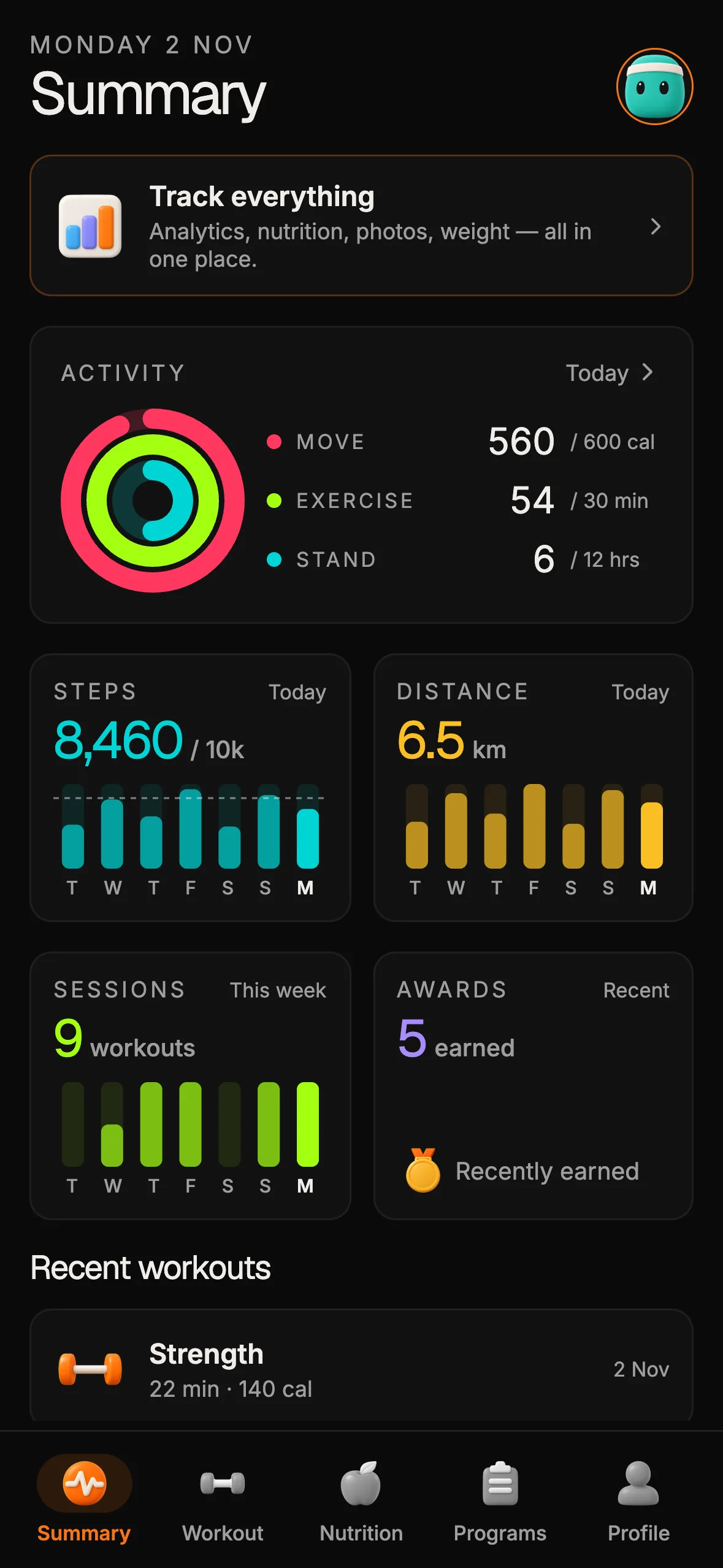
The Fitness Kit is a mobile starter with its own API, with sign-in and a database. Live demo at fitness-preview.otf-kit.dev.
Make candidates distinguishable
A result list needs enough context to help someone tell similar names apart. Depending on the data your product actually has, that could include brand, preparation, serving unit, or the source of the entry. Do not display a field as if it were verified when it is missing or inferred.
Put the information that changes the choice near the food name. If two rows both say “rice,” a person still has to open them one by one unless the list shows a meaningful distinction such as cooked versus dry or a serving unit. If the catalog cannot supply that detail, let the user create a clear personal entry instead of presenting false precision.
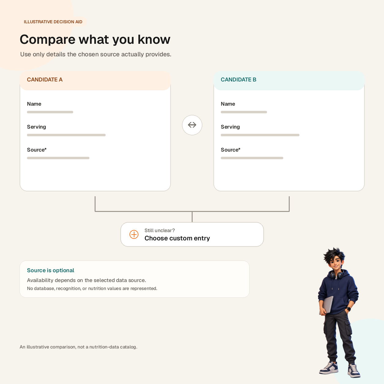
Illustrative decision aid. Candidate fields are shown only to illustrate Name, Serving, and optional Source labels; no foods, amounts, or nutrition values are implied.
A small result model keeps the interface honest. Carry the name, a serving label, and a source label for each candidate, and mark the optional fields as optional rather than inventing them.
Only render labels the selected data source provides. If a serving is not known, ask the user to choose or enter one; do not imply that an approximate match is exact. Keep the chosen serving editable on the confirmation step.
Give homemade meals an honest route
A general food catalog will not contain every recipe or family meal. A “custom meal” path can let someone save a name, ingredients or notes, and a user-entered portion if those fields exist in the product. Make the difference between a verified catalog record and a personal entry visible, so the user knows what they are relying on.
Avoid making a custom meal feel like a failed search. Offer it when the query has no useful result, and keep the typed name so the user does not start again. If the product stores nutrition totals, show where they came from; if it does not, do not invent calorie or macro values to make the screen look complete.
The same principle applies to photo, voice, or barcode input. Those can be alternate ways to enter a meal only when they are implemented and their output can be reviewed. A capture interface alone does not establish recognition quality or a nutrition-data source.
Keep the save and correction steps visible
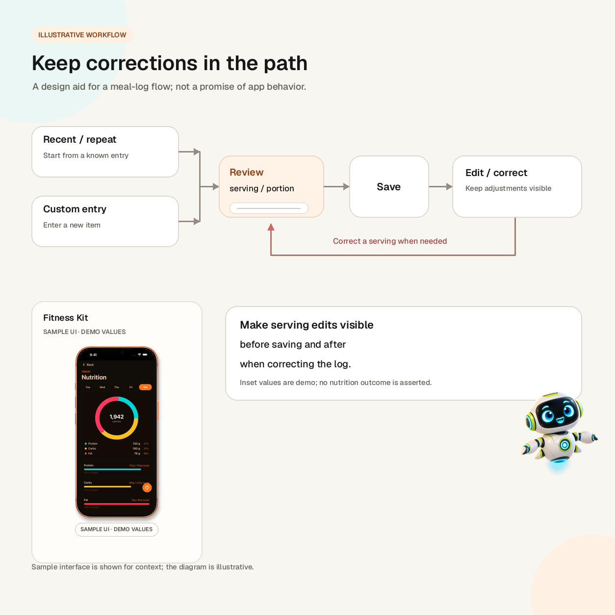
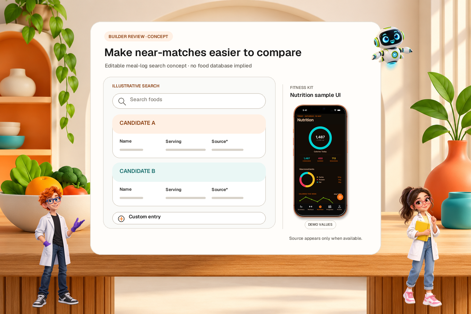
Illustrative workflow, not a promise of app behavior. The Fitness Kit inset is sample UI with demo values, and the diagram shows no nutrition totals.
Before saving, summarize the selected item and amount in plain language. For example: “Cooked rice · 1 cup.” Let the user adjust the serving in place, and make the saved result visible in the day’s log. The user should not have to reopen search just to discover what was recorded.
After saving, corrections should preserve the original entry long enough to make the change understandable. If someone replaces a candidate or changes a quantity, update the displayed total using the data the app actually has. Make deletion and undo behavior explicit. A meal log can be quick without hiding how its entries were chosen.
For a mobile interface, test the same flow with the keyboard open, a long food name, a no-result query, and a screen reader. Check that the result list remains usable when it is narrow, the selected row is announced, and the save action is reachable without awkward scrolling. These are test cases to run in the app you are building, not guarantees supplied by a starter screen.
Decide what to improve before adding automation
When search feels slow, first identify which step consumes attention. If the list is hard to scan, improve labels and grouping. If people repeatedly enter the same items, test recents or favorites. If homemade meals dominate the no-result path, make personal entries easier to create and correct. If users can find the food but cannot choose a portion, improve the serving editor.
Only consider automatic recognition after the basic entry and correction paths are clear. Any automated suggestion needs a review step and a way to fix a wrong match. Otherwise, automation may move the effort from typing to checking uncertain results.
A simple event plan can help a team see where work accumulates: record when search opens, when a query is submitted, when a result is selected, when a custom entry begins, when a meal saves, and when the user edits or deletes it. These are events a builder would need to implement; dashboard screens by themselves do not collect them. Compare the flow by task type and by app version, then use the results to choose the next small change.
What a starter can and cannot provide
The Fitness Kit currently lists nutrition and food-log screens, a macro breakdown, and a real database as part of its app scaffold. Those screens can give a builder editable UI and app structure to adapt. The product page does not claim to include a nutrition database, barcode scanning, or AI food recognition, so a buyer building those capabilities still needs to choose and integrate the relevant data and services.
The Fitness Kit app overview shows the broader screen set. For a food-search problem, inspect the live demo and source expectations before buying, then decide whether its existing log screens are a useful starting point for the workflow you need.
The practical goal is modest: make the intended food and serving easier to identify, keep uncertain entries editable, and make correction cheaper than abandoning the log. Better search is not a promise of better nutrition data. It is a clearer path from a person’s meal to a record they can review.
Sources
- Reddit r/SideProject: "I spent 2 years building an app, silently released it — already making money" — posted 16 Feb 2026 (date from the source listing). One builder's post about meal-log search friction; not evidence of market-wide demand.
- Fitness Kit — kit page checked 2 Nov 2026 (HTTP 200): lists nutrition and food log, a macro breakdown, and sign-in on a real database. It does not list barcode scanning or food recognition.
Ship your first screen tonight — free starter in your inbox
The quickstart, the SDK repo and the live kit demos, on this screen and in your inbox.
No spam. Unsubscribe any time.