A Practical 24-Point UI Design Checklist

A screen can look finished in a screenshot and still feel unfinished when someone tries to use it. A row that never responds, a dialog that loses keyboard focus, or an error that gives no next step turns visual polish into extra work for the person using the product.
This checklist is a review aid for product interfaces, not a claim that any template ships or automatically enforces these checks. Work through it on the real screens and states you intend to release. Record failures with a screen, a reproduction step, and an owner; then review the changed state again.

Review interaction and keyboard behavior
-
Make each control behave like its label. A control called “Save” should save; “Open filters” should expose filters. Use a native button for an action and a link for navigation so keyboard and assistive technology users get the expected behavior.
-
Give pointer users a clear hover response where it helps. Hover styling can help people see which row or control is under the pointer, but do not make hover the only way to reveal information or operate a feature.
-
Show a pressed or selected state when the action needs confirmation. After activation, make the changed state visible: a toggled setting should look toggled, and a selected tab should be distinguishable from the others. Do not use color alone to communicate the change.
-
Explain disabled controls. A disabled action should look unavailable and should not activate. If the user needs to complete a prerequisite, explain it nearby instead of leaving them to guess why the action cannot be used.
-
Keep keyboard focus visible. Removing the browser outline without an equally visible replacement makes keyboard position hard to track.
:focus-visiblecan style keyboard focus while allowing a different treatment for pointer interaction; check the actual contrast against the adjacent surface. -
Keep focus order aligned with the task. Tab through the screen from its beginning. Focus should move in a sensible reading and action order, stay visible, and not jump behind a modal or into content that is currently unavailable.
-
Label inputs independently of placeholder text. A field needs a persistent accessible name, and its instructions should explain a format or constraint before the user submits. A placeholder can show an example but should not be the only label.
-
Attach validation messages to the field that needs attention. State what failed and how to fix it in text, identify the affected input programmatically, and preserve a value the user already entered when it is safe to do so.
-
Make submission feedback explicit. While a request is pending, communicate that state and prevent accidental duplicate submission where appropriate. On completion, tell the user whether the action succeeded or what they can do next.
-
Move focus into a modal when it opens. A modal dialog should receive an accessible name and move keyboard focus to a useful element inside it. Keep keyboard navigation within the modal while it is open.
-
Close dialogs predictably and restore focus. Escape commonly closes a dialog when closing is safe; when it closes, return focus to the invoking control unless the workflow has moved to a more logical place. Confirm destructive actions with a suitable design rather than trapping users unexpectedly.
-
Follow the keyboard pattern for composite controls. Menus, tabs, radio groups, and listboxes have different keyboard conventions. Use the WAI-ARIA Authoring Practices pattern that matches the control instead of adding ad hoc key handlers.
Review visual clarity and accessibility
-
Check text contrast against its actual background. WCAG 2.2 AA sets a 4.5:1 minimum contrast ratio for most text, with a lower threshold for large text. Verify real color pairs in both themes rather than judging them by appearance alone.
-
Check important control boundaries and state indicators. WCAG 2.2 AA calls for at least 3:1 contrast for visual information needed to identify user interface components and their states, subject to the criterion’s exceptions. Include borders, icons, selection markers, and focus indicators when they carry that information.
-
Do not rely on hue alone. Pair color changes with another cue such as a label, icon, underline, shape, or pattern. This helps people distinguish status and selection when they cannot perceive the color difference.
-
Use named design tokens for repeated decisions. Put surfaces, text, borders, focus styles, and status colors behind shared tokens. A designer or developer can then review one consistent system instead of chasing unrelated values across screens.
-
Review both light and dark appearances, if both are offered. Check more than the page background: menus, dialogs, tables, empty states, charts, and disabled controls all need readable colors and recognizable boundaries in each theme.
-
Respect reduced-motion preferences. Use the
prefers-reduced-motionmedia query to remove, reduce, or replace non-essential motion when a person has requested less motion. Preserve the information and feedback that the animation was meant to convey. -
Make touch targets practical to operate. WCAG 2.2 AA’s Target Size (Minimum) criterion uses a 24-by-24 CSS-pixel target or a spacing exception, with other stated exceptions. The separate Target Size (Enhanced) criterion is a 44-by-44 CSS-pixel AAA criterion; treat that as a stronger design goal where the layout allows it, not as the AA minimum.
-
Check narrow layouts and zoom. At a narrow viewport and when zoomed, content should remain readable and operable without making a person pan in two directions to follow a normal page flow. Inspect sticky headers and overlays too; they can hide the control that currently has focus.


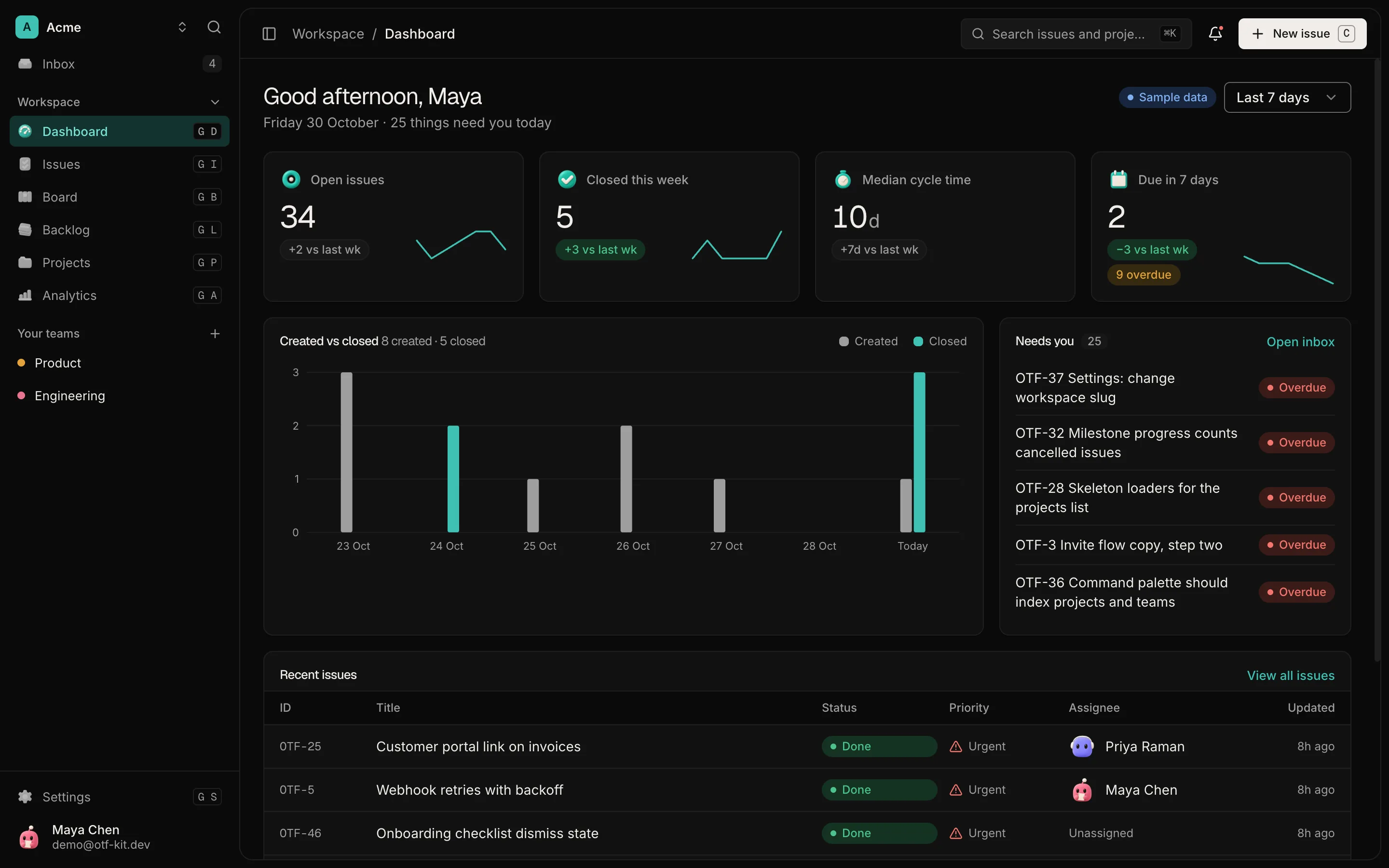
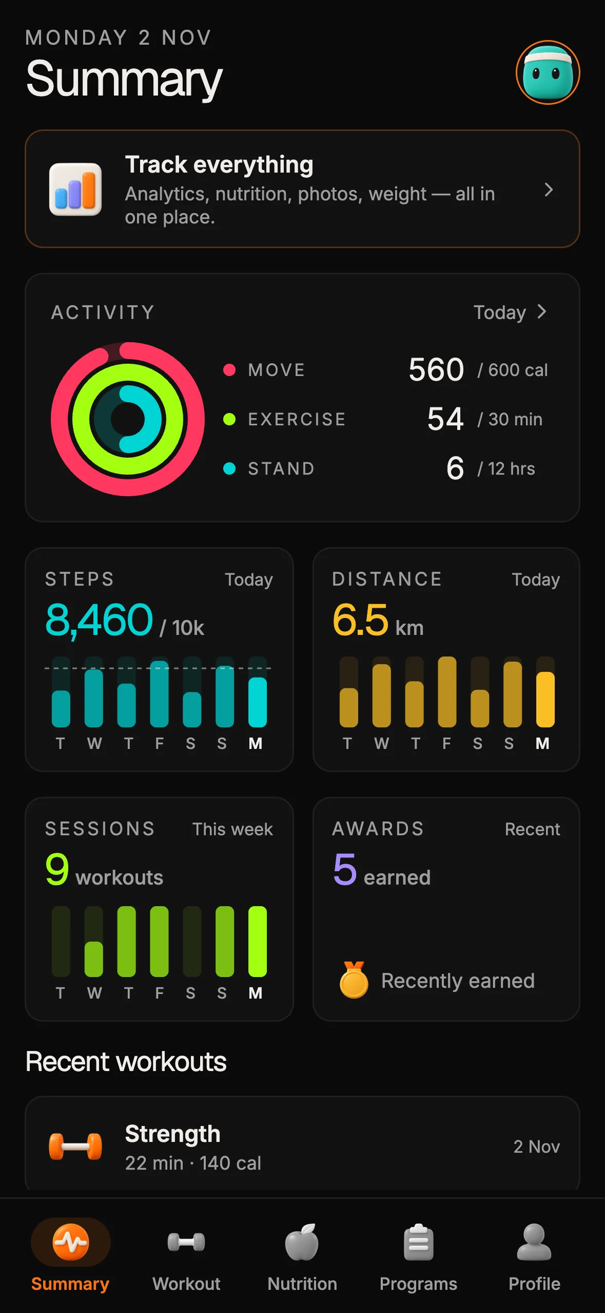
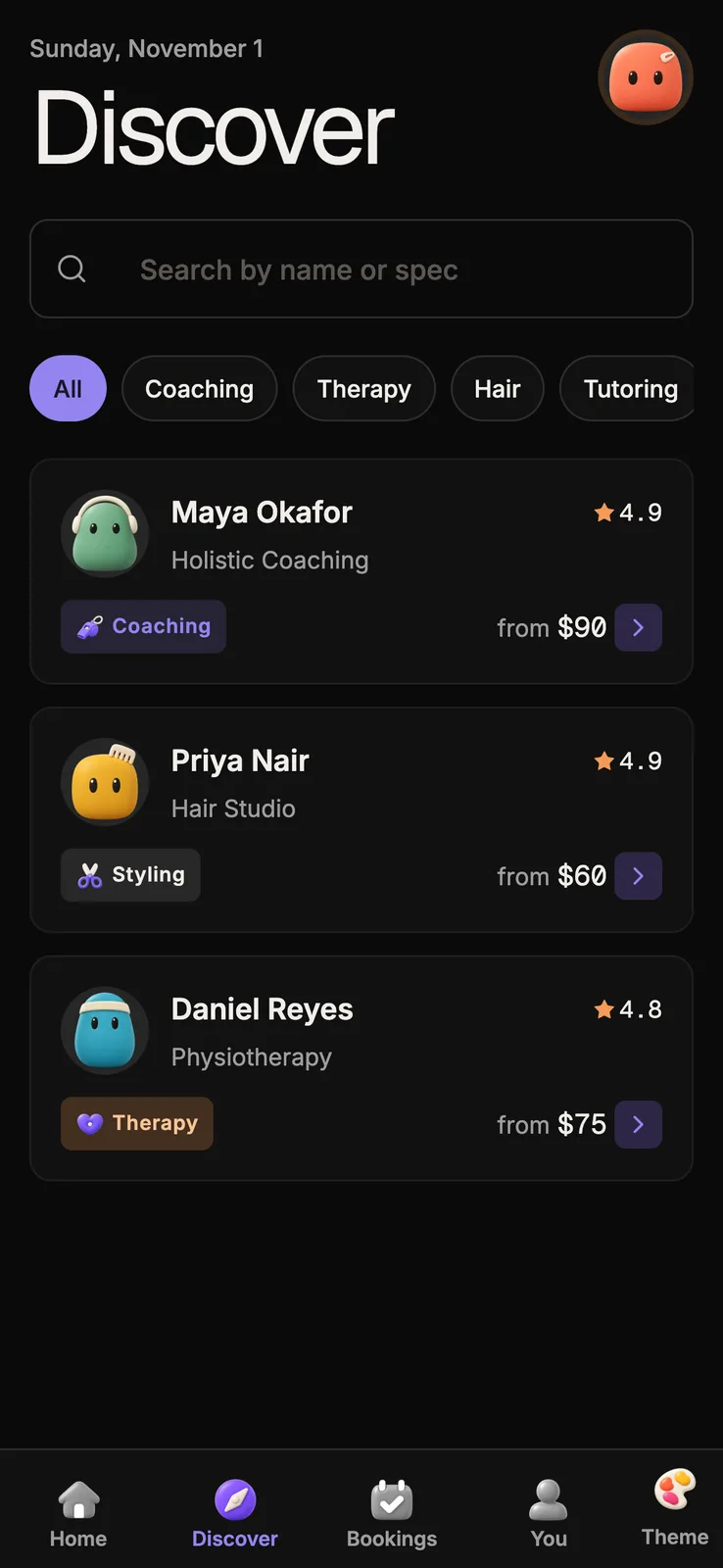
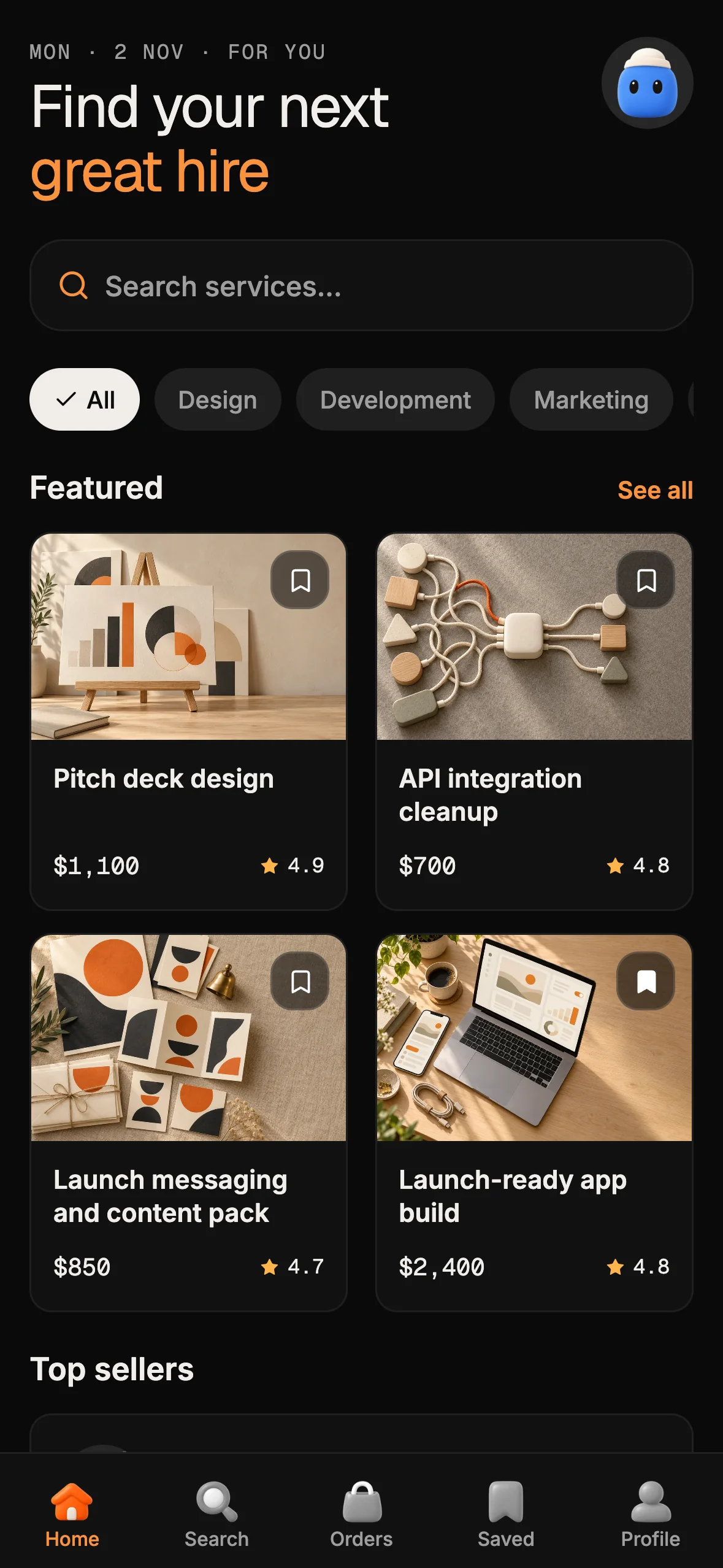
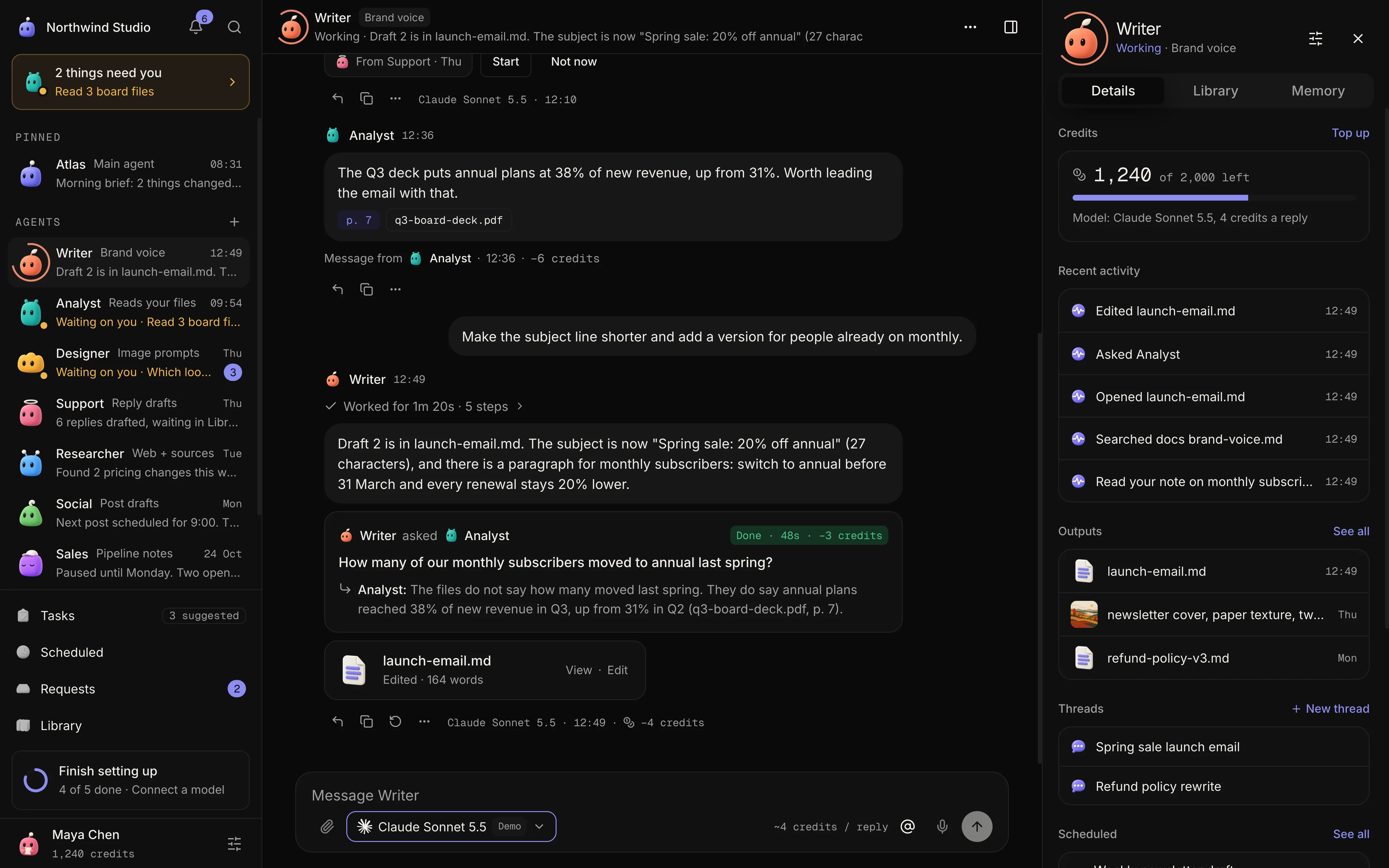
12 production screens. Login and database wired.
The SaaS Dashboard Kit includes login, a database, and a working dashboard. Live demo at saas.otf-kit.dev.
Review data states and completion
-
Design the loading state. Keep the user oriented while data is pending. If a placeholder layout is useful, make its shape match the content that will arrive; do not imply that sample or stale data is current.
-
Give empty states a useful next step. Explain why the area is empty when that is known, and offer a relevant action such as creating the first item or adjusting a filter. Avoid dead-end labels that simply say “No data.”
-
Make errors recoverable. Say what the user can do, preserve their input where possible, and provide a retry only when retrying is meaningful. Do not replace a detailed internal error with a raw stack trace or expose private implementation details.
-
Announce important updates to assistive technology. Dynamic success messages, validation results, and asynchronous errors need to be exposed when they change, not only painted onto the screen. Use a suitable live region or other semantic pattern, and verify the message is announced without stealing focus.
Turn the review into a release habit
Use the checklist against one complete task, not only the initial screen: start with a keyboard, open a menu, change a filter, submit a form, trigger an error, and recover. Repeat the same flow in every supported theme and at the narrow layout. When a check fails, write down the expected behavior and the observed behavior so the fix can be verified by someone else.
These checks do not replace a full accessibility evaluation, user research, or testing with assistive technology. WCAG success criteria have defined scope and exceptions; an informal checklist cannot certify conformance. It can make common interface failures easier to spot before release and give a team a concrete conversation about what “finished” means.
For a broader release review, see our production-readiness audit for an AI-built app. If you are ready to turn your idea into an editable starting point, start here.
Sources
- W3C, Understanding Success Criterion 1.4.3: Contrast (Minimum), WCAG 2.2, accessed 15 October 2026.
- W3C, Understanding Success Criterion 1.4.11: Non-text Contrast, WCAG 2.2, accessed 15 October 2026.
- W3C, Understanding Success Criterion 2.5.8: Target Size (Minimum), WCAG 2.2, accessed 15 October 2026.
- W3C, Understanding Success Criterion 2.5.5: Target Size (Enhanced), WCAG 2.2, accessed 15 October 2026.
- W3C, Dialog (Modal) Pattern, ARIA Authoring Practices Guide, accessed 15 October 2026.
- W3C, Developing a Keyboard Interface, ARIA Authoring Practices Guide, accessed 15 October 2026.
- MDN, The
prefers-reduced-motionCSS media feature, accessed 15 October 2026.

Ship the product, not the setup.
- 12 production screens — auth, team, analytics, and settings
- Login and a real database are wired in
- AI configs pre-tuned so your agent extends instead of regenerates
Ship your first screen tonight — free starter in your inbox
The quickstart, the SDK repo and the live kit demos, on this screen and in your inbox.
No spam. Unsubscribe any time.