
Unify Your UI Across Web and Mobile with OTF's Cross-Platform Components
Three codebases, three Buttons, one design review
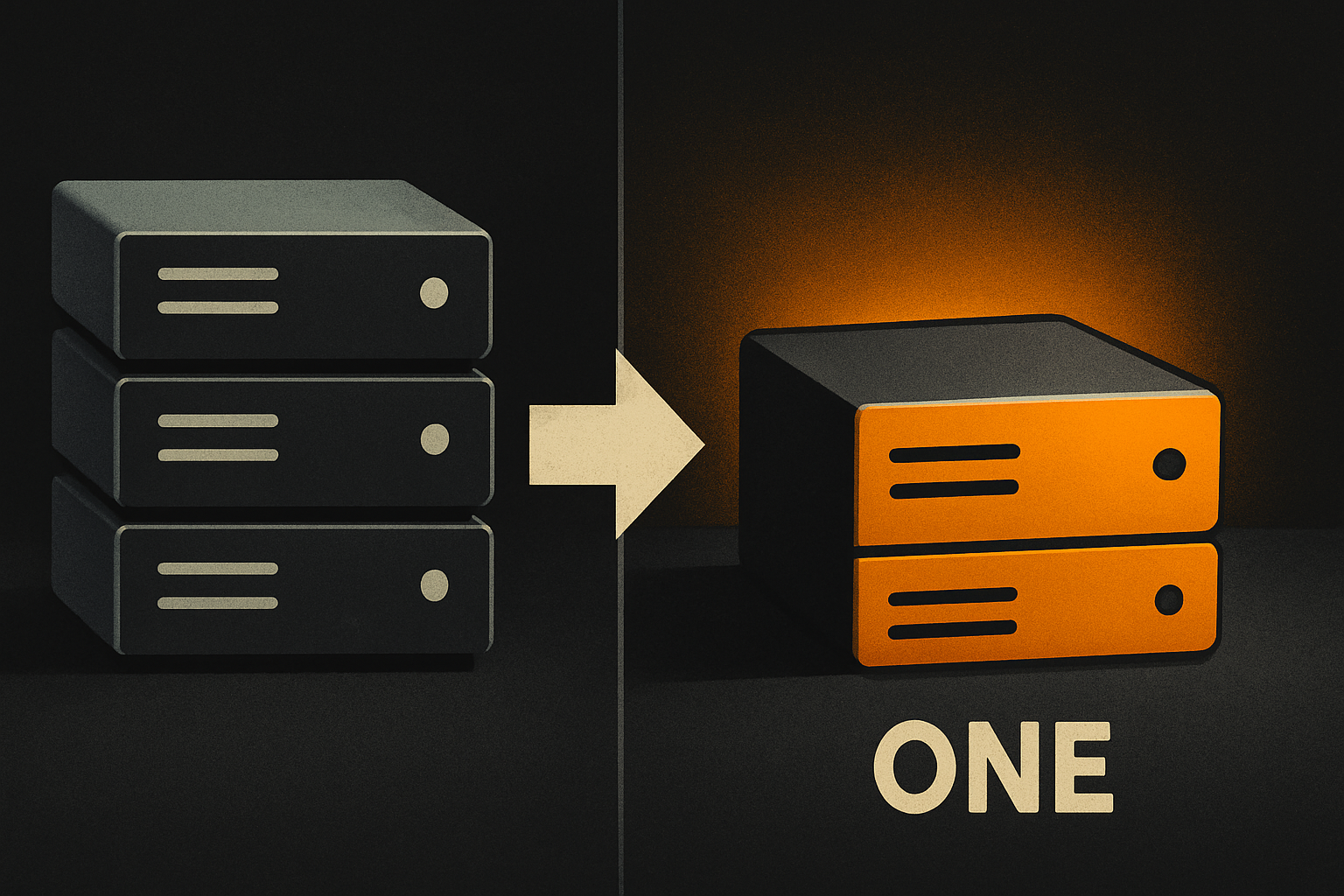
Every team I've worked on has shipped the same Button three times. Web in one repo. iOS in another. Android in a third. Three PRs, three reviews, three token files that drift by sprint two. Designer pings Slack: "can we ship the new accent by Friday?" The web team does it. The mobile teams schedule it for next quarter. By the time mobile ships the new accent, the web team is two shades past it.
This is the cross-platform tax. It isn't theoretical — it's every shipped feature, every redesign, every accessibility audit.
The genuine win, and it is a real one, is when a single component definition reaches all three platforms. Same name, same props, same accessibility story, same token. The user feels it as consistency. The team feels it as shipping speed. The ~200 components in a real cross-platform kit cover the bulk of UI — Button, Card, ListItem, Form, Modal, Toast, Tabs, the usual suspects — and each one ships to web, iOS, and Android from one definition.
What "same component" actually means
Same name and same props aren't enough. A Button that takes onPress on web and onTap on native is two components wearing the same costume. Real cross-platform means the props are stable across surfaces — onPress everywhere, variant everywhere, size everywhere — and the rendering, accessibility tree, and gesture handling are native to each surface under the hood.
| Surface | What you'd write without OTF | What you write with OTF |
|---|---|---|
| Web | A web-only Button, its own tokens, its own a11y wiring | <Button> from @otfdashkit/ui |
| iOS | A SwiftUI Button recreated from scratch | <Button> from @otfdashkit/ui-native |
| Android | A Compose Button with different props again | <Button> from @otfdashkit/ui-native |
| Design tokens | Three token files, drifted by Q2 | tokens.color.accent[500] — same hex on every platform |
The component's behavior — focus ring, ripple, press scale, screen-reader announcement — is consistent across platforms because each surface renders with its own primitives, but the contract (props, variants, a11y labels, token names) is shared. That distinction is the whole game.
Same component. Web and mobile. One codebase.
The free, open-source SDK gives you components that work the same on web and mobile — one codebase. github.com/otf-kit/sdk
How the same Button ships everywhere
Two imports, one contract. The web build pulls from @otfdashkit/ui; the native build pulls from @otfdashkit/ui-native. Both expose <Button> with the same prop shape, so the feature code reads the same on every platform.
// web/src/components/PayButton.tsx
import { Button } from "@otfdashkit/ui";
import { tokens } from "@otfdashkit/tokens";

export function PayButton({ amount, onCheckout }: Props) {
  return (
    <Button
      variant="primary"
      size="lg"
      onPress={onCheckout}
      accessibilityLabel={`Pay ${amount} dollars`}
      style={{ backgroundColor: tokens.color.accent[600] }}
    >
      Pay ${amount}
    </Button>
  );
}// mobile/src/components/PayButton.tsx
import { Button } from "@otfdashkit/ui-native";
import { tokens } from "@otfdashkit/tokens";
export function PayButton({ amount, onCheckout }: Props) {
return (
<Button
variant="primary"
size="lg"
onPress={onCheckout}
accessibilityLabel={`Pay ${amount} dollars`}
style={{ backgroundColor: tokens.color.accent[600] }}
>
Pay ${amount}
</Button>
);
}Same prop names. Same variant values. Same token path. A designer updates accent[600] in one place and all three surfaces flip on the next build. There's no second PR to write, no second review to schedule, no second test plan.
Tokens that flip themes, not platforms
The token package is the layer that turns a redesign from a quarter-long project into an afternoon. Brand colors, spacing scale, type ramp, radii — all defined once, consumed identically on web and native. Theme switching is a one-line swap:
import { applyTheme } from "@otfdashkit/tokens";

// light is the default; dark doesn't require rebuilding components
applyTheme("dark");

// or roll a custom brand for a white-label tenant
applyTheme({
  name: "acme",
  color: { accent: { 500: "#0EA5E9", 600: "#0284C7" } },
  radius: { md: 8 },
});
A web app and a native app reading the same applyTheme("dark") end up with the same accent color, the same focus ring, the same disabled grey. The pixel-level consistency designers want becomes a configuration problem, not a rewrite. The component code doesn't know or care which theme is active — it pulls from tokens.color.accent[600] and the right hex shows up.
When you genuinely need to diverge
Cross-platform primitives cover 90% of UI. The other 10% — a platform-specific gesture, a native share sheet, a custom map overlay, a hardware keystore — needs an escape hatch. The component API exposes composition slots so you can drop down to native primitives without breaking the contract.
// mobile: wrap a native share sheet inside a Button
<Button variant="ghost" size="md" onPress={() => Share.share({ message })}>
  <Button.Icon name="share" />
  Share route
</Button>
The Button still owns layout, tokens, and a11y. The native gesture is owned by the platform. You get divergence where you need it, consistency where you don't. The 24-item design checklist — contrast ratios, touch target sizes, focus visibility, dark-theme parity, RTL coverage, screen-reader labels — runs as a script before any kit ships, so the divergence you add is your decision, not an oversight.
AI tools extend, they don't regenerate
This matters more than it sounds. When a coding agent — Cursor, Claude Code, or otherwise — opens a repo with a real component library and a tested prompt set, it extends existing components instead of inventing new ones. The kit ships CLAUDE.md, .cursorrules, and 20+ tested prompts under ai/prompts/, so the agent treats the kit as the source of truth.
<!-- .cursorrules (excerpt) -->
- Use @otfdashkit/ui for web components. Don't author new primitives.
- Use @otfdashkit/ui-native for iOS/Android. Don't author new primitives.
- All colors come from @otfdashkit/tokens. Never hardcode hex.
- New variants go in the kit, not in feature code.
Without these, an agent cheerfully invents a BigBlueButton to satisfy a prompt. With them, it edits the right file in the kit, the change ships to every surface that imports the component, and the codebase stays one Button wide instead of growing three.
What this enables
A single design review can land on three platforms. A designer changes the accent and the next deploy reflects it everywhere. A new engineer ships a working Button on day one because the import is the answer. A redesign becomes a token swap. An accessibility audit is one set of components to test, not three.
The paid kits own the code in your repo. The Fitness kit ($99) is the most direct example of this thesis in practice — one codebase, one Button, three shipped apps on web, iOS, and Android. SaaS Dashboard ($99) and Booking ($99) cover the web side with auth, billing, DB, and Stripe wired. The Everything Bundle ($149) is all three. Fifteen single-page landing templates ($9 each) handle the marketing surface. Distribution is either copy-paste from the CLI or npm install — your choice. Shipping to production is a single script that wires a custom domain, DNS, TLS, and the mobile build.
Open saas.otf-kit.dev on a laptop and fitness-preview.otf-kit.dev on a phone, side by side. The Button you tap on the phone is the same Button you hover on the laptop — same prop, same variant, same accent, same focus ring. The constraint that makes that possible is the same one that lets your team ship the next redesign in an afternoon: one definition, three surfaces, no drift.
Buy once, own the code. Ship with the agent you already use.
- Free, open-source SDK — same component, web and mobile
- Paid kits include AI configs + 40+ tested prompts — your agent reads the whole project
- $99/kit or $149 for everything. No subscription, no sandbox limit.