
React Native Paper owns Material components; you still own the product kit

React Native Paper is a Callstack-maintained Material Design component library for React Native. On npm it is described plainly as "Material design for React Native." The project site positions it as a Material Design library for major UI use cases, with official Material You (Material Design 3) support, theming, platform adaptation, accessibility, and RTL. The demo is documented as working on web and mobile.
That is a clear, bounded job: ship Material UI primitives on React Native without rebuilding buttons, dialogs, lists, and theme plumbing yourself. It is not a full product kit. Screens, domain schema, auth and billing seams, agent prompts, and a web-plus-native delivery spine remain your problem—or the problem of whatever owned kit you adopt.
This post is a keep-or-move decision. Keep React Native Paper when Material components are the gap. Move to an owned product kit when you need a production app spine that coding agents can edit end to end.
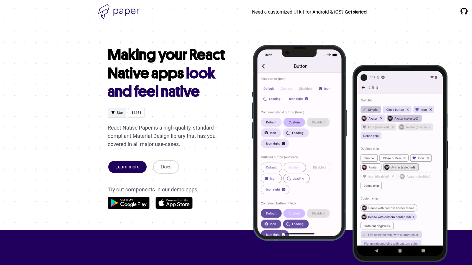
Source: https://reactnativepaper.com/ — public marketing page captured 2026-09-16.
When Paper wins
Paper wins when your bottleneck is UI kit work on React Native and you want Material Design as the system of record.
Install is straightforward:
npm install react-native-paperFrom v5, the getting-started guide also requires safe-area handling:
npm install react-native-safe-area-contextOn vanilla React Native, some components depend on Material Design icons internally (for example AppBar.BackAction on Android), so you add the icon pack and follow its platform setup:
npm install @react-native-vector-icons/material-design-iconsUsage centers on PaperProvider. You wrap the root so theme and portal behavior reach the tree. Customization extends MD3LightTheme (Material Design 3) and passes the theme into the provider—colors, typescales, and related tokens are first-class, not afterthoughts.
What you get from the public product surface, without stretching claims:
- Material You / MD3-adjusted components (colors, typography, animations called out on the project site)
- Full theming, including light and dark and custom color roles
- Platform adaptation aimed at iOS and Android expectations
- Accessibility and RTL support called out as library concerns
- Cross-platform demo coverage that includes web and mobile
If your product already has (or will accept) a Material visual language, and your team is prepared to own screens, data, and account flows separately, Paper is a rational default. You stop reinventing Material primitives and keep shipping product logic elsewhere.
Paper is the wrong tool when you treat a component library as a substitute for product architecture. Buttons themed to MD3 do not define your domain model, subscription states, or how an agent should change a booking flow without inventing conventions every session.
For a related web-side framing of Material UI as a decision, not a full spine, see /blog/material-ui-web-first-decision.
What you still own
Even with Paper correctly installed and themed, ownership of the product still sits with you.
Screens and flows. Paper gives you building blocks. You still compose onboarding, settings, empty states, error recovery, and domain-specific layouts. A Button and a Dialog do not encode your product's happy path or failure modes.
Domain schema. Material components do not define entities, migrations, seed data, or typed API contracts. Your booking, fitness, marketplace, or SaaS objects live outside the UI kit. Agents editing the product need that schema in the repo, not only theme tokens.
Auth and billing seams. Sign-in, session boundaries, protected routes, plan gates, and payment webhooks are product services. A Material app bar does not wire accounts or invoices. If those seams are missing, every feature branch re-derives them.
Agent prompts and project memory. A component library does not ship tested prompts, architecture notes, or command maps for the coding agent you already use. Without that context in the repository, agents rediscover patterns screen by screen. An owned kit treats rules, prompts, and ship scripts as part of the product surface.
Web and native delivery. Paper's demo works on web and mobile, which is useful for Material UI parity. Shipping a commercial app still means app shells, API routes, deploy scripts, and environment configuration you control. Cross-platform components are not the same as a single owned delivery path.
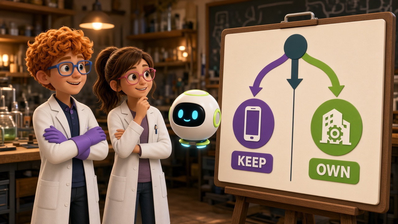
In short: Paper owns Material components. You still own the product kit—or you buy one that already owns those layers as editable source.
One codebase. iOS, Android, and web.
The Fitness Kit ships with auth, a database, and a backend already connected — no setup. Live demo at fitness-preview.otf-kit.dev.
Decision tree
Use this as a hard filter, not a branding exercise.
Keep React Native Paper when all of the following are true
- You are building primarily on React Native and want Material Design / Material You as the UI language.
- Your gap is components, theming, accessibility, and RTL—not missing product spine.
- Auth, billing, schema, and deploy already exist (or are deliberately out of scope for this milestone).
- You are fine maintaining screens and domain logic yourself, with Paper as the UI substrate.
- You do not need a pre-wired agent context pack that describes the whole app.
Move toward an owned product kit when any of the following are true
- You need finished screens plus domain schema plus auth/billing seams in one repository.
- Multiple agents (or frequent tool switches) must edit the same product without rebuilding project memory.
- Web and native delivery must share conventions, not only a Material look.
- You are past the prototype and keep re-implementing the same account, data, and ship paths.
- Material primitives are table stakes; the cost is in product wiring, not button states.
Stay hybrid when
You keep Paper (or another Material UI layer) for RN primitives, but adopt an owned kit for the spine: screens, data, accounts, prompts, and deploy. Do not pretend the hybrid is "Paper alone." Name the boundary in the repo so agents do not invent a second architecture.
If the honest answer is "we only needed Material widgets," stop shopping for kits. If the honest answer is "every sprint starts by re-explaining auth and schema to the agent," Paper is not the missing piece.
Handoff to an owned kit
When the decision tips to an owned kit, treat Paper as a successful UI chapter, not a sunk-cost failure. Handoff is about moving product ownership into a repository agents can edit—not about deleting every Material import on day one.

A practical sequence:
- Inventory what Paper already covers. List the Material surfaces you rely on (forms, lists, dialogs, navigation chrome, theme tokens). That inventory is the UI contract you must preserve or replace deliberately.
- Map the spine you still lack. Screens and flows, domain schema, auth/billing seams, agent prompts, web/native delivery. Anything still hand-rolled or undocumented is handoff scope.
- Adopt an owned kit with source in your repo. Prefer a kit that ships the app surface, backend contracts, design system, AI instructions, and deploy scripts together—inspectable before you commit. OTF frames this as full-stack web and mobile products you own: clone, customize, and ship with the agent you already use. The free SDK entry point is github.com/otf-kit/sdk.
- Preserve agent-readable context. Move architecture notes, commands, and tested prompts into the repo so tool switches do not erase product memory. Owned kits that treat project context as source reduce rediscovery cost.
- Retire or contain Material primitives. Either replace Paper surfaces with the kit's shared system, or isolate Paper behind a thin adapter until screens migrate. Avoid two competing theme authorities without a written boundary.
- Prove the ship path. Auth, data, payments, and deploy must run from the owned repo—not from a local wiki that only one engineer remembers.
After purchase, the work is editing product behavior in owned source, not re-deriving the spine. For a concrete post-purchase path on a vertical kit, see /blog/fitness-kit-after-purchase.
Paper remains a strong answer when Material components are the only gap. When you need the full production app spine agents can edit, keep the honesty: components solved; product kit still required. Buy or build that kit on purpose.
Sources
- https://reactnativepaper.com/ — Material Design / Material You positioning, theming, accessibility and RTL, platform adaptation, demo on web and mobile
- https://callstack.github.io/react-native-paper/docs/guides/getting-started —
npm install react-native-paper,PaperProvider,MD3LightTheme,react-native-safe-area-context, vector icons on vanilla React Native - https://www.npmjs.com/package/react-native-paper — "Material design for React Native"; Callstack-maintained package
- https://otf-kit.dev — owned full-stack web and mobile kits, agent context, auth/data/payments, ship path
- https://github.com/otf-kit/sdk — OTF SDK outbound default
Stop wiring. Start shipping.
- Login, database, and backend already connected — nothing to set up
- iOS + Android + web from one codebase
- AI configs pre-tuned + 40+ tested prompts included