
Why Live Demos Outshine Static Screenshots for Template Evaluation

A live demo is the only honest proof a template works. It answers the questions that decide whether your users will tolerate the app — does the form validate on blur, what does the empty state look like, is the loading spinner visible on a slow connection. A screenshot answers none of these. That's why every kit we ship runs as a live, clickable deployment, and that's the standard you should hold any template to.
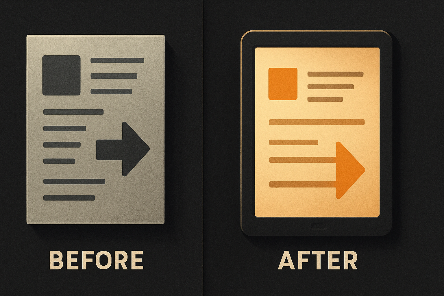
What a screenshot actually proves
A PNG of a dashboard tells you three things:
- This component renders at 1440×900
- Someone fed it enough data to fill the rows
- The designer who styled it liked this color
It does not tell you any of the things that decide whether your users will tolerate the app:
- What the empty state looks like when there's zero data
- Whether the table paginates at 50 rows or 5,000
- How long the chart takes to draw with 10k points
- Whether the form button does anything when you click it
- What the layout looks like at 375px wide
- Whether the modal traps focus correctly
- What the error boundary renders when the backend 500s
Every one of those is something your users will hit within five minutes of opening the app. None of them are in the picture.
Templates are a fit problem, not a beauty problem
A component library lives or dies on fit. Will it slot into my routes? Will the auth flow I already have plug into the one in the template? Will the billing webhook reach my endpoint? Will the mobile build pipeline accept this without a rewrite?
A screenshot answers none of these. A live demo — where you can click "Sign up," watch the form validation fire on blur, see the loading skeleton, land in the dashboard, open the billing modal, hit the empty state — answers all of them in under ninety seconds.
We ship three live kits right now:
saas.otf-kit.dev— full-stack web: auth, billing, DB, Stripe wiredfitness-preview.otf-kit.dev— mobile-first: the same codebase running iOS, Android, and web
Each one is the real kit, on real infrastructure, with the real auth provider, against a real test database. You can sign up with a fake email and walk the whole flow. The empty states are real empty states. The slow loads are real slow loads.
11 production screens. Login, database, payments — all wired.
The SaaS Dashboard Kit ships everything already connected. Nothing to set up. Live demo at saas.otf-kit.dev.
What we deliberately leave in the demo
A polished demo is suspicious. The demos that ship everywhere — every landing-page hero shot, every "Try the demo" button that pops a controlled modal with seeded data — are designed to hide the parts that took effort to build well. Specifically:
Loading states. Every async action in our kits shows a spinner or skeleton. You can throttle the network in DevTools and watch them. The skeleton on the dashboard chart is the same one your users will see on a flaky 3G connection in a subway tunnel. We didn't swap it out for the demo.
Empty states. No data? No fake rows faked in. You see the empty illustration, the CTA, the copy we wrote for it. The empty state is a first-class component:
// Real component from the SaaS dashboard kit
<DataTable
  data={rows}
  columns={columns}
  emptyState={
    <EmptyState
      title="No customers yet"
      body="Connect your Stripe account to start importing."
      action={
        <Button onClick={openStripeConnect}>
          Connect Stripe
        </Button>
      }
    />
  }
/>
That <EmptyState> ships in the kit. It took longer to design than the full-data view. We didn't hide it for the demo — we put it on the front page.
Error boundaries. Hit an action that 500s and you'll see the error UI we ship. We tested it. We made sure the "Try again" button actually retries. We made sure the error copy tells the user something useful. A screenshot never shows this because nobody wants to advertise their error screen — but your users will see it in production, guaranteed.
Slow renders. The fitness kit's activity timeline renders a thousand entries by default. Scroll it. It's not a joke. It's the real render path, and it's the one you'll inherit when you fork the kit.

The buyer math
A $99 template is a thirty-second decision in your head: does this look good enough to bet a weekend on? A screenshot can't answer that — but it can lie convincingly enough that you say yes. Then you spend the weekend discovering the empty state is a sad <div>, the loading spinner is a CSS animation that's broken in Safari, and the form validation only fires on submit instead of on blur.
That's the real cost of screenshot-driven buying. Not the $99. The weekend.
A click-through demo flips the bet. You see the empty state before you pay. You see the form validation before you pay. You see the loading spinner before you pay. If any of it is bad, you walk away having lost two minutes, not two days.
How to verify any template in 90 seconds
Before you buy anything, run this checklist against the live demo:
# 1. Click the primary CTA. Does it work?
#    Yes, actually click it — don't just look.

# 2. DevTools → Network → throttle to "Slow 3G". Reload.
#    Are loading states visible and readable, or do they flash
#    past in 40ms?

# 3. Resize to 375px wide. Does the layout hold, or does it
#    overflow horizontally?

# 4. Submit the form with empty fields. Does validation fire
#    on blur or only on submit?

# 5. Kill the backend (or hit an action that should 500).
#    Does an error boundary render something useful?

# 6. Tab through every interactive element with the keyboard.
#    Can you reach the modal close button? The dropdown menu?
#    The date picker?

# 7. Open it in Safari (or any non-Chromium browser).
#    Anything rendering wrong? Backdrop filters? Date inputs?
#    Custom scrollbars?
If the demo passes all seven, you have a real product. If it fails even one, you have a screenshot.
Why we open-source the SDK but charge for the kits
The free @otfdashkit/ui package on npm — roughly 200 components, MIT-licensed — is the surface area where every component renders on every theme in our docs. The kits are a different thing. A kit is the integration: auth wired up, billing hooked to Stripe, the mobile build configured, the 24-item design checklist enforced by a script before any kit ships.
That's why the live demos are the kits, not the components. The components don't have empty states or error boundaries — they're primitives. The kits do. The thing you're buying is the assembled thing, so the demo has to be the assembled thing.
Distribution is your call: npm install for the SDK, or the copy-paste CLI for the kits. Either way, what you clicked in the demo is what lands on your filesystem. The 24-item checklist runs at install time. The AI-tool configs (CLAUDE.md, .cursorrules, 20+ tested prompts in ai/prompts/) are wired so a coding agent extends the kit instead of regenerating it. One script wires the custom domain, DNS, TLS, and the mobile build.
What this gets us
It gets us fewer refunds. It gets us fewer "the screenshot didn't match" support tickets. Most importantly, it gets us users who know what they're getting — who can make the thirty-second decision honestly because the evidence is clickable.
Screenshots sell the moment. Live demos sell the next six months of your codebase. We only ship the second kind.
Ship the product, not the setup.
- 11 production screens — auth, billing, team, analytics, settings
- Real database, payments, and login — all wired on day 1
- AI configs pre-tuned so your agent extends instead of regenerates