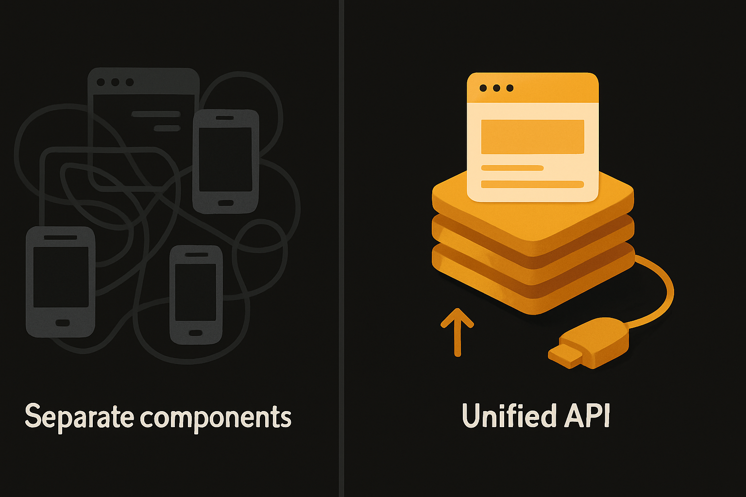
Write <Button> once and ship it consistently on web, iOS, and Android with one API

Writing <Button> once and shipping it on web, iOS, and Android — with the same props, same name, and visually identical result — sounds simple until you burn weeks split-brain fixing divergent “details” in multiple stacks. The promise: ship fast, swap themes, wire AI or analytics, and never think “Which Button is this?” again. Solo founders, side project junkies, and lean teams all hit this. The relief is measurable.
The thesis: one component API across platforms is not about aesthetics — it’s the structural win that makes small teams deliver features at the pace of their largest competitor’s mobile squad.
The concrete pain: duplicated UI is a tax you always pay
Build for web and mobile the “classic” way and you’ll keep a web repo (React, Vue, Svelte, whatever) and a mobile repo (Swift, Kotlin, React Native, Flutter). Every button, card, and input becomes a negotiation:
- The web Button supports
asChildand forwards refs. Mobile takes children or a label, but never both. Spacing and color diverge. - State props like
loadingordisabledrequire threading and separate visual feedback on each target. - Roll an update (“make the Button a pill”) — it’s an afternoon landing tiny PRs in both places and hoping a future self remembers.
- AI agents and codegen tools (Claude, Copilot, etc.) add features on one side and hallucinate the other, worsening “web drift” vs “mobile drift”.
The easy answer — “just componentize” — falls apart fast.
Naming, props, and structure must line up — or pattern-matching tools fail
Web and mobile don’t just disagree at the pixel level. The names, the prop signatures, the valid composition patterns: nearly all drift.
Here’s how two hand-rolled Buttons diverge:
// Web (React)
<Button asChild disabled>Save</Button>

// Mobile (React Native / SwiftUI)
<Button disabled label="Save" />
Props aren’t just different by accident — they reflect different platform idioms. That kills code reuse, but it also blocks static analysis and AI agents. Any code-mod, prompt, or agent that wants to “add a button” must special-case each target or risk breaking both. The net: you avoid refactors because the likelihood of silent breakage is high.
One codebase. iOS, Android, and web.
The Fitness Kit ships with auth, a database, and a backend already connected — no setup. Live demo at fitness-preview.otf-kit.dev.
Ship updates once — avoid cobwebs and confidence collapse
Start with two components that look “mostly the same.” Six months later:
- The web Button supports icons, loading, a custom radius, and analytics hooks.
- Mobile falls behind or gains its quirks.
Now running a global refactor (“add feature flag to Buttons”) turns into a miniproject — the exact moment a solo builder starts deferring core product work. Apps grow cobwebs for this reason, not lack of ambition.
A truly shared API isn’t about DRY. It’s about staying fast enough to dream.
What “write one, ship everywhere” looks like in the real stack
The false promise is “reuse logic, rebuild the view.” Nearly every tool punts and then calls itself cross-platform.
A shared component API means:
- Same import path:
import { Button } from "@otfdashkit/ui". - Same interface: every prop present and enforced.
- Theme and size recipes split by tokens, not media queries.
- Internals swap at build time, but public API does not leak.
Example — the identical Button everywhere:
// Used in web, iOS, Android — one import, one API
<Button
  iconStart={<UserIcon />}
  loading={isSaving}
  disabled={!formValid}
  onPress={handleSave}
>
  Save
</Button>
Result: feature work, themes, or analytics injection touches one code path. You can trust that “update all Buttons” does exactly that.
The design token layer — a single theme for every surface
Maintaining consistent styling is not just about CSS versus native styling. Component libraries often drift because spacing, colors, and font sizes are tuned (or hardcoded) per-platform. When you own a single design token source, you can flip:
- Brand color
- Size scale (xs/s/m/l/xl)
- Border/pill radius
across every component and screen with a single change.
// Unified tokens — used in both web and mobile builds
export const tokens = {
  color: { primary: "#3264fe", accent: "#e65100" },
  radius: { button: 8, input: 6 },
  size: { sm: 32, md: 44, lg: 56 }
};
No Figma handoff; no double maintenance. Your dark mode theme or seasonal rebrand ships everywhere.
The “one source of animation truth” — experience parity
Native and web often cue users differently: tap highlights, focus animations, accessibility hints. Maintaining two logic sources breaks parity and leads to subtle bugs.
Example: Button loading spinner timing.
<Button loading={isLoading} onPress={handleAction}>
  {isLoading ? "Processing…" : "Submit"}
</Button>
Animation, accessibility states, and interaction timings fit one model — everywhere.
What it feels like: one change, all platforms
The reality: solo builders can’t babysit two platforms, much less three (web, iOS, Android). With a single component API, tasks that used to mean “change the web thing, then try to remember what breaks on iOS” collapse to:
# npm install @otfdashkit/ui @otfdashkit/ui-native @otfdashkit/tokensor
npx otfkit add uiAdd a button — guarantee parity for web and mobile. Update the accent color — see the change instantly everywhere.
How to use this in a real project
You copy, install, or CLI-add the components:
# Add OTF component set
npm install @otfdashkit/ui @otfdashkit/ui-native @otfdashkit/tokens
Import anywhere:
import { Button, Card, Input } from "@otfdashkit/ui";Use components in both your web app (Next.js, Vite, whatever) and native build (React Native, Expo). Props are shared, signatures match, and every visual tweak is token-driven.
Design parity is enforced by the component layer. No need to check a Figma file to see if your mobile Button is behind.
What you don’t touch: the internals
The internals pull best-in-class primitives for each target (web, native), but that’s not your concern. Upgrade one side, your API does not shift. The whole point: never need a “compatibility PR” to translate between platforms.
Everything is MIT-licensed, copy-paste or install — you own the code. Not “generated glue,” but the real implementation.
What stacks this saves — the combinatorial explosion
Every solo builder swapping between web/Button.js and mobile/Button.tsx has felt the pain. Three places to fix (web, iOS, Android) means every refactor is three times the work, three times the places to diverge, and three times the testing surface. Developer time is already the gating resource — duplicating it for “UI parity” is a dead weight.
A single source of UI truth turns this table:
| Task | Separate stacks | Single OTF API |
|---|---|---|
| Add loading state | 2-3 updates | 1 update |
| Theme change | 2-3 themes | 1 set of tokens |
| Analytics or haptic hooks | 2-3 codepaths | 1 hook |
| Accessibility support | 2-3 checklists | 1 enforced checklist |
| Agent / AI extension | 2 configs | 1 (Claude/Copilot/etc) |
The only reason big teams can run dual stacks is scale. Startups and soloists can’t.
What this enables when pairing with AI-driven dev
Shipping AI-wired templates only works when the agent (Claude, Copilot, Cursor) can recognize, use, and extend the existing code. When every feature (Button, Card, Sheet, Modal) is API-predictable and prop-stable, codegen tools reliably “just work.” No special recipes, no hallucinated props.
Every OTF kit ships with a config the agents can target — CLAUDE.md, .cursorrules, and baked prompts/ — so an agent extends the kit, not replaces it.
If your component interface is steady, your AI does not re-gen whole screens (losing state); it extends. This removes regressive breakage and makes automation reliable.
The fallback is slow and expensive — this is the durable path
Owning a single, stable, token-driven UI set is how you keep the output shippable when everything else is in flux: new AI tools, new native APIs, new form factors. Your component API is the contract every layer abides by — dev, design, and AI.
This isn’t abstraction for its own sake. It is how you launch product velocity and avoid the slow fade into stalled PRs and platform drift.
Use the OTF kits to get the structure; tweak, own, and theme from a single codebase. Ship idea-to-app without platform tax.
The long bet: the fastest shipping teams are the ones that look up and realize they haven’t had to open a “web only” or “mobile only” file in months. The code is unified. So is the product.
Stop wiring. Start shipping.
- Login, database, and backend already connected — nothing to set up
- iOS + Android + web from one codebase
- AI configs pre-tuned + 40+ tested prompts included