
Why Every Kit Needs Named Hotkeys and a `?` Help Sheet

The first thing a power user notices is missing
You open a new app. You press ?. Nothing. You press /. Nothing. You mouse to the search field, type, hit enter. You find the new-item button in the top right. You click it.
In eight seconds, an experienced operator has decided whether this product respects their time. The decision is not about features. It is about whether the team that built it ever used it themselves.
This post is about why we bake five or more named keyboard shortcuts — with visible labels and a ? help sheet — into every kit by default. It is the smallest detail nobody puts on the buy page, and the first thing a power user notices is missing.
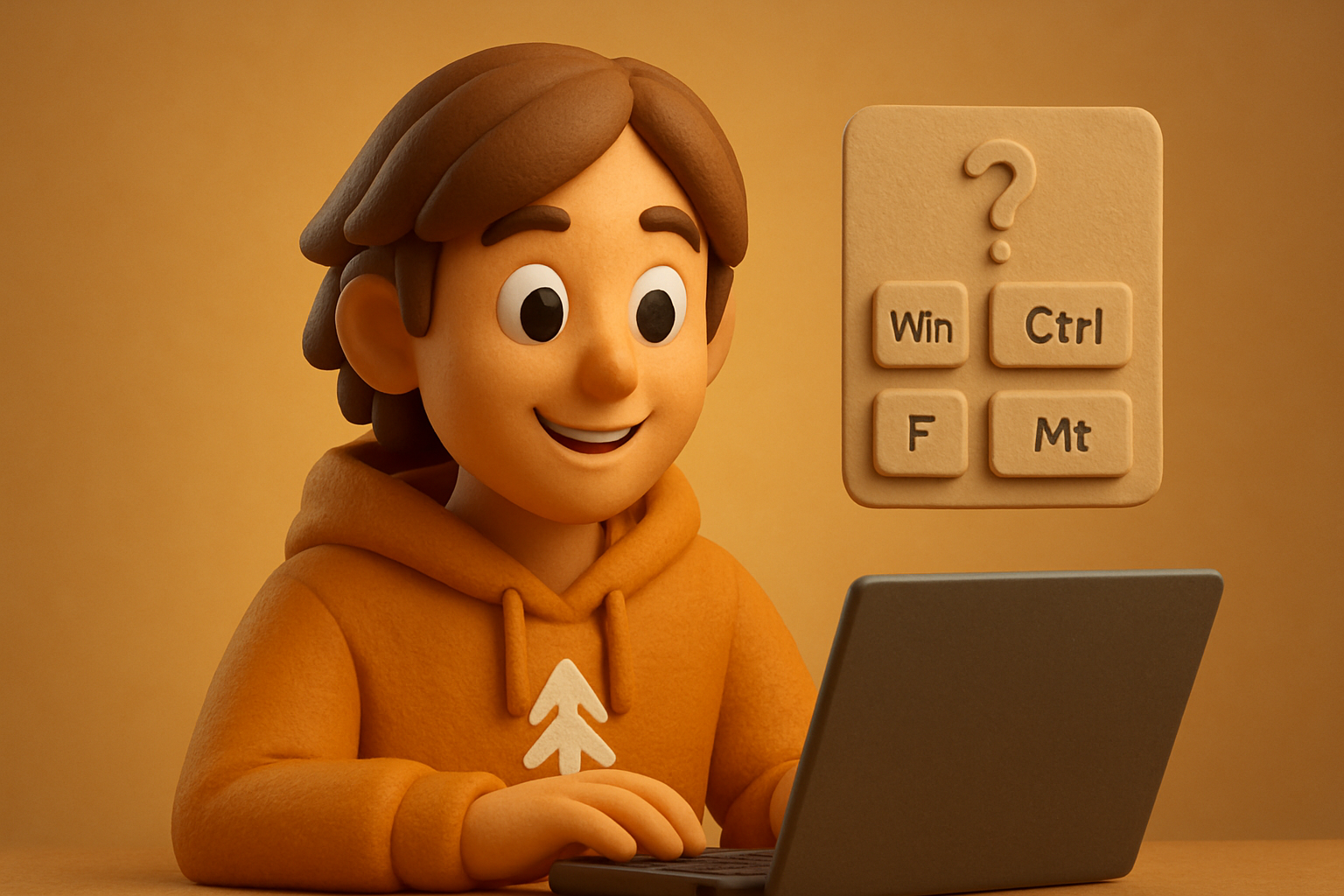
What "5+ hotkeys by default" actually looks like
A kit ships with a shortcuts registry — a single source of truth for every binding the app understands. The SaaS Dashboard ships these out of the box:
// src/shortcuts/defaults.ts
export const defaults = [
  { id: 'help',     combo: 'shift+?', description: 'Show all shortcuts',   group: 'general'    },
  { id: 'palette',  combo: 'mod+k',   description: 'Open command palette', group: 'general'    },
  { id: 'search',   combo: '/',       description: 'Focus search',         group: 'navigation' },
  { id: 'new',      combo: 'c',       description: 'Create new resource',  group: 'create'     },
  { id: 'save',     combo: 'mod+s',   description: 'Save current form',    group: 'create'     },
  { id: 'escape',   combo: 'escape',  description: 'Close dialog / cancel',group: 'general'   },
  { id: 'go-home',  combo: 'g h',     description: 'Go to dashboard',      group: 'navigation' },
  { id: 'go-list',  combo: 'g l',     description: 'Go to resource list',  group: 'navigation' },
] as const
Eight bindings on day one. A user opens the app, hits shift+?, and sees exactly what they can do — without reading docs, without hovering thirty icons, without a tutorial modal they will dismiss in 400 ms.
The registry is consumed by one hook:
import { useShortcuts } from '@otfdashkit/ui'
import { defaults } from '@/shortcuts/defaults'

export function DashboardShell({ children }: { children: React.ReactNode }) {
  useShortcuts(defaults, {
    onNew:     () => router.push('/projects/new'),
    onSave:    () => formRef.current?.submit(),
    onPalette: () => setPaletteOpen(true),
  })

  return <main>{children}</main>
}
That is the whole API. The hook handles modifier detection, key sequencing (g h is a two-key combo, not a single press), input-field suppression (typing g in a textarea must not trigger navigation), and cleanup on unmount. The bindings are data; the wiring is plumbing.
The visible label: a <Kbd> chip, not a tooltip
The shortcut is half the work. The label is the other half. Power users do not memorize — they pattern-match. The visible label has to sit next to the action it triggers, every time.
import { Kbd, Button } from '@otfdashkit/ui'

export function TopBar() {
  return (
    <div className="flex items-center gap-2">
      <Button onClick={onNew}>
        New project
        <Kbd keys={['mod', 'N']} />
      </Button>

      <Button variant="ghost" onClick={openPalette}>
        Search
        <Kbd keys={['mod', 'K']} />
      </Button>
    </div>
  )
}
The chip is platform-aware. macOS shows ⌘ K. Windows shows Ctrl K. Touch devices hide it entirely. The chip is also non-interactive — it is a label, not a button, so screen readers announce it as text, not a focusable element.
This matters. A tooltip that says "Press Cmd+K" disappears in three seconds and vanishes on mobile. A chip stays. The chip is also a teaching artifact: a user who hovers a button and sees ⌘ N next to it has just learned a shortcut without opening the help sheet. Three visits to the top bar and they have the binding.
11 production screens. Login, database, payments — all wired.
The SaaS Dashboard Kit ships everything already connected. Nothing to set up. Live demo at saas.otf-kit.dev.
Building the ? help sheet once, reusing it everywhere
The help sheet reads the same registry. One component, one source of truth, no per-screen duplication:
import { ShortcutSheet } from '@otfdashkit/ui'
import { defaults } from '@/shortcuts/defaults'

export function DashboardLayout({ children }: { children: React.ReactNode }) {
  return (
    <div>
      {children}
      <ShortcutSheet
        trigger="shift+?"          // opens on the binding
        shortcuts={defaults}       // grouped by 'general' / 'navigation' / 'create'
        onDismiss="escape"         // closes on Esc
      />
    </div>
  )
}
Three props. The sheet renders the grouped list, supports type-to-filter (/ inside the sheet, then type to jump to a binding), and closes on escape or backdrop click. Built once. Reused in the SaaS Dashboard, the Fitness kit, the Booking kit — the same component, the same bindings, the same visual treatment on every platform. A binding registered once in defaults.ts appears in every view that consumes the registry: the topbar chip, the help sheet, the command palette, the mobile discoverability page.
Why shortcuts are infrastructure, not a backlog item
The standard argument for shipping without shortcuts is "users will ask if they want them." This is wrong, and here is why:
- The users who want shortcuts do not ask — they leave. They open the app, find it mouse-bound, move on. You never see the churn because they never signed up.
- The users who ask are the bottom of the power-user curve. They have already adapted to mouse. Asking is a courtesy, not a demand.
- Shortcuts are a registry plus a hook plus a sheet — three files, one afternoon per kit. The marginal cost is not a feature. The marginal benefit is that experienced operators stop noticing your app, which is the highest compliment a power user pays.
There is a second reason. Shortcuts are also an accessibility surface. Tab to next field, Enter to submit, Esc to cancel — these are not power-user features, they are the difference between "usable with one hand" and "requires a mouse." A team that treats shortcuts as nice-to-have is accidentally building a one-input device.
What this gets you — the compound effect
The visible labels compound. New shortcuts you ship later inherit the same registry. When you add mod+shift+p for "Publish draft" six months later, it shows up in the help sheet automatically. When you redesign the top bar, the chip moves with the button. When you add a mobile app, the same registry renders as a discoverable list under a "Keyboard shortcuts" item in the settings menu.
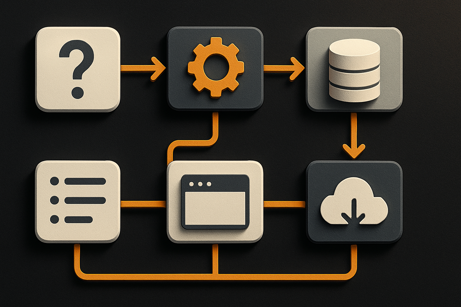
The shortcut registry is the substrate. The chip, the sheet, the command palette, the mobile discoverability page — they are all views over the same data. Build the data once and the views are free. This is the same shape as design tokens: one source of truth, many surfaces, no drift.
Where OTF bakes this in
Every kit ships:
@otfdashkit/uiand@otfdashkit/ui-nativewith auseShortcutshook, a<Kbd>chip, and a<ShortcutSheet>— the same components render on web, iOS, and Android from one codebase.- A pre-populated
shortcuts/defaults.tswith five to eight bindings tuned to that kit's screens. SaaS Dashboard ships the eight above. Fitness kit addsg w(workout),g h(history),space(start/stop timer). Booking kit hasg c(calendar),g b(bookings),n(new appointment). - A 24-item design checklist that runs before the kit ships. "Does the topbar have at least two visible
<Kbd>chips?" is item #11. "Does pressing?open a help sheet?" is item #14. Both fail the build if missing. - AI-tool configs that reference the registry.
CLAUDE.mdand.cursorrulesinclude the shortcut file path and the convention "extenddefaults.ts; do not register shortcuts inline." When an agent adds a feature, it adds the binding too — because the convention is in the prompt.
This is the part that does not change when the framework changes. Hotkeys, visible labels, a ? help sheet — the durable layer underneath the model churn and the design trend churn. A team that adopts OTF ships power-user UX on day one and stops debating whether shortcuts belong in v1 or v2.
One registry. Eight chips on screen. One ? press away from a complete map of the app. The power user who opened your app thirty seconds ago has already voted with their second keystroke — and the answer was in the chip next to the button, the whole time.
Ship the product, not the setup.
- 11 production screens — auth, billing, team, analytics, settings
- Real database, payments, and login — all wired on day 1
- AI configs pre-tuned so your agent extends instead of regenerates