Lucide 1.0 launches with over 1,600 icons and brand icons removed for leaner builds
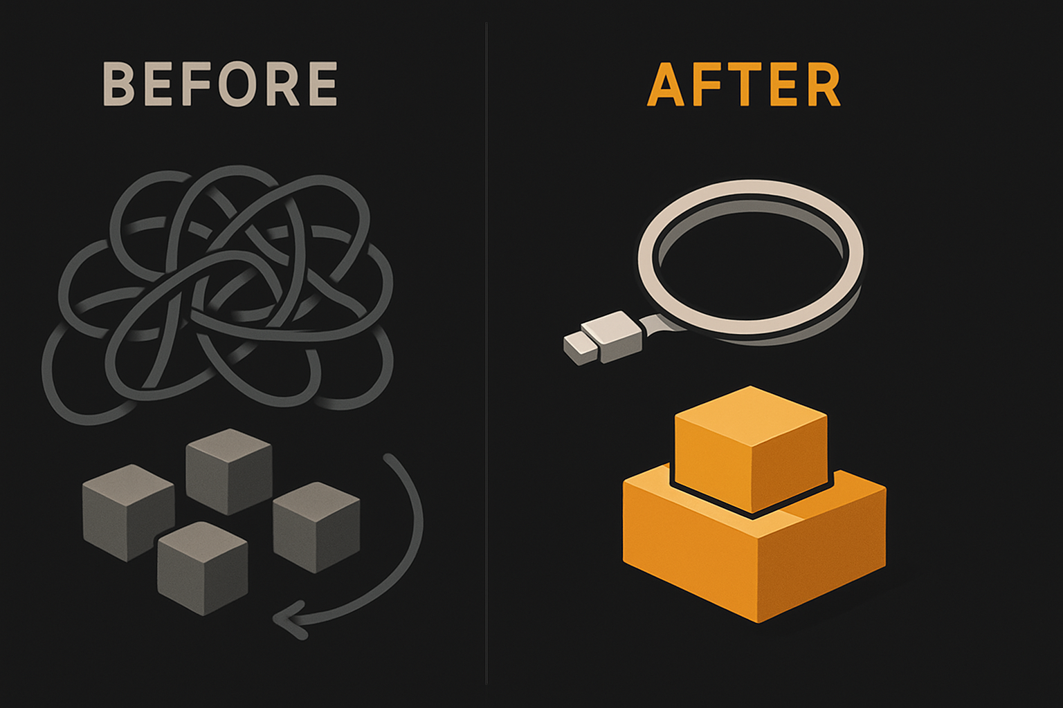
Lucide 1.0 is here, and it changes the way developers ship icons. A 32% bundle size reduction for React, no more legal gray area with brand marks, over 1,600 consistently styled SVGs — all in a single stable package. If you build with React, Vue, Svelte, or Solid, Lucide 1.0 is a clear productivity and performance win.
Why did Lucide remove brand icons in version 1.0?
The most visible change in Lucide 1.0 is that every brand logo — GitHub, Facebook, Figma, Slack, and more — is gone. This isn't a whim, and it isn't just about design taste. Brand icons are a legal risk. The Lucide team cited three concrete drivers: mounting legal pressure from rights-holders, real consistency headaches for the design system, and the time sink of keeping dozens of brands up to date as logos morph.
Brand marks are intellectual property, and redistributing them as part of a general-purpose icon set brings licensing headaches both for maintainers and for the downstream users. The legal threat isn't hypothetical — several open-source icon sets have faced takedown requests, and the climate has shifted. Lucide responded by removing all trademarked icons in version 1.0. Users who still require those logos are pointed directly to Simple Icons, a set purpose-built around brand marks with its own compliance approach.
This move wasn't sprung on the community. One developer on Reddit flagged the signal early in 2020: "Lucide have deprecated brand icons for a while now (2020) and plan to remove them in the future." If you rely on these logos for quick hacks or status chips in interfaces, you'll need to source them from Simple Icons going forward.
The impact for design teams is positive: no more surprise takedowns, one less audit concern, and icons that actually match the visual system everywhere else. For the vast majority of UIs, the benefit is a net gain: consistency over novelty, and legal safety for all downstream adopters.
How much did Lucide 1.0 reduce bundle size?
The numbers here are concrete, and the impact is system-wide. Before 1.0, the lucide-react package clocked in at 11.4 MB. With the 1.0 release, the team cut it by 32.3%, slashing the gzipped size to roughly 1 MB. The underlying mechanism: Lucide dropped the legacy UMD build and now ships only standard ESM and CommonJS outputs. No code bloat from outdated module formats, and no more accidental UMD inclusion.
This is not an edge-case optimization — Lucide reports tens of millions of weekly downloads for React alone, and the project as a whole now exceeds 30 million npm installs a week. Every production build, CI job, and cold start just got meaningfully lighter.
Faster installs, smaller node_modules, and quicker CI runs translate to both developer velocity and user experience. Consider the impact if you're building a large web app, a component library, or distributing across a team:
npm install lucide-react@1.0
# installs ~1MB gzipped, not 11MB
You get smaller JavaScript bundles for your users, meaning faster load times. Your deploys finish faster, and global CDN caches handle less weight. It's not theoretical — 10 MB per app over tens of millions of installs per week is a tangible bandwidth and disk savings.
11 production screens. Login, database, payments — all wired.
The SaaS Dashboard Kit ships everything already connected. Nothing to set up. Live demo at saas.otf-kit.dev.
What are the new features and improvements in Lucide 1.0?
Lucide didn’t just remove icons and recut the package. 1.0 brings real new features for developers:
1. Context providers for every major framework
You can now set shared default props for all icons at once, avoiding noisy, repetitive prop passing in every call site. This is supported in React, Vue, Svelte, and Solid projects:
// React example: set color and size for all icons
import { LucideProvider } from 'lucide-react';

<LucideProvider color="red" size={32}>
  <SomeIcon />
  <AnotherIcon />
</LucideProvider>
Similar context primitives land in Vue, Svelte, and Solid packages, letting every team DRY up config and avoid typo-driven inconsistencies.
2. Modern Angular package
Lucide ships a standalone, up-to-date Angular package — no more shoehorning in React/Vue artifacts.
3. Improved accessibility
aria-hidden is now true by default on every icon, ensuring that decorative icons don’t clutter screen reader output.
4. Consistent codepoints and shadow DOM support
Web font users get stable codepoints for each glyph, and the core lucide package now supports the shadow DOM, making icon integration simpler in web components and modern DOM isolation use-cases.
5. Revamped documentation for every supported library
Each framework — not just React — gets versioned, direct docs, making migration and onboarding smoother.
6. LLMs.txt for AI tooling
Lucide now ships an llms.txt file to help large language models and AI tooling correctly interpret icon metadata and usage.
7. Breaking renames and package updates
Some icons and package names were normalized for clarity. The maintainers published framework-specific migration guides to ease the upgrade, especially when updating code references after icon or package renaming.
Performance, maintainability, and ergonomics all get a lift.
How to upgrade and use Lucide 1.0 in your projects today
Upgrading to Lucide 1.0 is direct but does require some housecleaning. Here’s a clear migration path for the core use cases:
1. Install the latest package for your framework
For React:
npm install lucide-react@1.0For Vue:
npm install lucide-vue@1.0For Svelte:
npm install lucide-svelte@1.0For Solid:
npm install lucide-solid@1.0For Angular:
npm install lucide-angular@1.02. Replace removed brand icons
Any icons that rendered brand logos (e.g., <GitHubIcon />, <FacebookIcon />) are gone in 1.0. Search for usages and replace them with imports from Simple Icons or another dedicated brand logo library.
Sample upgrade script:
// BEFORE (will break in Lucide 1.0)
import { GitHubIcon } from 'lucide-react';

// AFTER
import { SiGithub } from 'simple-icons/icons'; // check docs for exact import
3. Use the new context provider for shared defaults
DRY your props:
// React example
import { LucideProvider } from 'lucide-react';

<LucideProvider color="#222" size={20}>
  <IconA />
  <IconB />
</LucideProvider>
4. Migrate renamed icons/packages and audit for breaking changes
Review the Lucide version 1 guide and framework-specific migration guides to capture all renamed exports and changed APIs. Search especially for imports by icon name as several were normalized or updated.
Pro tip: Automated refactoring scripts or simple regex/find-replace can speed up updates across a large codebase.
5. Read the updated docs
The Lucide team now maintains per-framework documentation, so onboarding to the new context providers or shadow DOM patterns doesn’t mean trawling React-centric guides.
Net outcome: The upgrade is a one-time effort, and all new features are immediately available once you’re on 1.0.
How does Lucide 1.0 compare to other icon libraries?
Lucide’s story is unique: it’s the community-driven successor to Feather Icons. While Feather was lauded for minimalism, Lucide layered on hundreds of new icons — over 1,600 in all — without drifting into bloat. That expansion was deliberate, with the community curating new glyphs to strict SVG and stylistic conventions.
| Library | Icons | Brand Icons | Bundle (React, gzipped) | Community | Use Case |
|---|---|---|---|---|---|
| Lucide 1.0 | 1,600+ | No | ~1 MB | 30M+ weekly npm | Consistent UI, legal use |
| Feather Icons | ~280 | No | Small | Mature, but static | Minimalist, smaller set |
| Simple Icons | 2,500+ | Yes | Varies (often larger) | Large, niche | Brand-centric, logos |
Lucide's removal of brands distinguishes it from Simple Icons. Simple is perfect for branding-heavy dashboards and marketing pages — and only for that use case. Lucide is now squarely a UI toolkit: every icon fits the same stroke, cap, and fill conventions. Install size sits right between Feather (compact, minimalist) and the sprawling brand libraries. With over 30 million weekly downloads, Lucide isn't niche — it's the default icon set for many React, Vue, and Svelte projects.
The result is a toolkit that balances scale, maintainability, and design cohesion. Community feedback remains overwhelmingly positive. One developer on Reddit sums up the draw: “I usually go with Lucide. I like it because the icons are clean, lightweight, and easy to customize, especially in React or Next.”
What this enables
Lucide 1.0’s changes aren’t just for show. Cutting dead weight from every build, eliminating legal unknowns, and standardizing defaults through context providers — these are moves that benefit teams and users at scale.
- Deploy pipelines are faster and more reliable.
- Every icon in the UI matches — no outlier brands warping a system’s aesthetics.
- No license audits needed for icons — legal clarity you don’t have to DIY.
- Performance boosts drop directly into your user’s first contentful paint.
With strong doc coverage, clear community patterns, and no legacy drag, it’s a toolkit you can trust to stick.
Closing
Lucide’s 1.0 milestone isn’t just another version bump — it fundamentally improves how icons slot into modern web stacks. With the removal of brand logos, a 32% bundle size drop, and new context APIs for every major framework, Lucide delivers both performance and legal clarity for millions of projects. The ROI is clear: cleaner code, faster builds, and confidence you’ll never be hit by a logo takedown. Adopt it for React, Vue, Svelte, Solid, or Angular and know your icon pipeline is both lean and future-proof.
Ship the product, not the setup.
- 11 production screens — auth, billing, team, analytics, settings
- Real database, payments, and login — all wired on day 1
- AI configs pre-tuned so your agent extends instead of regenerates