
Unify Web and Mobile Development with OTF's Cross-Platform Components

I've shipped three Buttons to production. The web one lives in your JS bundle. The iOS one is a SwiftUI view. The Android one is a Compose composable. They all say "Primary". None of them look the same.
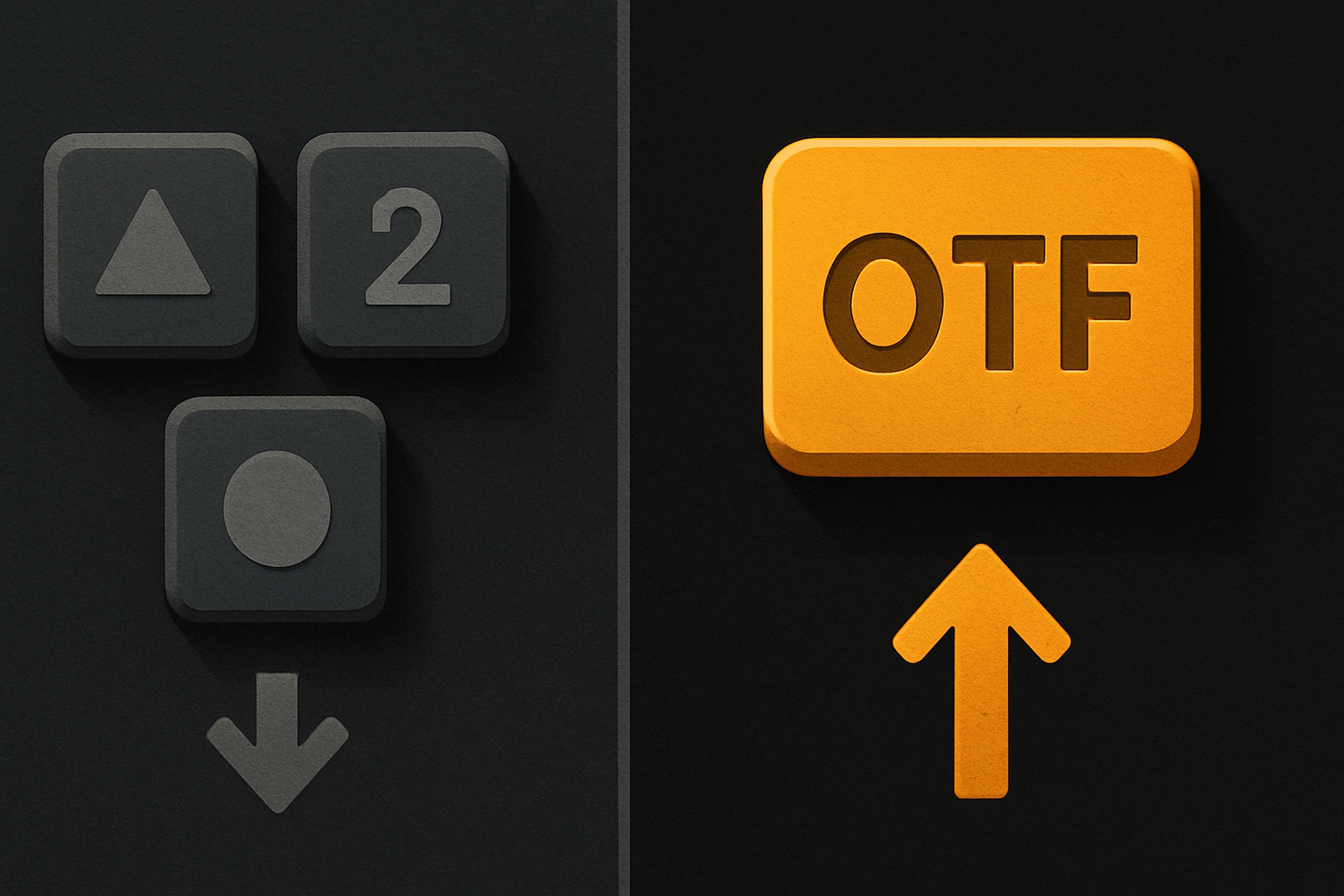
That is the cross-platform tax. You don't see it on day one. You see it in month six — when the web team adds a loading variant, the iOS team is two sprints behind, and Android wrote a third one in a different design system. Three implementations, three design queues, three rounds of brand-color review.
The thesis: a shared component API — same name, same props, three render targets — is the smallest change that fixes the largest cross-platform problem. OTF is built around that bet.
1. The triple-Button problem
Every cross-platform team has three files that look like these:
// web/src/components/PrimaryButton.tsx
export function PrimaryButton({ onClick, children, loading }) {
  return (
    <button className="btn btn--primary" onClick={onClick}>
      {loading ? <Spinner /> : children}
    </button>
  )
}
// ios/PrimaryButton.swift
struct PrimaryButton: View {
var onTap: () -> Void
let label: String
let loading: Bool
var body: some View {
Button(action: onTap) {
if loading { Spinner() } else { Text(label) }
}
}
}// android/PrimaryButton.kt
@Composable
fun PrimaryButton(onClick: () -> Unit, label: String, loading: Boolean) {
Button(onClick = onClick) {
if (loading) Spinner() else Text(label)
}
}Three files. Three review queues. Three implementations of "loading" that handle accessibility differently. The web one has a focus ring; iOS doesn't; Android has it on the wrong side of the touch target.
This isn't a discipline problem — disciplined teams still ship this. It's a runtime problem. The honest fix is to accept the runtime difference and stop duplicating the contract.
2. Why three codebases feel inevitable
They feel inevitable because the runtime IS different. Web runs in a browser engine. iOS runs in Swift on its own view system. Android runs on Compose — a separate renderer on a separate semantics tree. A web component cannot literally execute inside a SwiftUI view; a Kotlin composable cannot literally execute inside a DOM. Pretending otherwise is how teams ship a JavaScript bridge and wake up six months later debugging it.
The honest version of "one codebase" is: same contract, different render. The component name and props are the contract. What runs underneath is whatever each platform does best. That's the only architecture that survives when your iOS developer wants a NavigationStack and your web developer wants a real <dialog>.
One codebase. iOS, Android, and web.
The Fitness Kit ships with auth, a database, and a backend already connected — no setup. Live demo at fitness-preview.otf-kit.dev.
3. The single-API bet
OTF ships ~200 components under two package surfaces. The shape is identical:
npm i @otfdashkit/ui         # web
npm i @otfdashkit/ui-native  # iOS + Android
The import is the same shape on every platform:
// web/button.tsx
import { Button } from '@otfdashkit/ui'
import '@otfdashkit/ui/styles.css'

export function PayNow({ onClick }: { onClick: () => void }) {
  return (
    <Button variant="primary" loading={false} onClick={onClick}>
      Pay now
    </Button>
  )
}
// mobile/button.tsx — iOS or Android, same file
import { Button } from '@otfdashkit/ui-native'
export function PayNow({ onPress }: { onPress: () => void }) {
return (
<Button variant="primary" loading={false} onPress={onPress}>
Pay now
</Button>
)
}Same name, same props, same visual. On the web, Button resolves to platform-native web primitives underneath. On iOS, the same name resolves to a SwiftUI view. On Android, to a Compose composable. The contract is shared; the implementation is whatever the platform does best.
The handler differs in name — onClick on web, onPress on native. TypeScript flags every mismatch at build time, so the divergence shows up before it ships. The variant taxonomy — primary, secondary, ghost, destructive, loading — is identical across platforms. Designers stop arguing about which platform ships the new variant first, because every variant lands on every platform at once.
4. Tokens are the part that actually travels
Components are the visible layer. Tokens are the durable layer. A token is a named value — color, spacing, radius, font — and it's the part that has to be consistent or everything else is noise.
OTF ships one token source. Web reads CSS variables. Native reads generated Swift/Kotlin constants built from the same JSON.
// tokens/tokens.json — one source
{
  "color":   { "primary": { "500": "#5B5BD6" } },
  "radius":  { "md": 8 },
  "spacing": { "3": 12 },
  "font":    { "sans": "Inter, system-ui, sans-serif" }
}
/* web — generated */
:root {
--otf-color-primary-500: #5B5BD6;
--otf-radius-md: 8px;
--otf-spacing-3: 12px;
}// iOS — generated
enum Tokens {
static let primary500 = UIColor(hex: 0x5B5BD6)
static let radiusMd: CGFloat = 8
static let spacing3: CGFloat = 12
}// Android — generated
object Tokens {
val primary500 = Color(0xFF5B5BD6)
val radiusMd = 8.dp
val spacing3 = 12.dp
}Flip #5B5BD6 once in the JSON. Every Button on web, iOS, and Android updates on the next build. No designer ping. No Slack thread asking which platform shipped the new brand. The token travels because it is data, not a style retyped by three different people at three different times.

5. The kit is the part that survives the agent
The cross-platform problem doesn't end at the codebase. It extends into every coding agent that opens the repo. Cursor, Claude Code, Lovable, Bolt, v0 — pick one — they will read your components and propose changes. The default behavior is the worst possible one: the agent sees a Button, doesn't recognize it as OTF's Button, and helpfully rewrites it as a raw <button> with custom CSS. Six prompts later, your design system is gone.
OTF ships the kit with a convention file the agent reads first. Same content, exposed three ways:
<!-- CLAUDE.md -->
# Repo conventions
- Buttons: use <Button> from @otfdashkit/ui / @otfdashkit/ui-native.
  Never raw <button> or native Button().
- Loading: pass `loading={isPending}`. Don't roll your own spinner.
- Colors / spacing / radius: never hardcode. Use tokens.
- A11y: every interactive component has built-in focus, aria-label, and
  keyboard handling. Don't add your own.
<!-- .cursorrules -->
Same content, formatted for Cursor. Buttons → OTF. Tokens → tokens.
No bespoke components for things the kit already covers.<!-- ai/prompts/ -->
Twenty-plus tested prompts for common additions:
- "add a destructive variant"
- "add a Toast that surfaces as a snackbar on native"
- "make this list support keyboard navigation"The convention file is what makes the agent extend the kit instead of replacing it. Swap Cursor for Claude Code, Claude Code for Lovable — the agent reads CLAUDE.md regardless of who you point it at. The kit is the part that doesn't change when the model does. That's the durable layer under the agent churn.
6. Ships to production, not just to your laptop
Most cross-platform kits die at the last mile. You get the kit running locally on day one; six weeks later the team is still arguing about DNS records and iOS signing certificates.
OTF collapses the last mile to one command:
otf shipThe script wires the custom domain, points DNS, provisions TLS, and triggers the mobile build pipeline in one run. Same script whether you're shipping the SaaS Dashboard, the Fitness app, or a custom OTF-shaped project you built from the SDK.
Before any kit ships, a 24-item design checklist runs against it:
otf kit:check
# ✔ contrast ratios pass WCAG AA
# ✔ every interactive component has a focus state
# ✔ tokens referenced, no hardcoded values
# ✔ a11y labels present on icons
# ...
If the check fails, the kit doesn't ship. The cost of one bad Button in production is larger than the cost of slowing the release by an hour.
7. What this gets you in 2026
The free SDK on npm (@otfdashkit/ui, @otfdashkit/ui-native, @otfdashkit/tokens) ships ~200 components under MIT. The full-stack kits — SaaS Dashboard, Fitness, Booking — are $99 each; the Everything Bundle is $149. Fifteen single-page landing templates ship at $9. Every kit and template ships with the AI-tool configs above, so the moment you hand the repo to Cursor or Claude Code, the agent already knows what a Button is.
Distribution is either-or: npm install if your build expects it; the copy-paste CLI if you want components as files you own and rewrite. Either way, you own the code.
Live demos to poke at:
- Web:
saas.otf-kit.dev— SaaS Dashboard end-to-end (auth, billing, DB, Stripe). - Mobile:
fitness-preview.otf-kit.dev— iOS, Android, and web from one codebase.
The part that doesn't change
Three Buttons is not a bug. It's the default outcome of shipping to three runtimes. The fix is not better discipline; it's a contract every runtime honors — same component name, same props, same tokens, same conventions an agent can read.
If you ship web and mobile, you already know the cost. The Button alone doesn't matter. The hundred components drifting in lockstep with it do.
Stop wiring. Start shipping.
- Login, database, and backend already connected — nothing to set up
- iOS + Android + web from one codebase
- AI configs pre-tuned + 40+ tested prompts included