
Why AI-Generated Apps Miss the Real 'Done': Beyond the Demo

The demo looked done. Then I clicked submit on an empty form, and the whole thing came apart in a way no screenshot could have shown me.
A landing page is one render path. An app is at least six — loading, empty, error, recovering, offline, partial-success. AI-generated demos and most hand-rolled ones ship the first two and quietly skip the rest, because screens without states are how a Friday afternoon turns into a Sunday afternoon.
I want to talk about the three states every kit should ship by default — error recovery, bespoke empty states, and skeletons that mirror the layout they're filling — and the concrete design checklist that makes them hard to skip.
What "done" usually means
A component renders once with seed data, looks great, gets screenshotted, ships. The first render is the only render the author watched. The states the user actually hits are the ones the author never clicked into.
I have a habit of clicking the empty input. I delete seed users. I kill the network. I refresh mid-submit. Most "done" apps fall apart at one of those moves, and the failure is always the same shape: a blank panel where data used to be, or a toast that says "Something went wrong" with no path back. The other three states — recovering, offline, partial-success — are variations on the same three patterns. Get these three right and the variations write themselves.
A component isn't done when it renders. It's done when every state has a name, a layout, and a recovery action. That's the standard a real kit holds itself to. The rest of this post is what that looks like in code.
Error states that recover, not just display
Display the error. Cool. Now what? "Something went wrong" is a wall. "Couldn't save — your draft is preserved locally, [retry] or [discard]" is a hallway.
The shape that works:
<FormState
  kind="error"
  title="Couldn't save your changes"
  body="Your edits are kept locally. We'll retry automatically in 12s."
  primary={{ label: "Retry now", onClick: retry }}
  secondary={{ label: "Discard draft", onClick: discard }}
/>
Three things matter: a title that names what failed, a body that tells the user where their work is, and two actions — one to advance, one to escape. Every error component in a shipped kit should follow this shape. If "Something went wrong" lives anywhere in your tree, it's a bug, not a state. The 24-item checklist catches it on review: every error has a title, a body, and both a primary and a secondary action.
11 production screens. Login, database, payments — all wired.
The SaaS Dashboard Kit ships everything already connected. Nothing to set up. Live demo at saas.otf-kit.dev.
Empty states that tell the user what to do next
The generic empty state is an icon, a sentence, and a dead button. It exists to fill a panel. The useful empty state is a sales pitch for the first action:
<EmptyState
  illustration={<InboxIllustration />}
  title="No projects yet"
  body="Projects group related work — boards, docs, runs — so your team sees one picture."
  primary={{ label: "Create your first project", onClick: newProject }}
  hint="Or import from a CSV"
/>
The test: if a new user landed on this state cold, would they know what to click in 5 seconds? If the answer is no, the empty state is decorative. A checklist forces you to answer yes, because the item reads "every list has a primary CTA, a hint, and an illustration that signals the data shape" — and the script that gates the release won't pass without it. The same rule applies to the search panel that found nothing, the inbox with zero messages, the filter that returned an empty set. The empty state is the first time the user sees your product do nothing — make it the moment that teaches the product.
Skeleton loaders that mirror the layout
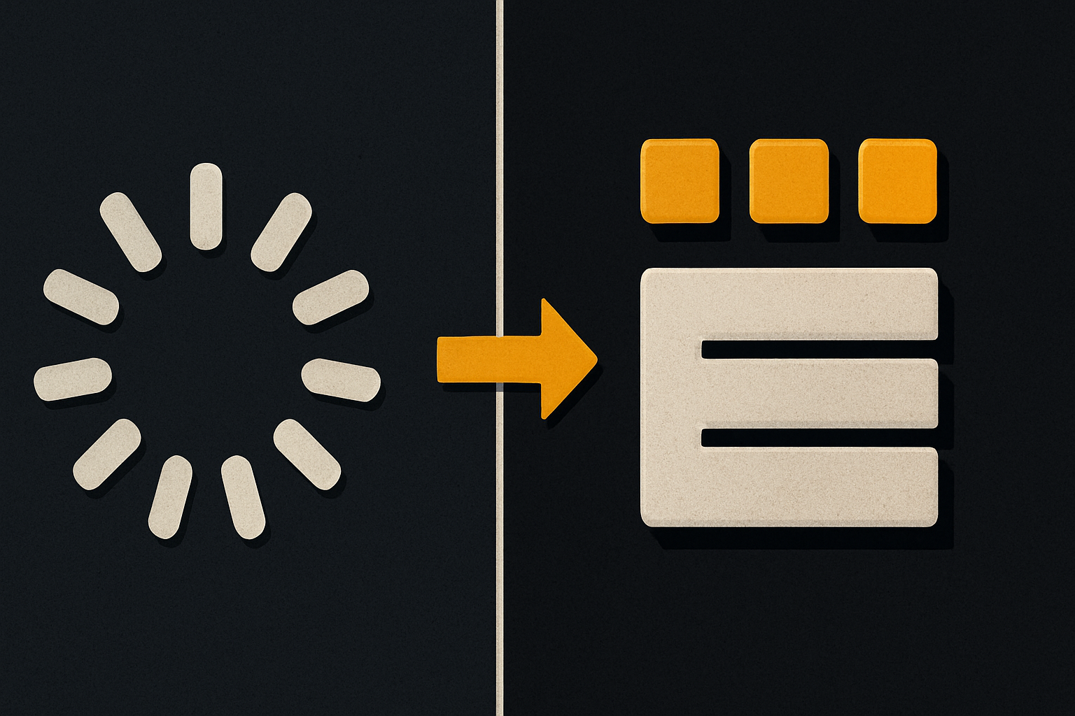
The spinner is the original sin. A spinner in the middle of a layout tells the user "wait", but it doesn't tell the screen "preserve the shape". When the data arrives, the page jumps. Cumulative Layout Shift is the metric, and the spinner inflates it.
A skeleton that mirrors the layout:
<Card>
  <Skeleton block className="h-4 w-1/3" />   {/* title row */}
  <Skeleton block className="h-3 w-2/3 mt-2" /> {/* subtitle */}
  <div className="flex gap-2 mt-4">
    <Skeleton circle className="h-8 w-8" />   {/* avatar */}
    <Skeleton block className="h-3 w-24" />   {/* byline */}
  </div>
</Card>
Widths match the real content. Vertical rhythm matches the real content. When the data lands, the only thing that changes is the gray blocks swap for text. CLS is near zero. The user feels the page is faster even when it isn't, because nothing moves unexpectedly. That's the difference between "loading" as a feeling and "loading" as a placeholder.
The 24-item checklist, broken into five buckets
The bar we ship against is 24 items, grouped:
- Foundations (5) — tokens defined for color, type, space, radius, motion. One theme flips across web and native.
- Components (6) — every primitive renders on web + iOS + Android from the same API; one source of truth for
Button,Input,Card,Dialog,Toast,Skeleton. - States (4) — loading, empty, error, success. Every state has a copy contract, an illustration, and at least one action.
- Forms (3) — inline validation, async submit states, draft preservation.
- Ship (6) — domain, DNS, TLS, mobile build, env validation, AI-tool configs (
CLAUDE.md,.cursorrules, 20+ tested prompts).
The States bucket is the one most teams skip. It's also the one your users feel the most. The script that gates every release reads these 24 items off a config; if any is missing, the build fails. Skipping a state isn't a vibe call — it's a CI failure. You can disagree with the color of the primary button, but you cannot ship a list view without an empty state. The script literally won't let you.
Why AI coding agents default to the first render
An agent reads your code, sees a Card, and renders a Card. It doesn't render a Card that knows what to show when the list is empty, because the empty list isn't in the context window. The agent's "done" is "renders successfully with seed data". The user's "done" is "survives the empty form submit at 11pm on a Tuesday".
The fix isn't a longer prompt. The fix is a convention the agent can't avoid. When the kit ships a useListState(resource) hook that returns { data, error, empty, loading, refetch } and a <List> component that consumes all five, the agent has no choice. It can't render the success case without rendering the other four, because they're the same component:
const { data, error, empty, loading, refetch } = useListState(api.projects.list)

if (loading) return <List.Skeleton count={6} />
if (error)   return <List.Error onRetry={refetch} />
if (empty)   return <List.Empty onCreate={newProject} />
return <List.Items items={data} />
That's the convention. Every list, in every kit, follows it. The 20+ tested prompts shipped with the kit point agents at the same hook, so a new coding tool — Cursor, Claude Code, anything that reads the conventions — extends the pattern, not the screen. That's the part that doesn't change when the model does.
What this enables
A kit that bakes states in isn't slower to build. It's faster, because the empty / error / loading paths are written once, in the kit, and reused across every screen you add. The marginal cost of a new list view is the success case; everything else is free.
Three concrete wins:
- The demo is the product. No more "looks great in the screenshot, breaks on submit" handoff. Every state is in the kit from day one, so a clickable preview is the real thing, not a sand-boxed render.
- The agent extends the convention.
CLAUDE.md+.cursorrules+ the 20+ tested prompts tell the tool which hook to use, which states to render, and which copy contract to follow. A new model ships the same patterns because the patterns are the file, not the prompt. - The build won't lie to you. The 24-item gate runs in CI. A PR that adds a screen without states fails the same way a PR that breaks the build does. There is no path to merge that bypasses the checklist.
If your "done" means "renders once with seed data", you're one empty submit away from finding out it isn't. If your "done" means every state has a name, a copy contract, and a recovery action — and your build won't pass without them — then the demo is the product. That's the only version of done worth shipping.
Ship the product, not the setup.
- 11 production screens — auth, billing, team, analytics, settings
- Real database, payments, and login — all wired on day 1
- AI configs pre-tuned so your agent extends instead of regenerates