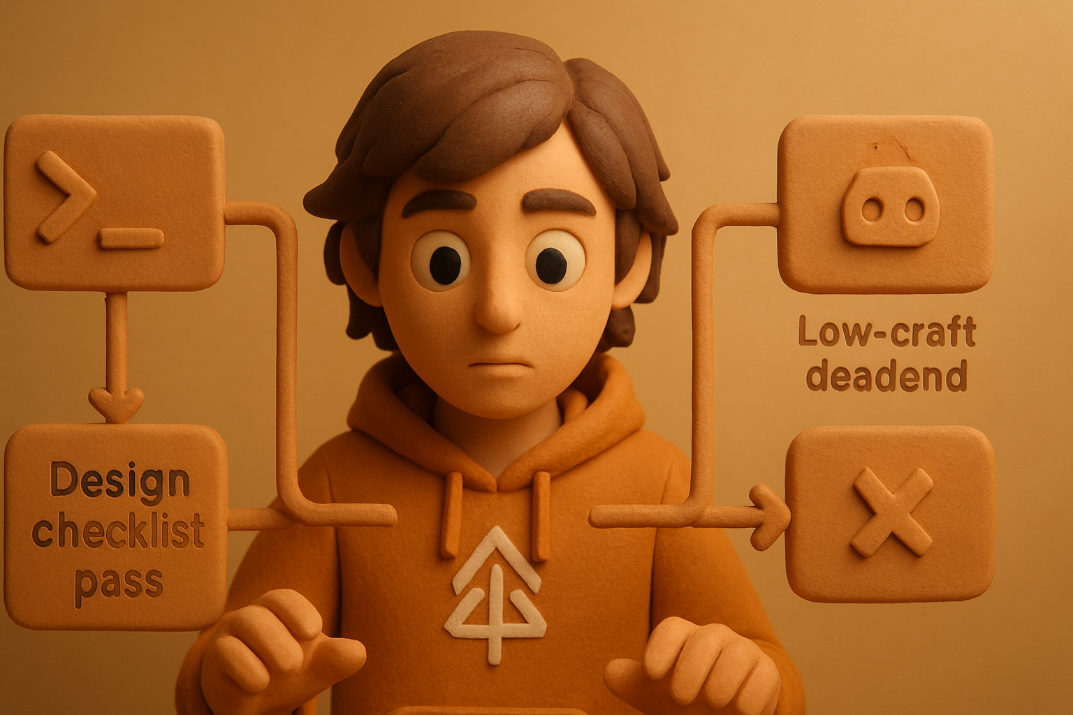
The 24-item design bar every OTF kit must pass before shipping ensures polished, usable product

Every OTF kit ships only after passing a 24-point design checklist — enforced automatically, blocked on failure. This is not cosmetic polish. It’s the reason “basic” dashboards don’t sell: the churn of template packs, AI-generated UI, and brittle clones all fail in the same places. Real craft is now a product feature, and every shortcut is easy to spot in production. Here’s what that means, how we enforce it, and why copying the “minimal” style guarantees you ship an unsellable app.
Basic templates look grown in a test tube
There’s a graveyard of dashboard starters and AI-generated admin panels that “work” but feel wrong. Skeleton templates cut corners: hardcoded hex colors, flaky focus rings, placeholder-agnostic states, no dark mode, the same “no results” message everywhere, whiplash transitions, keyboard traps, context menus that ignore native patterns. The result: a toy.
We’ve seen this up close. Buyers ask “is there a demo?” and inspect details: empty states, keyboard access, palette, motion, dark mode. Even for an intern CRUD app or a showing-to-investors internal tool, these details telegraph whether anyone on the team cared. A basic kit is unsellable even at $9 — the cost to turn it into something production-grade overshadows any amount of code it “saves”.
A script-enforced design checklist clears the bar
The difference between a toy and a durable kit is not effort; it’s standards. Every OTF kit runs a script that blocks a merge if any of the 24 checks fail. UI is not signed-off by the designer — it is proven to exist, tested in dark and light, keyboard navigable, palette-controlled, and resilient to API or data failures.
Here’s a subset of what the checker enforces:
// fails if any [aria-*] is missing on interactive elements
function enforceAriaAttrs() {
  // verify every <Button>, <Input>, <Dialog> contains expected attrs
}

// fails if any color/class is a hex or literal, not a token
function enforceDesignTokens() {
  // scan for /#[a-f0-9]{6}/ or bg-[#...] and block
}

// fails if dark mode or reduced-motion variants are missing
function enforceVisualVariants() {
  // check for ☑️ .dark ☑️ .motion-reduce ☑️ .light
}
This is not theoretical. The script runs in CI for every paid and free kit. Failures are non-negotiable. Most are auto-fixable, some require a design pass, all force a conversation.
11 production screens. Login, database, payments — all wired.
The SaaS Dashboard Kit ships everything already connected. Nothing to set up. Live demo at saas.otf-kit.dev.
A real empty state on every screen
A starter that renders {children} by default and handles “no data” by saying “Nothing here yet” feels dead in every SaaS demo. OTF ships unique empty and error states for every list, table, and chart — with a purpose.
{/* Instead of just: */}
{data.length === 0 && <p>Nothing here yet</p>}

{/* OTF pattern: bespoke illustration, trackable event, action suggestion */}
{data.length === 0 && (
  <EmptyState
    icon="file"
    title="No invoices yet"
    description="Create your first invoice to get started."
    action={<Button onClick={...}>New Invoice</Button>}
  />
)}
A typical kit has 6–12 empty states, each with guided action. Not the same blob and not copy-paste text. The script checks for duplication and for action coverage (e.g., can a user resolve this state?).
Skeletons that match the real layout (not “gray boxes”)
Shapeless loading skeletons are an obvious shortcut. The right pattern: a skeleton component that matches the real shape of the screen, with animated tokens (e.g., bg-muted), no color literals, all tokens defined for both dark/light.
{/* bad: just 3 gray lines */}
<div className="bg-gray-300 h-3 mb-2 w-full" />
<div className="bg-gray-300 h-3 mb-2 w-full" />
<div className="bg-gray-200 h-3 w-1/2" />

{/* OTF: structure matches Card with Avatar, Name, and CTA */}
<CardSkeleton>
  <div className="flex items-center">
    <div className="rounded-full bg-muted h-10 w-10 animate-pulse" />
    <div className="flex-1">
      <div className="h-4 bg-muted w-1/3" />
      <div className="h-2 bg-muted w-2/3 mt-2" />
    </div>
  </div>
  <div className="mt-4 h-8 bg-muted w-full" />
</CardSkeleton>
The script diffs element trees to catch mismatches between Skeleton and their non-skeleton listitem parents. Skeletons are a contract: what appears loading must match loaded.
Focus-visible and keyboard is not optional
If you cannot tab through every button, link, modal, and command menu, the kit fails. Focus rings are not a browser default haze — they must use a design token and be visible in both themes.
/* OTF: tokens, always visible when :focus-visible */
.button:focus-visible {
  outline: 2px solid var(--color-ring);
  outline-offset: 2px;
}

/* enforced in both .light and .dark, never #333 or #fff */
A script-driven check will crawl the built UI, tabbing and shift-tabbing, flagging any element that doesn’t render a visually obvious focus ring.
Motion on every mount/unmount (and everywhere it matters)
Perceived quality tracks motion. No-scale templates lack any animated mounts, soft fades, or page transitions. OTF kits animate every modal, toast, dropdown, and a standard mount for the top-level route.
<Dialog.Root>
  <AnimatePresence>
    {open && (
      <motion.div
        initial={{ opacity: 0, y: 16 }}
        animate={{ opacity: 1, y: 0 }}
        exit={{ opacity: 0, y: 16 }}
        transition={{ duration: 0.24, ease: "easeOut" }}
      >
        <Dialog.Content>{children}</Dialog.Content>
      </motion.div>
    )}
  </AnimatePresence>
</Dialog.Root>
The linter crawls for mount/unmount animations on Dialog, Popover, and main Page wrappers. It enforces a minimum tokenized timing and readable curves (no 0ms or raw numbers).
Command palette, keyboard to everything
Every OTF kit ships a functional Cmd-K palette (including on Windows, where it’s Ctrl-K) — covering all navigation and key entity actions. A separate navigation audit script verifies there is a keyboard-driven path to every link, list, modal, and input.
<CommandPalette
  commands={[
    { label: "New Invoice", shortcut: "cmd+n", action: () => ... },
    { label: "Invoices", shortcut: "g i", to: "/invoices" },
    // + all sidebar links
  ]}
/>
The script checks all actions are keyboard-addressable and present in the palette, with collision detection and coverage for all top-level entities.

Dark and light, enforced with design tokens (never hex literals)
No color value appears outside @otfdashkit/tokens. If a button or background uses #FAFAFA or #222, it's a block. All classes resolve to CSS variables (web) or theme tokens (native). Dark and light variants are visually reviewed and diffed.
// design tokens file
export const colors = {
  background: { light: "#FAFAFA", dark: "#111113" },
  ring: { light: "#D1D5DB", dark: "#374151" },
  // ...
}

// usage
<div className="bg-background text-foreground" />
<button className="focus-visible:outline-ring" />
A linter prevents commits with any file matching /#[0-9a-f]{6}/i or containing rgb(...) not from a token. On native, Tamagui tokens route to the same palette, so the web and app kits stay visually locked.
All checks, no skipped steps
If a kit fails a single item — a missing empty state, a hardcoded color, an action only accessible by mouse — it does not ship. The pass ledger is displayed in CI, blocking merges and alerting on Slack. This is the product: the difference between a kit that feels like someone’s first React Saturday and one that lands as a $99 starter.
Here’s an abbreviated ledger:
| Check | Required? | CI Enforced |
|---|---|---|
| Unique empty state per table | ✅ | ✅ |
| Focus-visible ring as token | ✅ | ✅ |
| Cmd-K palette w/ all routes | ✅ | ✅ |
| Dark and light, no hexes | ✅ | ✅ |
| Layout-matched skeletons | ✅ | ✅ |
| End-to-end keyboard nav | ✅ | ✅ |
| Mount/unmount token motion | ✅ | ✅ |
| Error state per async action | ✅ | ✅ |
| All design tokens, never RGB | ✅ | ✅ |
| Context menu on all table rows | ✅ | ✅ |
| ...and 14 more | ✅ | ✅ |
Every line is a blocking requirement, not a stretch goal.
What this enables: landing real buyers, not browsers
A template “with code you can copy” is not a product feature. A kit that feels finished and opinionated out of the box closes buyers who have auditioned three or four competitors and noticed the dead ends: missing actions, unstyled inputs, blank pages where data should be. It is not just about “wow factor” — it is about being able to ship an MVP, investor demo, or seed product without weeks of refactoring.
More: real design discipline is an AI multiplier. Kits that use tokens, structured layouts, and deterministic UI are dramatically more extendable with coding tools and agents. Prompting a model to “add an entity” works better if every part has ownership, tokens are discoverable, and the palette is shaped. OTF kits ship with playground CLAUDE.md configs and AI prompt guides knowing this is what enables the stack.
Treating craft as a feature — not a post-hoc fix
“Basic” is not a neutral default — it’s half-finished. Buyers can spot the copy-pasted palette and duplicated “empty state” a mile away. We treat design fit and UI completeness as a core product feature, measured, enforced, and surfaced as a selling point. The script leaves no gray areas: a kit passes, or it doesn't ship.
Write the script, pass the 24 checks, and ship with pride: that’s the difference between yet another template, and a product people will actually pay for.
Ship the product, not the setup.
- 11 production screens — auth, billing, team, analytics, settings
- Real database, payments, and login — all wired on day 1
- AI configs pre-tuned so your agent extends instead of regenerates