
Why Dark Mode Requires a Dual-Design Approach from the Start
Dark mode done properly is not a stylesheet that flips white to black. It's a second, separately-designed surface hierarchy — its own contrast decisions, its own shadow language, its own elevation rules. When the token system is built for both from day one, every component renders correctly in both with a single attribute swap. When it's bolted on later, surfaces bleed the wrong tint, shadows compound in the wrong direction, and the dark theme reads as an afterthought.
I learned this the hard way on a SaaS dashboard in 2024. I shipped v1 in light mode, then added a dark theme the next sprint by flipping a handful of CSS custom properties. The pages looked OK in isolation. The moment components stacked — a card on a sheet on a modal on the page — the depth cues collapsed. The "raised" card ended up DARKER than the canvas behind it. Drop shadows turned into black halos on a near-black background. The brand green went sickly because I had inverted the HSL value without re-deriving the saturation. The codebase had maybe forty components and every one of them had to be revisited.
The fix is to bake dark mode into the token shape from day one, not to bolt it on. Here's what that actually means.
What "elevation" means in light mode
In a light theme, elevation is signalled by two channels working together: a brighter raised surface, and a longer, softer shadow beneath it. A button on a card on a page reads as three discrete depth layers because the canvas is the dimmest surface, the card is whiter than the canvas, and the button is the whitest of all — with three different shadow recipes stacked underneath.
// elevation token — light theme
const elevation = {
  canvas:   { surface: '#FAFAFA', shadow: 'none' },
  raised:   { surface: '#FFFFFF', shadow: '0 1px 2px rgba(0,0,0,.06), 0 1px 1px rgba(0,0,0,.04)' },
  overlay:  { surface: '#FFFFFF', shadow: '0 4px 12px rgba(0,0,0,.08), 0 2px 4px rgba(0,0,0,.04)' },
  modal:    { surface: '#FFFFFF', shadow: '0 24px 48px rgba(0,0,0,.16), 0 8px 16px rgba(0,0,0,.08)' },
}
Notice the pattern: as elevation rises, the surface gets brighter and the shadow gets heavier. Both channels agree.
The dark-mode flip most apps get wrong
Now reverse it naively:
// naive dark theme — surfaces get darker, shadows get heavier
const darkElevation = {
  canvas:   { surface: '#0A0A0A', shadow: 'none' },
  raised:   { surface: '#000000', shadow: '0 1px 2px rgba(0,0,0,.6), 0 1px 1px rgba(0,0,0,.4)' },
  overlay:  { surface: '#000000', shadow: '0 4px 12px rgba(0,0,0,.8)' },
  modal:    { surface: '#000000', shadow: '0 24px 48px rgba(0,0,0,.9)' },
}
Two things just broke. First, the raised surface is now darker than the canvas, so the card sinks into the page instead of lifting off it. Second, the shadows are functionally invisible — black on black — so the depth cue collapses entirely. The component doesn't look raised; it looks like a smudge.
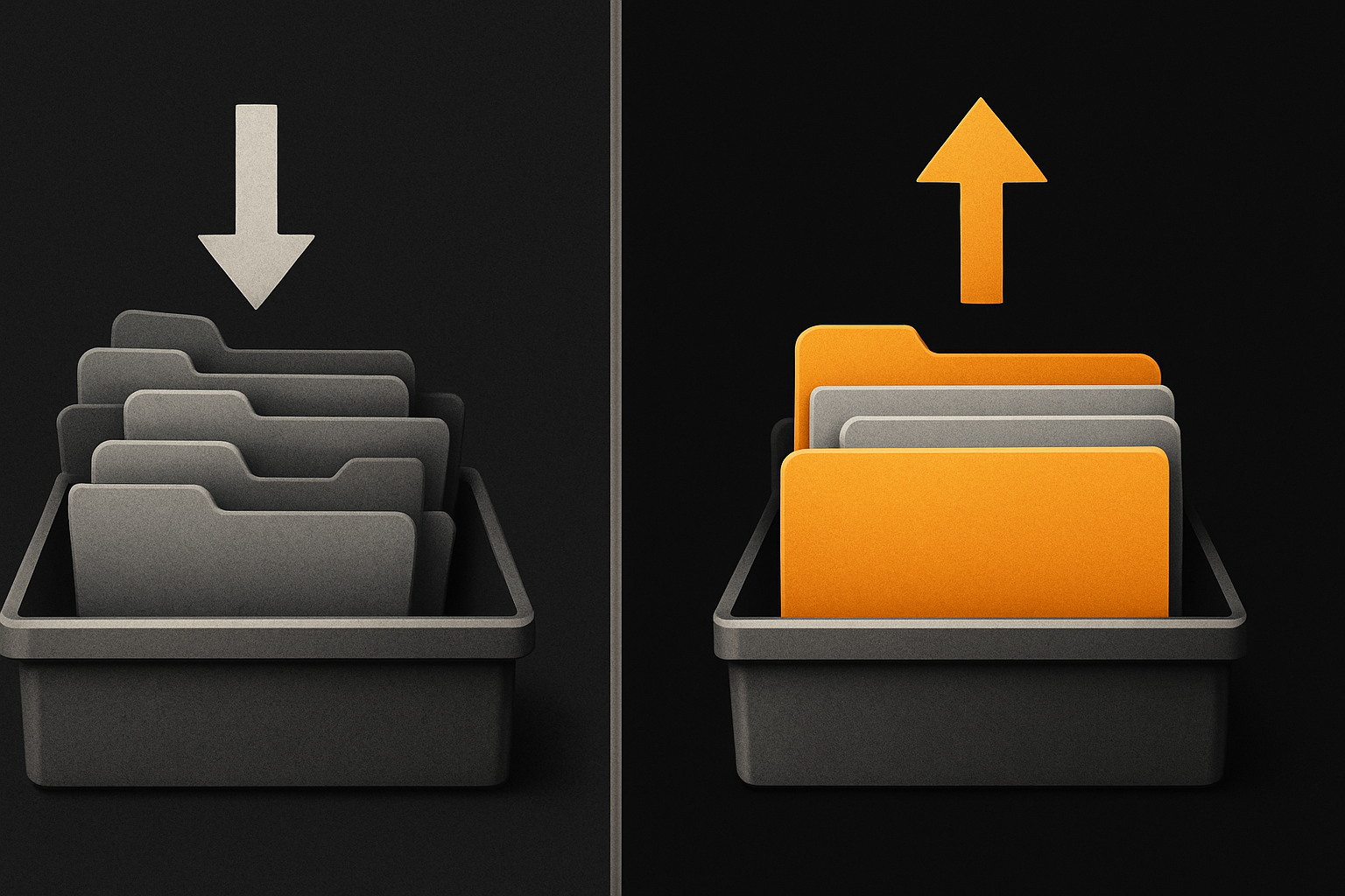
The dark-theme rule most bolt-on attempts miss is that elevation inverts in shape, not in direction. The modal still has to feel "above" the overlay still has to feel "above" the raised still has to feel "above" the canvas — but in dark mode you signal that with a lighter surface tint (brighter than the canvas) and a softer, often coloured shadow, not with a darker surface and a blacker shadow.
11 production screens. Login, database, payments — all wired.
The SaaS Dashboard Kit ships everything already connected. Nothing to set up. Live demo at saas.otf-kit.dev.
The token shape that makes both work
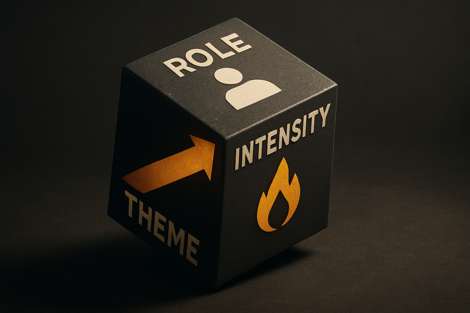
The token has to encode three independent axes: surface role (canvas / raised / overlay / modal / accent), intensity tier (resting / hover / pressed / focus), and theme (light / dark / high-contrast). Not two of them. All three.
type Role = 'canvas' | 'raised' | 'overlay' | 'modal' | 'accent'
type Intensity = 'rest' | 'hover' | 'pressed' | 'focus'
type Theme = 'light' | 'dark'

// one token, two complete themes
const surface: Record<Theme, Record<Role, Record<Intensity, string>>> = {
  light: {
    canvas:  { rest: '#FAFAFA', hover: '#F4F4F5', pressed: '#E4E4E7', focus: '#FAFAFA' },
    raised:  { rest: '#FFFFFF', hover: '#FAFAFA', pressed: '#F4F4F5', focus: '#FFFFFF' },
    overlay: { rest: '#FFFFFF', hover: '#FAFAFA', pressed: '#F4F4F5', focus: '#FFFFFF' },
    modal:   { rest: '#FFFFFF', hover: '#FAFAFA', pressed: '#F4F4F5', focus: '#FFFFFF' },
    accent:  { rest: '#FFFFFF', hover: '#F8FAFC', pressed: '#F1F5F9', focus: '#FFFFFF' },
  },
  dark: {
    canvas:  { rest: '#0A0A0A', hover: '#171717', pressed: '#262626', focus: '#0A0A0A' },
    raised:  { rest: '#171717', hover: '#1F1F1F', pressed: '#2A2A2A', focus: '#171717' },
    overlay: { rest: '#262626', hover: '#2F2F2F', pressed: '#3A3A3A', focus: '#262626' },
    modal:   { rest: '#2F2F2F', hover: '#383838', pressed: '#404040', focus: '#2F2F2F' },
    accent:  { rest: '#1E293B', hover: '#273449', pressed: '#314158', focus: '#1E293B' },
  },
}
The relationship between canvas and raised is preserved in both themes: raised is brighter than canvas. The absolute values flip — but the contrast direction is identical. That's the entire trick.
Three things that break when you bolt dark mode on
Failure A — inverted brightness without re-deriving elevation. A card that uses var(--surface) for its background reads as a black slab on a black canvas. The fix: the token gives you surface.raised[theme][intensity] so the component never asks "what colour am I in dark mode" — it asks "what role am I."
Failure B — shadows copied verbatim from the light theme. box-shadow: 0 4px 12px rgba(0,0,0,.08) on a dark surface is functionally invisible. Dark-theme shadows need to be lighter in colour, not darker in opacity — a translucent white at low alpha creates the right separation without the puddle effect.
const shadow = {
  light: { raised: '0 1px 2px rgba(0,0,0,.06)',  modal: '0 24px 48px rgba(0,0,0,.16)' },
  dark:  { raised: '0 1px 2px rgba(255,255,255,.06)', modal: '0 24px 48px rgba(0,0,0,.6), 0 0 0 1px rgba(255,255,255,.06)' },
}
The dark modal shadow adds a 1px translucent-white ring — that's the standard Material 3 dark-mode trick: shadows are useless past a certain elevation, so you substitute a hairline outline.
Failure C — brand accent inverted 1:1. A green that worked at HSL 150 60% 40% does not become a good green at 150 60% 60%. Saturated colours lose perceived chroma at higher luminance. Fix: the dark-theme brand palette is authored, not derived:
const brand = {
  light: { primary: '#0F766E', success: '#16A34A', warn: '#D97706', danger: '#DC2626' },
  dark:  { primary: '#2DD4BF', success: '#4ADE80', warn: '#FBBF24', danger: '#F87171' },
}
The dark-theme primary isn't the light-theme primary inverted — it's a new colour picked from the same hue family, with the luminance and chroma re-tuned for a dark background. Same identity, different recipe.
The cross-platform wrinkle
iOS and Android have their own elevation conventions and they don't agree with each other, or with the web.
- iOS / HIG: elevation is rendered as a translucent overlay on the base material, not a solid surface. A raised card on iOS in dark mode is the canvas with a 4% white tint blended on top. Shadows are reserved for the very top of the stack.
- Android / Material 3: elevation is tonal — the surface picks up a hue-shifted lift from the base. Dark-mode surfaces get brighter, not darker, as elevation rises, and the hue is biased toward the primary.
- Web: no convention. Whatever you decide.
A token that only encodes theme: 'dark' can't express any of these. A token that encodes role × intensity × theme can, because the platform-specific renderer decides what each role means:
// same token read by three renderers
const card = surface[theme].raised[intensity]

// web:     card -> background-color + drop-shadow
// iOS:     card -> UIVisualEffectView with card-tinted overlay
// Android: card -> Compose Surface with tonalElevation = raised
The component code is identical across platforms. The renderer interprets the role. That's how the same <Card> ships on iOS, Android, and web with correct depth cues in both themes — one API, one source of truth.
One component, one codebase, two correctly-designed surfaces
Put it together and a Card reads tokens, not colours:
function Card({ tone = 'rest', children }: { tone?: Intensity; children: React.ReactNode }) {
  return (
    <div
      data-theme={theme}                          // flips the whole subtree
      style={{
        background: surface[theme].raised[tone],  // raised role, current theme, current intensity
        boxShadow:  shadow[theme].raised,
        border:     `1px solid ${line[theme].subtle}`,
      }}
    >
      {children}
    </div>
  )
}
Swap data-theme="dark" on the root and every Card, Sheet, Modal, Tooltip, Toast re-skins itself — because none of them ever hard-coded a colour. They asked the token "what role am I in this theme at this intensity" and the token answered.
What this gets us
A second surface hierarchy that doesn't ship as an afterthought. A single <Card> that renders correctly on web, iOS, and Android in both themes — same component name, same props, same look. A theme swap that's an attribute, not a rewrite. The ability to ship a third theme (high-contrast, branded partner, OLED-true-black) without forking a single component.
Dark mode is the easy-looking thing that quietly punishes you two redesigns later. The fix isn't a filter and it isn't a CSS-variable override — it's a token system authored for both surfaces from the first commit. That's the part of a component kit that doesn't break when the next visual trend lands, and it's the part that survives being ported from web to iOS to Android without losing its depth cues.
The free MIT component kit on npm ships with tokens shaped this way from day one — role × intensity × theme, with every surface in every tier authored, not derived, so a single attribute swap re-skins the entire surface hierarchy coherently. Lovable, Bolt, v0, and Cursor can each generate a styled landing page in an afternoon; none of them will hand you a token system you'll still respect on the third redesign. The kit's the part you keep.
Ship the product, not the setup.
- 11 production screens — auth, billing, team, analytics, settings
- Real database, payments, and login — all wired on day 1
- AI configs pre-tuned so your agent extends instead of regenerates