
Achieve True Cross-Platform Parity: One API, One Component, Consistent Output Across Web and Na

The promise, and the bar
Write a button. Ship it to web, iOS, and Android — same name, same props, same pixels. The honest version of that promise is harder than the lie most "cross-platform" libraries ship. They give you two packages that look similar in screenshots and drift apart the moment a designer opens Figma next to a phone.
The bar isn't screenshots. The bar is a contract that holds across every surface, enforced at build time, and known to every file, every developer, and every AI agent touching the codebase.
What parity actually means
Three things have to be identical, or the abstraction leaks the moment a real user opens the app:
| What | Why it has to match |
|---|---|
| Component name | <Button> in every file, on every platform. Not <Button> on web and a Pressable wrapped in a custom Button on native. The name is the contract. |
| Props | variant, size, disabled, onPress, loading — same shape, same values. A token like size="md" should mean the same height in pixels on web and points on iOS. |
| Visual output | Same colors from the same tokens. Same border radius. Same typography. Same disabled opacity. Same focus ring where the platform has one. |
If any of those drift, the codebase forks — not in the repo, but in the developer's head, and in the AI agent's context.
Same component. Web and mobile. One codebase.
The free, open-source SDK gives you components that work the same on web and mobile — one codebase. github.com/otf-kit/sdk
Where the naive approach breaks
The naive approach is "reuse React." It fails in three concrete places, all obvious in retrospect.
1. Web CSS doesn't compile to native
A <div style={{ display: 'grid', gap: 16 }}> works in the browser. It doesn't compile to a native view tree. A CSS animation that ships through your web motion library doesn't exist in the native runtime. Either every styled component gets rewritten for the native renderer, or "shared components" means "components that look shared in the screenshots."
// Web — works
<Card style={{ display: 'grid', gridTemplateColumns: '1fr 1fr' }}>
  <Stat label="MRR"   value="$48.2k" />
  <Stat label="Churn" value="1.4%" />
</Card>

// Native — silently degrades or errors
<Card style={{ display: 'grid', gridTemplateColumns: '1fr 1fr' }}>
  ...
</Card>
Same name, same props, wrong layout.
2. The press target is a different primitive
On web, a button is <button>. On native, the equivalent is Pressable, TouchableOpacity, or TouchableHighlight — and each has subtly different feedback timing, accessibility behavior, and pressed-state styling. A "shared" component that picks one will feel wrong on the other.
// Web: real <button> with focus ring, keyboard activation, form submit
<button onClick={handleSubmit}>Save</button>

// Native: Pressable with its own ripple, scale, and a11y label
<Pressable onPress={handleSubmit} accessibilityRole="button">
  <Text>Save</Text>
</Pressable>
A wrapper that hides both behind a single <Button> has to decide things about focus rings, hit slop, and pressed feedback that won't be right for both surfaces.
3. Tokens don't map one-to-one
A design token is a number with a name. --space-4 is 16px on web, 16pt on iOS, and 16dp on Android — close, not the same. Font sizes, line heights, and border radii all need platform-aware scaling. A naive token import either looks too tight on iOS or too loose on Android.
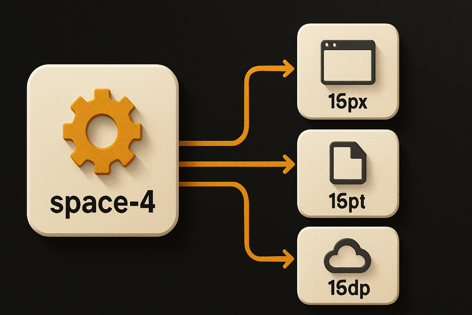
The fix isn't a stylesheet. It's a token pipeline that knows which platform is consuming the value.
What "the same component" actually requires
Once you've hit all three failure modes, the solution shape is obvious:
- A single import path per surface that resolves to a platform-appropriate implementation. On web you import from
@otfdashkit/ui; on native from@otfdashkit/ui-native. Names and props match exactly because the build enforces it. - Tokens as the only source of color, spacing, radius, and type. No hardcoded
#3B82F6in a component. Nopadding: 12pxin a style block. A brand color change lands on every platform in the same build. - A parity check at build time, not a screenshot review. A script diffs the prop signatures of every component across both packages. If
<Button>acceptssize="xs"on web but not on native, the build fails.
This is the part most libraries skip. They ship two packages and trust the developer to keep them in sync. The drift shows up six months later, in production, on a Tuesday.
The SDK shape
Two surface packages and a tokens package. Each component exists in both with the same name, same prop signature, and the same variants. The implementation differs; the contract doesn't.
// Web
import { Button, Card, Input, Stack } from '@otfdashkit/ui'

// Native
import { Button, Card, Input, Stack } from '@otfdashkit/ui-native'
Both expose Button with variant: 'primary' | 'secondary' | 'ghost', size: 'sm' | 'md' | 'lg', disabled, loading, onPress. A component that adds a new variant on one surface without the other fails the parity check.
A real screen looks the same on both surfaces — the import is the only thing that changes:
// app/screens/Paywall.tsx
import { Button, Card, Stack, Text, Heading } from '@otfdashkit/ui' // or ui-native

export function Paywall({ onSubscribe }: { onSubscribe: () => void }) {
  return (
    <Card>
      <Stack gap="md">
        <Heading level={2}>Pro plan</Heading>
        <Text>Unlimited projects, priority support.</Text>
        <Button variant="primary" size="md" onPress={onSubscribe}>
          Subscribe — $19/mo
        </Button>
      </Stack>
    </Card>
  )
}
The native version ships to TestFlight, the web version ships to a CDN, and a designer reviewing both builds sees no drift.
The tokens package is what makes the visual output match. A theme is a single object:
// app/theme.ts
import { defineTheme } from '@otfdashkit/tokens'

export const theme = defineTheme({
  colors: {
    primary: '#3B82F6',
    surface: '#FFFFFF',
    text:    '#0F172A',
  },
  radius: { sm: 4, md: 8, lg: 12 },
  space:  { sm: 8, md: 16, lg: 24 },
})
Both surface packages consume that exact theme object. Change primary to #8B5CF6 and every component on every platform updates on the next build — no second PR, no manual sync, no "did we update the iOS bundle?".
Where parity still doesn't exist
This isn't a magic trick. There are places where same name, same props, same tokens still produce different output, and you should know them before you commit:
- System fonts. iOS ships San Francisco, Android ships Roboto, web defaults to whatever the OS gives you. The SDK lets you pick a font stack; it can't make San Francisco render on Android.
- Safe areas. Web doesn't have a notch. iOS and Android do. Components anchored to the bottom of a screen still need platform-specific safe-area handling.
- OS-specific gestures. Swipe-to-delete on iOS is a long-press on Android by default. The SDK exposes the primitive; the gesture map stays platform-specific by design.
- Iconography. SF Symbols on iOS, Material Icons on Android, your own SVG set on web. Same icon name, different glyphs.
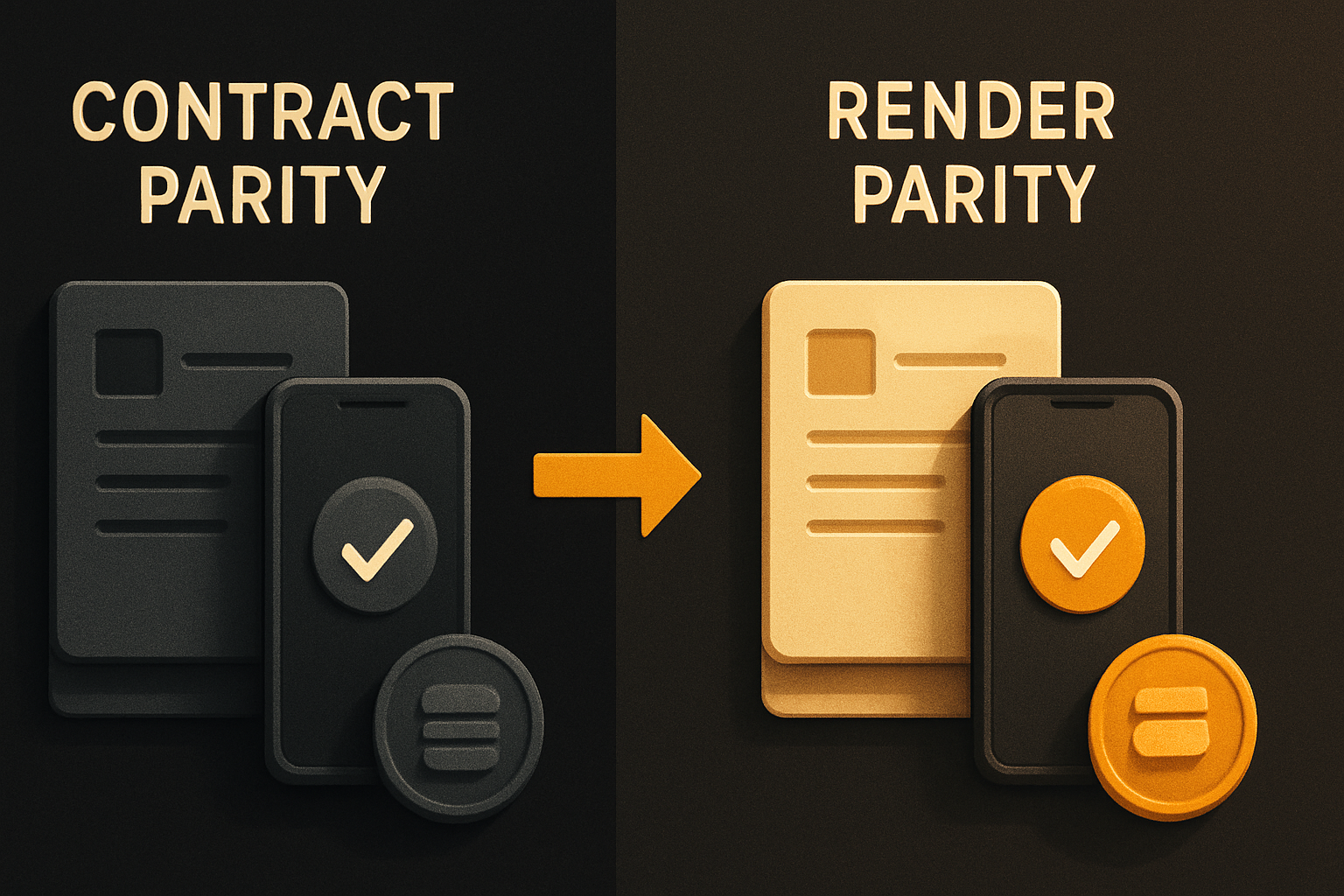
Knowing the boundary is what makes the abstraction trustworthy. A library that claims pixel-perfect parity across web and native is lying about the fonts. A library that claims name-and-prop parity and ships tokens that match is being honest about what "the same component" can mean.
What this enables
A unified component contract changes three workflows at once.
Designers stop maintaining two Figma libraries. One source of truth, with platform-specific notes where rendering genuinely differs. Review becomes a single sign-off.
Developers stop maintaining two component files. The same Paywall.tsx compiles to web and native. A bug fix lands once, ships to both.
AI coding agents stop hallucinating divergent APIs. When the agent reads Paywall.tsx and sees Button imported from the surface package, it knows the prop surface. When it sees the same import on the native file, it knows the prop surface is identical. The 20+ tested prompts that ship with each kit anchor on that contract — they don't have to guess the variant names, the size scale, or the disabled semantics.
The durable layer isn't the framework, the runtime, or even the tokens. It's the contract: the same name, the same props, the same visual output, enforced at build time. The framework changes every 18 months. The contract survives.
Closing
The naive approach to cross-platform is "reuse React." The honest approach is "reuse the contract." Same name, same props, same tokens, enforced parity check, platform-appropriate implementation under the hood. That's the part of the stack that doesn't change when the framework does — and it's the part an AI agent can actually extend without rewriting the design system from scratch.
Try it on one screen. Import Button, write a small Card with a heading, a paragraph, and a CTA. Ship it to web and to a simulator. The contract holds, or the build fails and tells you why. That's the bar.
Buy once, own the code. Ship with the agent you already use.
- Free, open-source SDK — same component, web and mobile
- Paid kits include AI configs + 40+ tested prompts — your agent reads the whole project
- $99/kit or $149 for everything. No subscription, no sandbox limit.