
Achieve smooth UI/UX with Unified Components Across Web and Mobile

Three platforms, one Button. Same hover state, same focus ring, the same 16px radius. When it works, it's the closest thing to a free lunch engineering has ever shipped — you write <Button> once and your web app, your iOS build, and your Android build all pick up the change.
When it doesn't work, you find out at the worst possible moment. Your designer hands you a Figma with a 12px radius update and you discover that "cross-platform" was a wish, not a fact. The Button on web rounded to 12. The Button on iOS is still 16. The Button on Android is whatever the platform defaults decided. You have three components now, pretending to be one.
This post is about the part of cross-platform that nobody puts on a launch slide: keeping the components in lockstep after the demo stops recording. OTF ships a pattern for it — same component name, same props, same look — across web and native, with one API surface. Below is what that actually looks like in code, why it holds up under an AI agent's worst impulses, and the small set of habits that keep it from drifting.
1. The cross-platform dream, stated honestly
A few things are genuinely true in 2026 that were not true five years ago:
- A single component can compile to native iOS and Android, with the platform's actual primitives underneath.
- A design token can be one variable that resolves to CSS variables on web and to native theme values on iOS/Android.
- An AI coding agent can extend a component without re-inventing the API.
These are real wins. A solo builder can ship a SaaS landing page on Friday and a native shell on Saturday, and the user can't tell where the seam is. That's not a slide — that's a working app.
But the wins have a precondition: the components have to be defined once, in a place the agent and the IDE and the build pipeline all read from. If your web Button is in one repo and your native Button is in another, no tool — not Cursor, not Claude Code, not the most capable model on the planet — will keep them in sync. They drift the day you turn off the monitor.
2. Why the obvious paths drift anyway
The most common starting point looks like this:
# web repo
src/components/Button.tsx

# mobile repo
ios/Components/Button.swift
android/Components/Button.kt
Three implementations, one component name, three definitions of "primary". Six months later, the colours are off by 4% in hue, the press states lag by 80ms on iOS, and the focus ring on web doesn't match the focus ring on Android because one team followed the WCAG checklist and the other didn't.
There are good reasons teams end up here. Web and native have different rendering models. Web animates in CSS, native animates through the platform's animation primitives. Web handles focus via the DOM, native via UIKit or Compose. Reconciling those differences honestly takes more than a tagline.
The pattern that works is to make the differences invisible to the caller. The caller writes <Button variant="primary">. The implementation underneath picks CSS or UIKit or Compose based on the build target. The caller never has to know.
Same component. Web and mobile. One codebase.
The free, open-source SDK gives you components that work the same on web and mobile — one codebase. github.com/otf-kit/sdk
3. Tokens flip one switch across every surface
Design tokens are the part of the system that costs you almost nothing and pays back forever. One source of truth for colour, spacing, radius, type scale. Web reads CSS variables. iOS reads named colour assets. Android reads Compose theme values. Same name on every surface.
// tokens — single source, exported three ways
export const tokens = {
  color: {
    primary:  '#5B6CFF',
    surface:  '#FFFFFF',
    text:     '#0B1020',
  },
  radius: { sm: 8, md: 12, lg: 16 },
  space:  { 1: 4, 2: 8, 3: 12, 4: 16, 6: 24, 8: 32 },
}
In the web bundle, this becomes:
:root {
  --color-primary: #5B6CFF;
  --radius-md: 12px;
  --space-3: 12px;
}
On iOS, the same export becomes a colour set in Tokens.xcassets plus typed CGFloat constants. On Android, it becomes colors.xml plus dimens.xml. The author of <Button> writes tokens.color.primary. The build target picks the right leg.
The win isn't "I changed a token and three platforms updated." That's table stakes. The win is that the agent doesn't have to guess. When Claude Code opens your project and reads tokens.color.primary, it edits the value in one place and the rest follows. That's the difference between a kit that holds up under an AI editor and a kit the agent quietly rewrites.
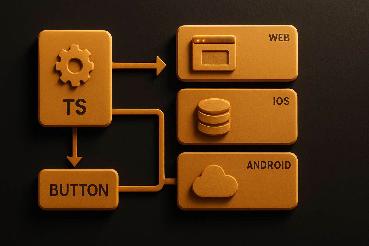
4. One API, same name, same props — three platforms
The component layer is where most cross-platform attempts leak. Web wants onClick. Native wants onPress. Web wants className. Native wants style. You can either expose both (twice the API surface) or pick one and translate (one leaky abstraction).
The pattern OTF uses: one prop name, one event name, one variant system, with the platform-specific translation happening at the boundary the caller never sees.
// same import name on web and native — only the package changes
import { Button, Card, Input, Stack } from '@otfdashkit/ui'
// on native:
// import { Button, Card, Input, Stack } from '@otfdashkit/ui-native'

<Stack gap="3">
  <Card>
    <Input
      placeholder="Search"
      value={query}
      onChange={(v) => setQuery(v)}
    />
    <Button variant="primary" onPress={runSearch}>
      Run
    </Button>
  </Card>
</Stack>
The web build wires onPress to onClick. The native build wires it to a touch handler. The caller wrote one thing. The variant string "primary" resolves to the same colour on every surface because it reads from the token layer.
This is the boring, durable bit. The model churns — Cursor today, Claude Code tomorrow, something else next quarter — and the API stays stable, because the API is the contract with the agent, the human, and the designer.
5. AI agents extend the kit instead of regenerating it
Here's the part that became true in the last year and quietly changed how kits are evaluated. An AI coding agent doesn't read your blog post. It reads your repo. It scans for conventions, finds a Button, sees how variant and onPress are used, and copies the pattern.
If your kit's components are consistent — same name, same prop shape, same variant vocabulary — the agent extends the kit. You ask for a DangerButton, it produces one that matches the existing Button and reuses the same token refs. You ask for a Card with a footer slot, it copies the existing Card and adds the slot.
If your kit's components drift — different naming, different prop shapes, three variants named three different ways — the agent regenerates. It invents a fourth convention. The kit decays in a week.
OTF ships with CLAUDE.md, .cursorrules, and a prompts/ directory of tested prompts — twenty-plus recipes an agent can follow without guessing. The configs are not magic. They're a description of the conventions the kit already follows, written down where the agent will read them.
# CLAUDE.md (excerpt)

## Conventions

- Components live in `packages/ui/src/<Name>/<Name>.tsx`.
- Variants are typed unions, not strings: `variant: 'primary' | 'secondary' | 'ghost'`.
- All colour, radius, and spacing come from `@otfdashkit/tokens`. No hex literals.
- Every interactive component accepts `onPress`, not `onClick`.
That's the durable layer. The model changes; the conventions survive the model change because they're written for the agent, not the human.
6. The 24-item checklist that runs before any of it ships
Cross-platform systems fail in unromantic ways: a missing focus state on web, a token that resolves to nil on iOS, an Android variant that crashes on a null title. Catching them after release is expensive. Catching them before commit is cheap.
OTF enforces a 24-item design checklist via a script that runs as part of the kit's build:
pnpm kit:check
# 24 checks across:
#   a11y       — focus order, ARIA, contrast ratios
#   tokens     — no hex literals, every colour refs @otfdashkit/tokens
#   events     — onPress on every interactive component
#   responsive — sm/md/lg breakpoints present and exercised
#   parity     — web + native implementations both exist for every component
A failing check blocks the kit from shipping. The list isn't a slogan; it's a script. The team that built it has shipped it, the team that uses it inherits the gate, and the agent that extends the kit reads the same gate when it proposes a change.
This is also why the kit is small enough to read. ~200 components. Not 2,000. Every one of them passed the gate.
7. How to put this in a project today
Two paths. Pick one.
Copy-paste the CLI if you want the files in your repo and you intend to fork them:
npx @otfdashkit/cli add button card input stack
# writes Button.tsx, Card.tsx, Input.tsx, Stack.tsx into your repo
# you own the code, you edit it freely
Install the package if you want to track updates:
pnpm add @otfdashkit/ui @otfdashkit/tokens
# on native:
pnpm add @otfdashkit/ui-native @otfdashkit/tokens
Then wire the tokens once:
// app entry — web
import '@otfdashkit/tokens/css'   // emits CSS variables
import '@otfdashkit/ui/styles'    // base styles
For native, the build pipeline emits the colour assets and theme XML from the same token source at install time. Same values, three platforms, one command.
The web demo is live at saas.otf-kit.dev. The mobile demo is at fitness-preview.otf-kit.dev. Open them side by side — the Button, the Card, the Input are the same component reading the same tokens, rendered by three different engines.
What this gets us
The model churn doesn't matter. The framework churn doesn't matter. The cross-platform consistency holds because it's defined in code the agent reads, in tokens the build pipeline emits, and in a checklist the kit can't bypass. A new model lands and your Button is still the same Button. A new agent opens your repo and finds a CLAUDE.md that matches the code it sees.
If your design system has three Buttons pretending to be one, the cheapest fix isn't a rewrite. It's a kit where the third Button can't exist, because the kit never made it. The hardest part of cross-platform was never shipping to three platforms. It was keeping one component honest across all three.
Buy once, own the code. Ship with the agent you already use.
- Free, open-source SDK — same component, web and mobile
- Paid kits include AI configs + 40+ tested prompts — your agent reads the whole project
- $99/kit or $149 for everything. No subscription, no sandbox limit.