
Why Skeleton Loaders Must Mirror Actual Layouts, Not Use Generic Spinners

A skeleton loader is the most lied-to pixel in shipping software. A team will spend two weeks tuning a 200ms API call, then render a gray rectangle in the middle of a card-shaped hole and call it loading UX.
It isn't. It's an admission that the layout wasn't worth thinking about until the data arrived. A spinner — older, louder, more honest — does at least admit it has nothing to show.
Here's the rule we enforce on every async surface across the OTF kit: a skeleton has to mirror the actual layout underneath it. A generic gray box or a centered spinner is worse than showing nothing.
The pain, named precisely
Three things go wrong when async UI is treated as decoration.
Content jumps in. The page renders an empty container, the data arrives, the container suddenly holds a card with text and an image, and the page below shoves itself down 200px. The user was reading something. Now they're looking for it. That's a CLS hit, and CLS is the one Core Web Vital that maps directly to "I lost my place."
The placeholder lies. A spinner says something is happening. It doesn't say what. A generic gray rectangle — <div style={{ background: '#eee', height: 200 }} /> — says even less. The user can't predict what's coming. They can't prepare for it. They just wait.
The app feels slower than it is. Counter-intuitive: a well-shaped skeleton visible for 800ms makes the app feel faster than a blank screen visible for 200ms. Perception is shaped by what the eye was doing during the wait, not by the wait itself.
Fixing all three is one mechanism: render the shape of the thing before the thing exists.
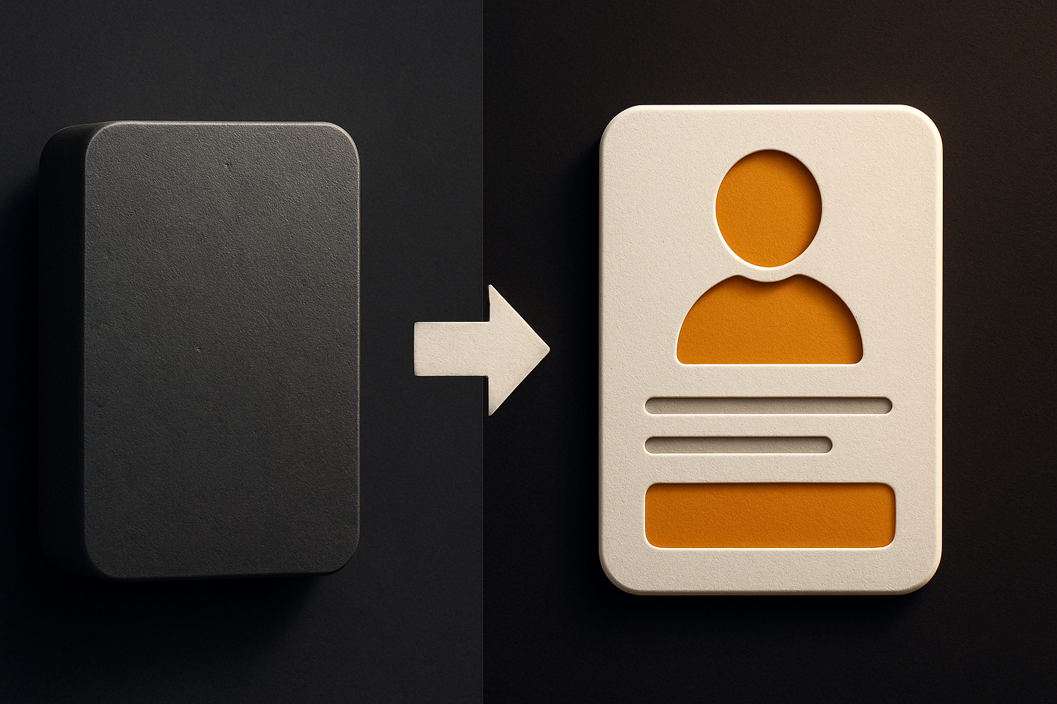
A generic gray box is a worse spinner
Spinners at least admit they don't know what's coming. A gray rectangle pretends. It sits in the layout like an apology: I am content. Don't look at me too closely.
/* the bad version — what most apps ship */
.loading {
  background: linear-gradient(90deg, #eee, #f5f5f5, #eee);
  height: 200px;
  border-radius: 8px;
}
Compare that to what the same component looks like when it has data:
/* the version that mirrors the card */
.card { display: grid; grid-template-columns: 48px 1fr; gap: 12px; aspect-ratio: 16 / 9; }
.avatar { aspect-ratio: 1; border-radius: 50%; }
.line { height: 12px; border-radius: 6px; background: #eee; }
.line--short { width: 60%; }
The second version reserves space and signals the shape. The first reserves space and lies about what goes in it. The second has measurable properties; the first has vibes.
A spinner is more honest than a generic skeleton — at least the spinner admits it has nothing to show. But honesty isn't the goal. Predictive perception is.
11 production screens. Login, database, payments — all wired.
The SaaS Dashboard Kit ships everything already connected. Nothing to set up. Live demo at saas.otf-kit.dev.
Why the layout match matters (the cognitive argument)
When you see a card-shaped silhouette with a circular silhouette in the top-left and two horizontal bars underneath, your brain does the work for you. By the time the data lands, you've already built the structure. The arrival is a fill-in, not a reveal.
This is the same reason low-fi wireframes feel faster than blank pages, and the same reason iOS launch images are screenshots of the app, not abstract artwork. The cognitive cost of what's coming? is paid before the wait begins. The wait itself becomes invisible.
Generic skeletons transfer that cost to the moment of arrival. The user is suddenly asked to integrate new information they didn't budget attention for. The app feels jarring. They blame the app, not the network, even when the network is the actual cause.
Convention beats configuration. Same principle as REST over RPC, same principle as naming components after what they are. The shape is the contract.
The CLS argument — the perf metric that proves it
Cumulative Layout Shift measures the sum of every unexpected movement on the page. The biggest contributor in real apps isn't fonts or images — it's async content landing in an unprepared container.
The fix isn't min-height magic numbers. It's aspect-ratio:
.card-skeleton { aspect-ratio: 16 / 9; }That's the entire CLS fix for a card. The container reserves its final shape before the content arrives. When the content swaps in, nothing shifts. The metric goes to zero. The user doesn't lose their scroll position.
This is one of the 24 items on the design checklist the kit ships with. Every async surface — card, list, table, modal — has to declare an aspect ratio in its skeleton, the same way it has to declare its real aspect ratio in its rendered state. A lint rule, not a hope.
What "matching the layout" means in practice
Per surface:
| Surface | Skeleton shape |
|---|---|
| Profile card | avatar (square, top-left) + title bar + 2 line bars + meta strip |
| List row | thumbnail + 2 lines + trailing meta |
| Table | header row + N rows with the same column widths the real table uses |
| Modal | header bar + body block + footer bar with two buttons right-aligned |
| Chart | aspect-ratio box + faint horizontal baseline |
The rule: every visible element in the loaded state has a placeholder in the loading state, in the same place, with the same dimensions. No exceptions.
// every loaded component exports its skeleton, not a generic one
export function CardSkeleton() {
  return (
    <div className="card" aria-busy="true" aria-label="Loading card">
      <div className="card__avatar skeleton" />
      <div>
        <div className="skeleton skeleton--line" />
        <div className="skeleton skeleton--line skeleton--short" />
      </div>
      <div className="card__meta skeleton skeleton--line skeleton--short" />
    </div>
  )
}// Suspense fallback is the matched skeleton, not a spinner
<Suspense fallback={<CardSkeleton />}>
<Card data={data} />
</Suspense>The fallback is the contract. If <Card /> and <CardSkeleton /> ever drift in shape, the page jitters when data lands, and the test fails.
When a spinner is correct (and when it's a lie)
Spinners have one legitimate use: confirming a user-initiated action. The user clicked Submit. They want to know the click registered. A spinner inside the button — replacing the label, restored on completion — answers yes, I heard you.
Spinners as page-level state are a lie. They say wait without saying what for. They invite the is this broken? reflex. They're an admission that the team hasn't thought about what's actually being loaded.
If the surface is a list, the loading state is N rows of the list's shape. If it's a card, the loading state is the card's shape. If it's a page, the loading state is the page's chrome with content slots. If it's an action, a spinner is fine. Anything else is a corner cut.

The checklist, enforced
The OTF design checklist has 24 items. One of them: every async surface ships its own skeleton, and the skeleton's layout must match the loaded component's layout, verified by a script that runs on every kit before it ships.
That's not a guideline. The build fails if the skeleton drifts. The same script checks contrast on the placeholder color, verifies aria-busy is set on the container, and confirms aspect-ratio is declared. A kit doesn't ship with a generic <Spinner /> as its only loading state. It ships with one spinner — for actions — and a matched skeleton for every async component.
This is one of the under-covered reasons the kits feel fast. It's not the network. It's that nothing on the page ever visibly shifts or lies about what's coming.
What this enables
Apps that respect layout during loading are perceptibly faster than apps that don't, at the same network latency. That's not opinion; it's a measurable CLS delta and a recurring complaint in user testing that disappears the moment the skeleton matches.
Three things you get for the cost of one extra component per async surface:
- Zero CLS on async content. Aspect-ratio reserved from the first paint.
- Faster perceived load. The user integrates the layout before the data arrives.
- Less "is this broken?" support. A skeleton that matches the card is obviously not broken. A spinner in a card-shaped hole might be.
The cost is one file per component: <Card /> ships with <CardSkeleton />. That's it. The discipline is in writing both, and in making the build fail when they drift.

Small details decide whether an app feels built or feels held together. The skeleton is one of those details. It's also one of the cheap ones — a single component per surface, enforced by a script, and the user never has to ask is this broken? again.
Try it on one card today. Render the card's shape before the data. Watch the CLS metric drop, and watch the support tickets for "the page jumps" disappear alongside it.
Ship the product, not the setup.
- 11 production screens — auth, billing, team, analytics, settings
- Real database, payments, and login — all wired on day 1
- AI configs pre-tuned so your agent extends instead of regenerates