
Why Live Demos Are the Ultimate Product Pressure Test

Screenshots are a presentation. Live demos are a contract. The difference is whether the product has to keep working while a stranger tries to break it.
When we shipped the OTF live demos — saas.otf-kit.dev and fitness-preview.otf-kit.dev — we told ourselves it was for marketing. It wasn't. The marketing was a side effect. The real reason a click-through demo exists is that it forces the product to survive contact with someone who wants to find the seams.
A screenshot is a single frame, picked from the best run, on the right data, in the light theme, at desktop width. A live demo is none of those things. It's every frame, every run, on whatever data the visitor invents, in whatever mode they toggle, at whatever viewport they resize to. Every one of those choices is an opportunity for the product to look bad — and a buyer, given a live demo, will systematically make all of them.
What a buyer actually does in the first ninety seconds
Watch someone land on a real click-through with no script. They don't read the hero. They don't watch the explainer video. They:
- Resize the window. Once. Aggressively. To phone width, then back, then to a weird in-between.
- Hit the dark mode toggle, if one exists.
- Try to sign up with garbage data. Spaces in the email. Empty password. A 200-character username.
- Look for an empty state. They will click "inbox" with zero emails. They will open the dashboard with no team. They will try to view a profile they haven't created.
- Try to break a flow. They will click submit twice. They will hit back mid-checkout. They will refresh a page they were typing into.
None of that is malicious. It's the default behavior of a person who has been burned before. They are doing exactly what you would do: stress-testing the seam between the marketing site and the actual product.
Mobile is the first seam to tear
The single most common failure mode in a click-through demo is the layout that "looked fine on desktop." A static screenshot can't show it. A live demo, opened on a phone or resized to 375px, will.
/* The component works on desktop. The component works on mobile.
   The transition between the two is where the bug lives. */
.dashboard-grid {
  display: grid;
  grid-template-columns: repeat(4, 1fr);  /* desktop */
}

@media (max-width: 768px) {
  .dashboard-grid {
    grid-template-columns: 1fr;          /* mobile */
  }
}
That looks correct. It is correct. It is also incomplete. What happens at 769px? What happens when a card has a nine-word headline that wraps to six lines on mobile but one line on desktop? What happens when the right-hand sidebar wraps below the main column and the page grows from three screens to nine?
A live demo forces these questions. A screenshot never asks them. Every component in the free MIT SDK — @otfdashkit/ui on web, @otfdashkit/ui-native on iOS and Android — ships with mobile, tablet, and desktop as a single source: the same component name, the same props, the same look on every platform. That isn't an aesthetic choice. It's a direct response to a class of bug a live demo finds in the first ninety seconds, every time.
11 production screens. Login, database, payments — all wired.
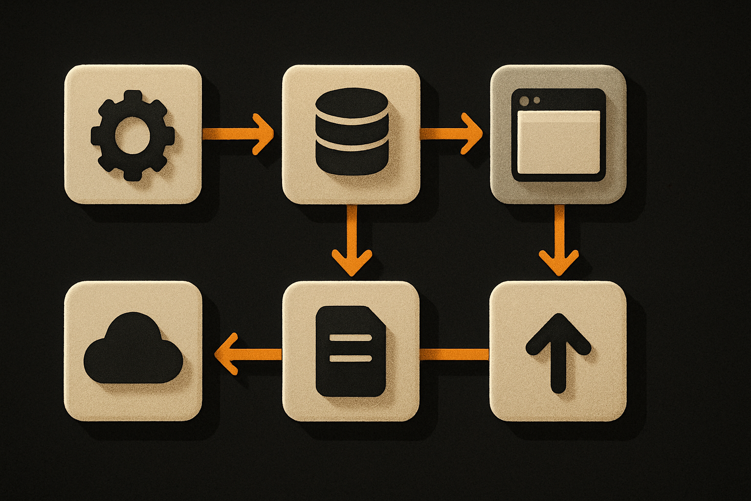
The SaaS Dashboard Kit ships everything already connected. Nothing to set up. Live demo at saas.otf-kit.dev.
Dark mode is the second seam — and the easiest to fake
A dark mode toggle is the single most-skipped feature in product screenshots. It is also the single most-asked-for feature in live demos. Buyers toggle it within fifteen seconds of landing on the demo. If the result is broken, the deal is functionally over.
// The naive version: two themes, two stylesheets, two sets of bugs.
const isDark = window.matchMedia('(prefers-color-scheme: dark)').matches

// The version that survives a live demo: one set of tokens, two values per token.
const theme = isDark ? tokens.dark : tokens.light
document.documentElement.style.setProperty('--bg', theme.bg)
document.documentElement.style.setProperty('--fg', theme.fg)
document.documentElement.style.setProperty('--border', theme.border)
The point isn't the implementation. The point is that design tokens — a single source of truth for color, spacing, type — make dark mode a one-line config flip, not a re-skin. With tokens, every component is visually identical on every platform, light or dark. Without them, dark mode is six weeks of find-and-replace. A screenshot hides which version you shipped. A live demo does not.
Our 24-item design checklist runs before any kit ships. Item nine is: every component renders correctly in light mode, dark mode, and a forced high-contrast preview. The reason that item is on the list is that a live demo revealed it had to be.
Empty states are the third seam — and the most expensive to fake
This is the one nobody talks about. Empty states are the screens of your product that no screenshot will ever show, because every screenshot is built on populated data.
// The screenshot version: 47 emails, 3 unread, 1 starred.
<Inbox initialEmails={sampleEmails} />

// The live demo version: zero emails, on first load.
<Inbox initialEmails={[]} />
When a buyer opens the inbox in your live demo, they will see zero emails. The question is whether that screen is a blank box with "Inbox" at the top, or a first-run state that explains what an inbox is for, offers a sample message, and has a primary action to send the first email.
The first option is what you ship if you never ran the click-through. The second is what you ship after you've watched three strangers land on the empty inbox and visibly hesitate.
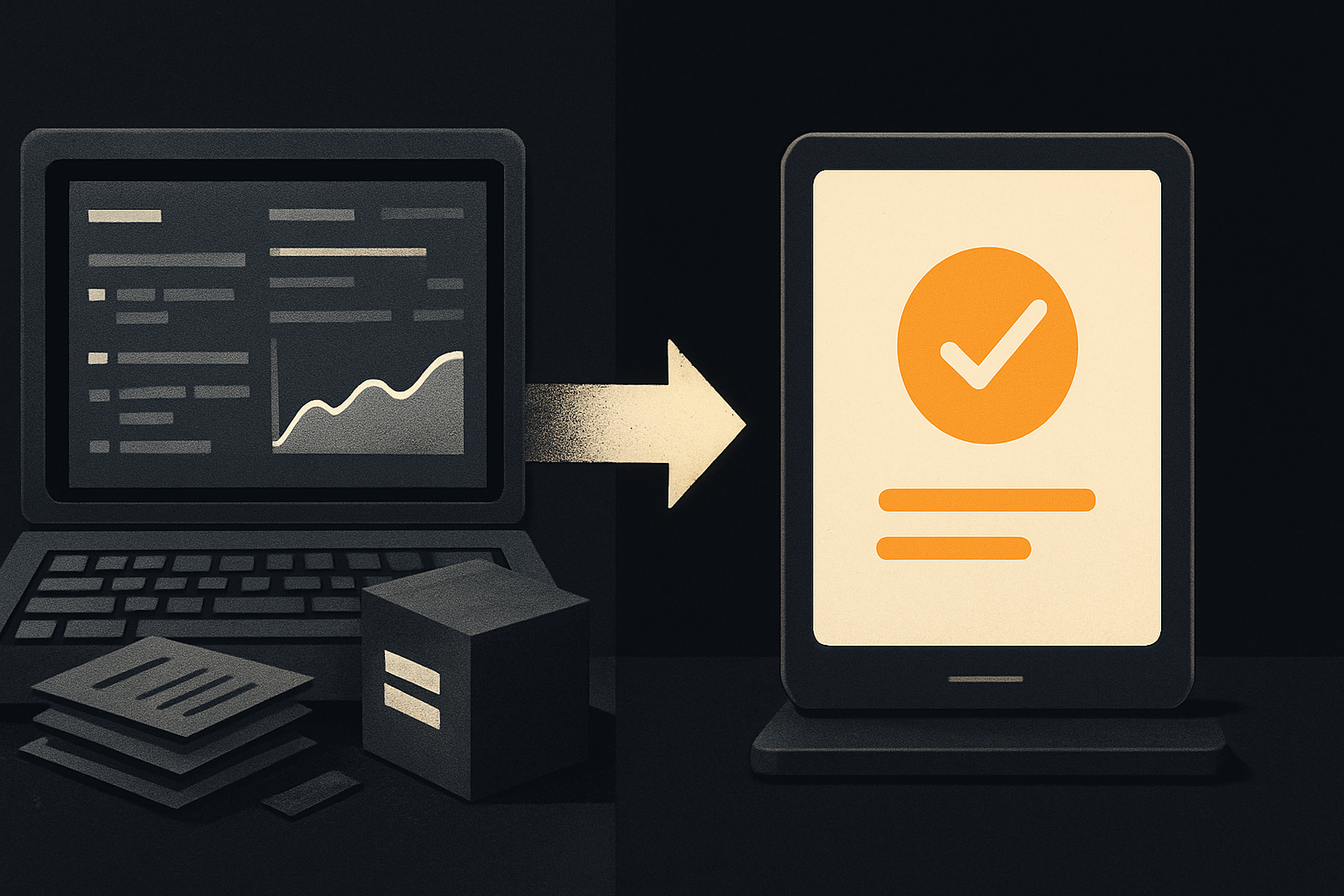
Empty states are where the seams show. They are also where the product's character shows. A blank page says "we never thought about this." A thoughtful empty state says "we knew this was the first thing you'd see, and we prepared for it." Buyers can tell. They can't always articulate how, but they can tell.
The pressure-test makes the product better, not just the pitch
The reflex is to treat the live demo as a marketing surface. It is not. It is a continuous integration server for product honesty. Every seam a buyer finds is a seam a real user would have found, slower and with worse consequences.
| Surface | What the screenshot hides | What the live demo forces |
|---|---|---|
| Mobile breakpoint | The transition zone, not the endpoints | Layout, type, and density at every width |
| Dark mode | That it exists at all | That every component honors the token flip |
| Empty state | That it exists at all | That it teaches, not just renders |
| Form validation | The happy path | What happens with garbage input |
| Auth flow | The signup page | The full claim → confirm → onboard journey |
| Refresh mid-flow | That state survives | That nothing silently breaks |
Every row in that table is a row we got wrong at least once, caught by someone clicking through a live demo, and then fixed before the next release.
The demo that almost shipped
The fitness mobile demo — fitness-preview.otf-kit.dev — has a workout tracker. A buyer opened it on their phone, started a workout, then flipped the phone to landscape mid-rep. The rest timer, the rep counter, and the active-set highlight all reflowed. The set-complete button moved from thumb-reach to requiring two hands. We had tested portrait. We had not tested the rotation transition under load.
That is a bug we would never have caught from a screenshot. It is also a bug no user review would have filed, because the workaround is "rotate back to portrait." It is exactly the kind of bug a live demo finds in the first ninety seconds, because a live demo gives the buyer nothing to do but look for seams.
What this enables
The point of shipping live demos isn't to win a specific deal. The point is to install a discipline:
- Every component must work on mobile, desktop, and the space between. Not "looks fine on desktop." Works.
- Every component must honor the theme tokens. No inline colors. No "this one is hardcoded for the brand."
- Every list, every inbox, every dashboard must have a real empty state. First-run is a feature.
- Every form must survive garbage input. Email validation, password rules, length caps, all of it.
- Every flow must survive a refresh. State persistence is not optional.
These are the things the 24-item checklist enforces before a kit ships. They are also the things a buyer, given ninety seconds with a live demo, will test. The checklist exists because the demo exists. If we shipped screenshots instead, half of those items would never have been written.
The contract
A screenshot says "the product can look like this." A live demo says "the product does look like this, on whatever you bring to it." Only one of those is a contract a buyer can rely on.
The free SDK is on npm — ~200 components, MIT, design tokens that flip one theme across every platform. The live demos are at saas.otf-kit.dev and fitness-preview.otf-kit.dev. Both are clickable. Both have dark mode. Both have empty states that aren't blank. Both have been clicked through by people looking for seams, and both have gotten better because of it.
The next time someone asks for a screenshot, send them the demo. The seams will show. Fix the seams, then ship the screenshot.
Ship the product, not the setup.
- 11 production screens — auth, billing, team, analytics, settings
- Real database, payments, and login — all wired on day 1
- AI configs pre-tuned so your agent extends instead of regenerates